![Internet Penetration Around The World [Infographic]](https://media.thenextweb.com/2011/01/Picture-308.avif)
This post was brought to you by Samsung Galaxy Tab. More Possibilities on the Go. Learn more here.
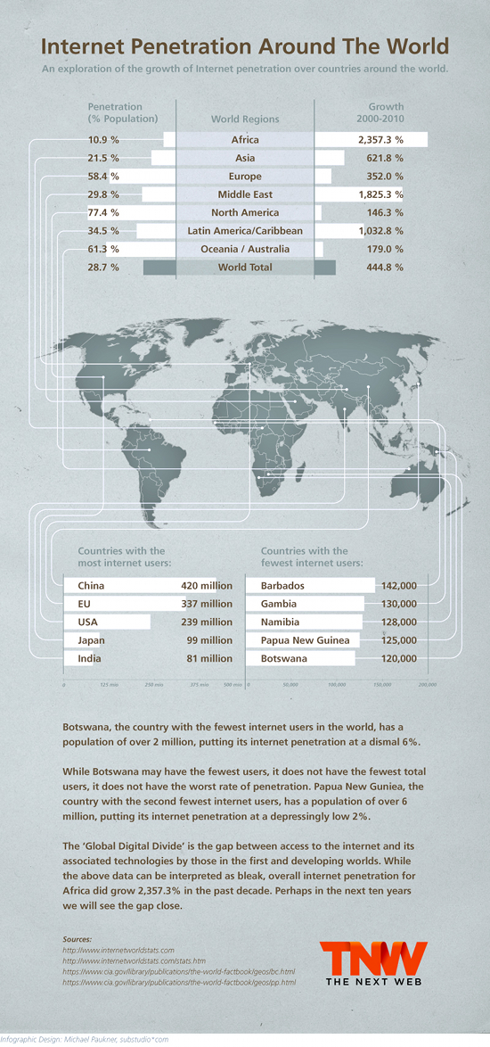
As Internet use around the world continues to grow, where is it making the greatest impact? This infographic shows you which countries have the most Internet users, those with the fewest and how usage has grown around the world over the past decade.
Be sure and check out our previous infographics:

The 💜 of EU tech
The latest rumblings from the EU tech scene, a story from our wise ol' founder Boris, and some questionable AI art. It's free, every week, in your inbox. Sign up now!
The Worlds Most Obscure Top Level Domains
Comparing the Two Fastest Selling Gadgets of All Time
Chinese: The New Dominant Language of the Internet
Get the TNW newsletter
Get the most important tech news in your inbox each week.