Once upon a time, when the internet was conceived, we dreamed up crazy websites. Everyone built their sites more or less from scratch, so there was huge diversity in layouts, colors, sound effects, transitions, animations and more.
In 2015, it feels like web design has become a lot more boring. The internet grew up, HTML5 came along and unleashed new possibilities… but we lost a lot of the fun along the way.
Every time I look at sites like Space Jam’s classic site (which is still somehow online), it makes me a little nostalgic for the days where we experimented and things would come out a little crazy.
Yes, the old Web was ugly and insane, but it was also much more fun than a sea of sites that look weirdly similar. Now it feels like everywhere you go online looks strangely similar to every other site.
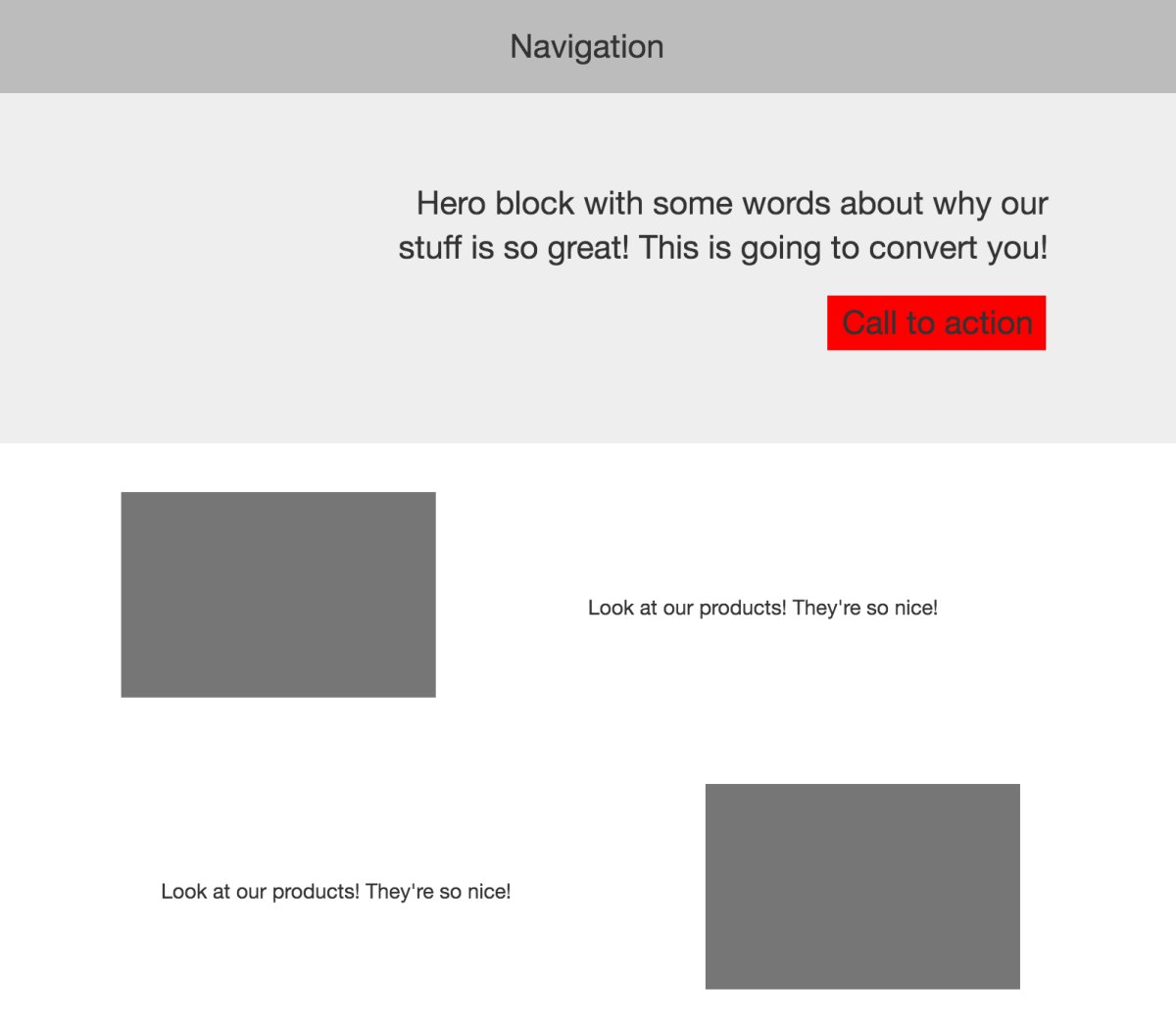
Web design has become this predictable equation that usually combines a big hero block with a call to action at the top followed by feature blocks and full-width colors before another call to action button at the bottom. Zzzzzzz.
Websites from small businesses to startups and giant companies have all started to use similar layouts and frankly, it’s boring.

How did we get here, and when did we lose the magic that was our insane Web designs? Why did everything start looking the same?
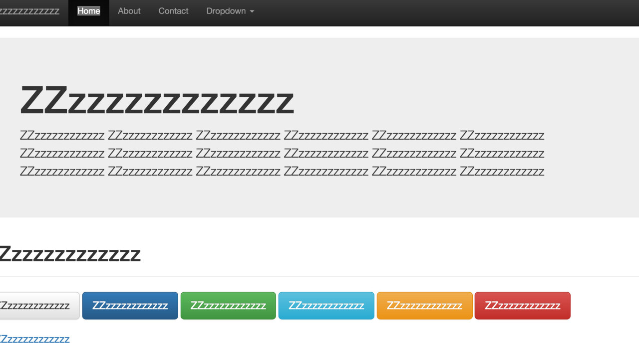
In part, the finger could be pointed at frameworks that made it easy to get an attractive website up and running with minimal effort.
Bootstrap, which provides commonly used elements for building sites fast, is now used on 6 million websites according to Built With. It’s by far the most widely-used framework, and is at least partially responsible for much of the layout style you see around the Web today.

It’s used so widely because it includes a great grid layout system and out of the box components, which make it easy for developers to quickly get new projects off the ground. The format works so well because it’s been A/B tested into oblivion — it converts people.
Unfortunately, it also sometimes stymies creativity as the fundamental building blocks are already defined for you. Everything quickly starts looking the same because nobody can be bothered customizing Bootstrap enough to make it look unique (the Bootstrap gallery shows some developers that did go the whole way).
Here’s a good example: out of 20,000 themes available on Themeforest for WordPress, Bootstrap is a part of more than 7,000 of them. It’s a framework so easy to use that it’s pervasive everywhere — when someone goes to look for a ‘responsive’ theme for their blog, it’s almost inevitable you’ll end up with Bootstrap.
Other frameworks, like YUI and Pure, encourage developers to build on similar bases. In the modern world, re-inventing the wheel is considered unnecessary, which leads to the same basic building blocks being used everywhere.
Another reason could be that in recent years Adobe Flash, which was responsible for many of the coolest, craziest early websites, has edged toward what seems like an inevitable death thanks to its exclusion from mobile devices.
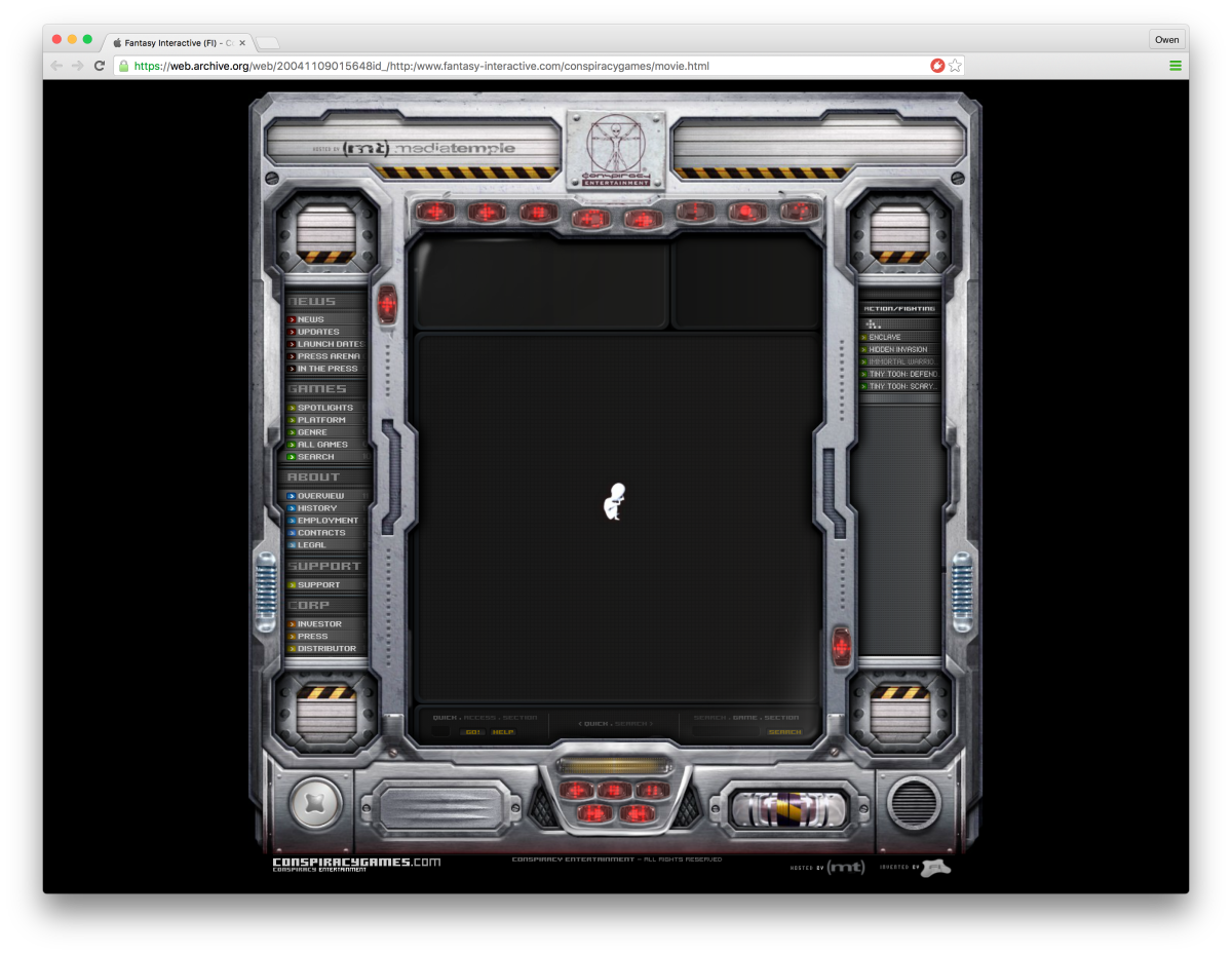
In its heyday, Flash bought us magnificent creations like Conspiracy Games and 2Advanced studios, which utterly broke down expectations of what could be done on the Web.
It feels gross and disgusting to say it out loud, but the death of Flash might actually be a bad thing for creativity. Developers and designers loved Flash because it enabled audacious ideas that didn’t necessarily require huge amounts of coding knowledge.
HTML5, CSS3 and other technologies offer some impressive new abilities, but the learning curve is steeper. There’s no single best way to approach ideas and they often require extensive knowledge of code, maths and more to build complex sites.
Adobe Flash’s app was a single place to build those crazy ideas, even if it meant that creativity was at the expense of other things.
I’m not saying frameworks or Flash dying are ruining everything — I use and love Bootstrap for many of my own Web projects and have seen some amazing projects built leveraging it — but the internet I remember has lost its charm, in part, because it’s become commoditized.
As we all recycle bits and pieces, we stick with the mould because we don’t want to reinvent the wheel. Sure, Chrome experiments are awe-inspiring showcases of what HTML5 can do, but where’s the wider Web embracing these audacious ideas?
Somehow, along the way, we built a cookie-cutter Web for ourselves that feels eerily the same wherever you go. Where’s the crazy shit from the early days?
Let’s start again, ignore the rules and stop building websites that look the same. We should start tinkering and breaking rules. Let’s not lose the magic of the early Web.
Get the TNW newsletter
Get the most important tech news in your inbox each week.


