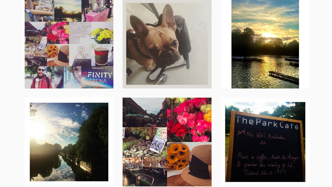
When Instagram first started out, it was promoting the retro feel of instant photos that Polaroid had successfully made famous in times gone by.
Limiting the format to a square was Instagram’s way of paying homage to the original size of instant pictures and using its filters you could give your images a unique, vintage feel.
It wasn’t something that had been done properly before and Instagram just happened to get it spot on at the right time.
As with anything that’s popular, the app was duplicated in various forms by thousands of developers and social networks, but none of them successfully replicated Instagram’s square formatting.
It’s the one characteristic that has remained part of Instagram’s identity and untouched since the beginning.
That’s why when the Facebook-owned company revealed it’s caving and letting people share in landscape and portrait as well, I couldn’t help but feel like it’s giving up part of its identity.
The real problem
To be honest, I don’t think it was Instagram’s issue to solve. The ‘problem’ is the rise of vertical shooting on mobile and people not realizing that you can’t fit a square into a rectangle without compromising something.
Cameras in the past were almost always set to horizontal shooting, which meant images and videos could easily be viewed on alternative screens and resized – something that’s been complicated by vertical shooting. By using square format, Instagram assures that all of your images are getting the same treatment on your phone’s display, regardless of how they were shot.
I tend to shoot in the square mode on the iPhone when I know it’s for Instagram and I guess, in an ideal world, it would have been the manufacturers bending to Instagram’s will by introducing a square sensor design and not the other way around.
With the new feature, the images still end up being compromised anyway; Instagram scrolls vertically, so horizontal images are resized to be smaller than any vertical ones.
Long live the square
The square format hasn’t always been viewed as a thorn in people’s sides. Kodak introduced it in the 1950s with its Starlet camera and the Star series cameras that followed.

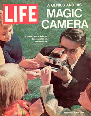
The square lost some of its appeal when the more affordable 35mm compacts arrived on the scene in the 1980s but Polaroid, which had introduced its own square photos with the SX-70 camera in 1972, kept the flame burning.

Toy cameras like the Holga, Diana or Lubitel continued to promote the square format as a niche photography style when digital cameras started to overtake Polaroids; and when our phones took over from carrying a digital camera, it was Instagram that picked up the torch.
I’ve had experiences of showing friends children old polaroids and they always think it’s an Instagram photo.
I know, I know
Don’t get me wrong, I have had moments in the past where I’ve taken an image in landscape and got annoyed at having to crop it for Instagram. But most of the time I just use external apps like Layout or InstaFit to make it work.
And it has never irked me so much that I haven’t posted an image.
I appreciate Instagram listening to user critiques – and it does still default to shooting square – but it weakens Instagram’s visual identity. For its part, this is what the company had to say about the change:
It turns out that nearly one in five photos or videos people post aren’t in the square format, and we know that it hasn’t been easy to share this type of content on Instagram: friends get cut out of group shots, the subject of your video feels cramped and you can’t capture the Golden Gate Bridge from end to end.
The new look may make Instagram blend more with other image-sharing platforms, but that’s not what it should be trying to imitate.
Instagram has never been about maximizing image quality in the same way as 500px or Flickr are; you can’t even zoom or view images at full resolution. It’s about sharing moments collectively and sparking conversation, whether that’s in the comments or in-person.
The square aspect ratio worked with that idea as it framed every moment under the same aesthetic. The new formats unwittingly prioritizes some images over others, and in doing so, weakens the identity Instagram has built over the years.
https://youtu.be/if-UzXIQ5vw
This article has been edited to correct that it is Edwin Land, not Laurence Olivier, on the cover of Life magazine, and to clarify that Polaroid’s square photos were introduced in the 1970s.
Get the TNW newsletter
Get the most important tech news in your inbox each week.


