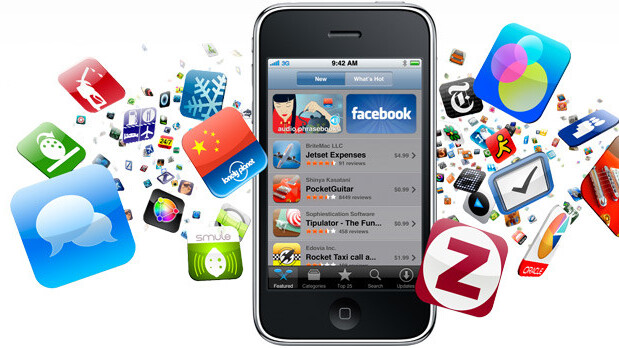
As the smartphone market continues to grow, as a large number of featurephone owners migrate to more powerful, Internet-connected and advanced devices, the demand for mobile applications has boomed.
Whilst many download a large number of apps on their smartphones the average number of installed apps that are frequently used sits at around 23 apps per device, with iOS device owners said to download more than their Android counterparts.
Research analysts IDC estimates that manufacturers will ship more than 472 million smartphones this year alone, an increase of over 160 million units from 2010 – that figure will nearly double to reach 982 million by the end of 2015. As a result, app downloads will rise to 183 billion within four years.
With nearly a billion people set to own a smartphone by 2015, downloading and using an average of over twenty apps, the already burgeoning app market is set to explode as new hardware technologies open up what is possible to achieve on a smartphone or tablet device. Where a number of developers (big and small) have already experienced the power of the App Store, thousands more are tuning their apps to mimic the success of Instagram, Angry Birds and Shazam.
Like any other saleable object, apps need to be unique to sell. Some of the most successful apps on smartphones today haven’t introduced new ideas, they just do them better. With this in mind, we wanted to take a look at what makes a good app great, what differentiates one photo app from another photo app, to become a top seller on a mobile app store.
UI, UI, UI.
The way an application looks and operates is imperative to its success. When an application is downloaded, a user is going to open that app and will instantly form an impression. Especially in the case of free apps, there is a huge amount of churn – if the app doesn’t look as good as a rival app and navigation isn’t fluid, the chances are the user won’t even bother getting to learn about what it can do.
A great app keeps in mind that in most cases, the user is operating a device that has a small touchscreen. The user interface needs to be as unobtrusive as it can be, leaving out any design elements that don’t add a use or function to the app. Bundling in too many design elements can leave it feeling bulky and will feel unintuitive.
Apple’s own User Interface Guidelines suggest that to make an app that people will care about, app developers should focus on the primary task, elevate the content that people care about, think about how a smartphone screen is viewed in different environments, to give users a logical path to follow and make usage easy and obvious – to name a few.
Photo applications are excellent proponents of Apple’s ideas, shaping experiences that make users care about the processes associated with sharing their photos. Take Path for example; on the iPhone, the application instantly loads photos taken by friends (elevating the content that people care about), emphasis is placed on a green camera icon which provides the user with the opportunity to share their own photos (focus on the primary task) and annotates each of the options on the toolbar (to make usage easy and obvious) and showcase other parts of the app.
The Path team realises that its users can only see one screen at a time and makes excellent use of categories to separate content. Because users will never want to access content simultaneously, developers need to ensure that different parts of the application can be accessed sequentially, giving necessary focus to each feature to ensure users understand what it required of them and highlight tools the app can actually provide.
Some applications by their very nature have numerous features that even the best designer will find hard to adequately incorporate without confusing some its users. Path tags people, places and things in each photo, incorporates moods, adds filters and allows other users to comment and like a user’s photos – it needs to highlight these features without taking too much away from the photo-capturing process.
To assist fluid navigation, Path’s developers have kept onscreen help to a minimum whilst retains the standard icons and buttons that a user will be familiar with in other applications, so they instantly know how to use the app. We take it for granted but the use of back buttons, cancel buttons and home buttons within an app help us retrace our steps and find the place we ideally want to be.
Path excels because it not only looks good, the number of options it provides are smartly labelled and organised so that a user never feels overwhelmed using it. Whilst the application hasn’t got quite the following of its rival Instagram, the Path team continue to iterate the product to walk its own Path (see what I did there?) and entertain its own large userbase.
Play To The Strengths Of Mobile
A presentation by Nick Watt suggests a good app “plays to the strengths of mobile”. In his eyes, this consists of five things: Communications, Spontaneous, Geo-sensitive, Short periods of use and Focused activity.
Shazam is a music discovery application that utilises a smartphones microphone to listen to ambient music and correctly identify it. The application passed 100 million users in December 2010 and continues to add thousands each day via its free and paid apps.
It is a great example that utilises the principles Watt outlines, encapsulating each one in its own way within the app.
The beauty of Shazam is that it isn’t a regularly used application, but it serves a purpose that could be much more important than a number of other apps on a user’s smartphone.
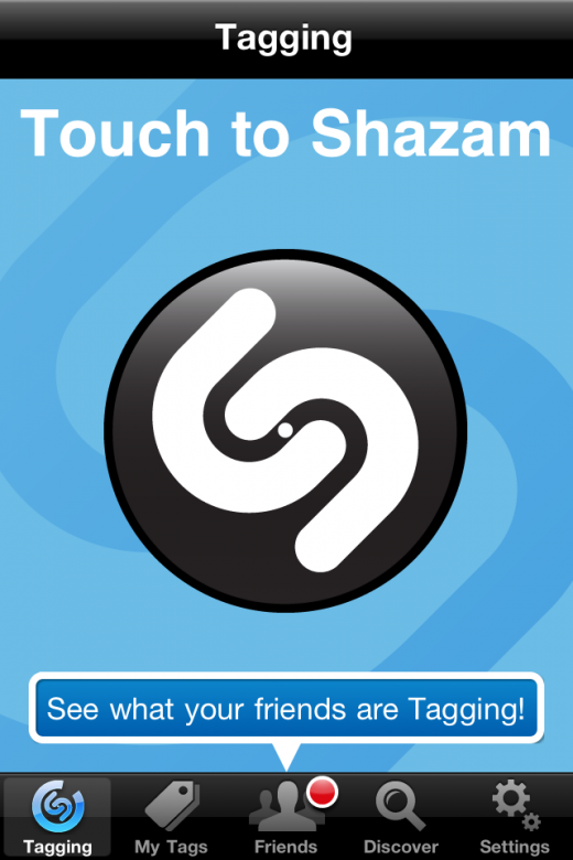
Upon launch, Shazam immediately displays a giant Shazam logo and asks the user to tap the screen to begin. If a track is playing on the radio, the user has no idea when the song could be changed or a DJ will start to talk over the track, so time is of the essence. Shazam wastes no time, elements are minimal and the main feature of the app is displayed front and centre, conveying a very simple but effective call to action.
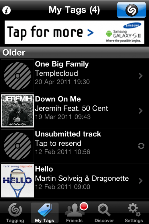
The app will keep a log of each track it correctly tags, allowing the user to immediately quit the app after successfully identifying a song. However, the addition of options to buy, listen or share a track via Twitter or Facebook increases app interaction time, increasing the likelihood of bringing the user back to the app to grab the name of the track many days/weeks/months after it was first tagged.
Shazam started a text messaging service that would identify music many years before smartphones came to market. The company hasn’t changed the service it provides, it has simply adapted the way users can interact with it. The Shazam app is simple in design – because it needs to be – any additional elements could impede users in their attempt to quickly tag a track.
Travel applications also keep things simple, obtaining a user’s location to suggest the best route to a predefined destination. An app that maps of the London Underground or the New York Subway can operate purely on its own; the user simply states the station they are at and the place they need to disembark, the app will crunch data locally and suggest a route without needing Internet connection or location input.
Adapt To A User’s Needs
Creating a successful app is one thing, maintaining that success is the real headache for developers.
With app downloads come app updates; a way for developers to submit fixes for their apps, introduce new features and streamline the way it operates. An app user may have paid a full 59 pence for an app but they will want far more in the way of support and feature iterations if a developer wants them to stay loyal to their brand or their specific set of applications.
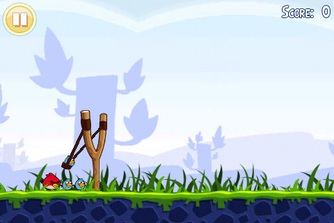
Angry Birds is the most successful app on any platform, recently hitting the 250 million app downloads milestone and is now downloaded over one million times each day. The franchise hit the heights it did because not only was it a fantastically fun game to play, Rovio works tirelessly to release updates to the game, completely free of charge, to keep its customers satisfied.
Today, there maybe five Angry Birds apps on the App Store but at the start, Rovio had to find a way to get its customers to return to the app. Rovio’s idea was to introduce a scoring system that would reward users based on how sparingly they used birds to complete levels. This ended up being a scoring system that utilised stars, issuing the maximum amount of stars should a player destroy the evil pigs with a lower-than-expected amount of birds.
If a user completed the game without getting three stars on each level, you can bet a large percentage kept coming back until they did.
Once gamers had scored three stars on each level and effectively completed the game, Rovio might have hoped that they would come back to the game and play it over again, much as a console gamer would do with an older title. Instead, the Finnish game developer rolled out level updates to existing customers, completely free-of-charge to keep Angry Birds fresh in their minds and increase the chances of that person recommending the game to their friends and family.
As new titles became available, those customers – fuelled by a desire to obtain three stars on new levels – would instantly buy the new games, effectively starting the same cycle but with a slightly different version of the game.
Rodrigo Coutinho writing on the Outsystems blog says that apps need to be “easy to change”:
Great apps are evergreen. Even if in subtle ways, they’re always improving and adapting to the latest requirements. To build a great app, you need to make sure your application can change as fast as your users’ needs.
Rovio has embodied that approach, but many other application developers consistently update applications to appease their users. Adding a new feature might make sense at the time, but if it is incorporated and the user’s don’t like it, the developer needs to be ready to adapt and update as quickly as possible to maintain good relationships with their customers.
In an increasingly competitive marketplace, a smartphone owner can quite as easily delete an app and move to a rival which is more understanding to its users’ needs.
Know Your Market
 App developers need to be aware of the market they operate. We have spoken to people who say some apps are lucky because they were featured on Apple’s Featured listings on the App Store, when their app didn’t.
When Tweetbot launched – to considerable praise – its makers knew that if they wanted to capitalise on the successful launch of the app, they would need to incentivise casual users to download and install the app. With this in mind, the team dropped the price of the application by a dollar and market the reduction as a special introductory price.
The team then took to Twitter and its blog, keeping their followers updated as to the progress it was making on updates it was scheduled to roll out. Over time, the team would tease new releases hours before they were due to hit the App Store, in an attempt to generate buzz, ensuring that news of the updates would proliferate across various social networks and tempt even those who had not yet downloaded the app but were aware of what it could do.
It’s most recent update saw Tweetbot finally get Push Notifications. News of the feature was posted to the developer’s Twitter accounts and when it became available, the 1,000 invitations were snapped up within minutes.
It took the makers of Tweetbot three months, but the application has returned to its original price, now that millions of existing users are willing to sing its praises to those that will listen.
Coming back to Rovio, it knew that smartphone owners on different platforms interacted differently with apps, with iOS device owners not only downloading more apps but paying more for them. The team did its research and launched an Android port – for free – because it knew Android handset owners weren’t as spend-happy as their iOS counterparts, choosing instead to integrate an advertising model that at one point was said to be earning the company $1 million a month (possibly more now).
Conclusion
There is no magic formula to app success; it always needs a good – if not unique – idea to make the hundreds of millions of smartphone owners take notice. However, a good understanding of what users will expect from an app is paramount, developers cannot expect people using their app to suddenly adopt new menu structures and use buttons that do not fit with the platform they are running.
The app market is still in its infancy, it could be said for smartphones in general – as new technologies make their way into mobile phones and into our pockets, the scope of what apps will be able to achieve in the near future is mindnumbing.
Consumers want something that can reduce the time to undertake something or entertain them when they are bored. It’s up to the developer to assess what is missing on the app market and make their idea it a reality. Innovation breeds success in a variety of markets but it will especially pay off in the world of digital apps.
Get the TNW newsletter
Get the most important tech news in your inbox each week.
