Today Microsoft further further unveiled Windows 8.1, a major update to the Windows 8 operating system that it released in late 2012. This post is not an attempt to recount what Windows 8.1 contains. For that, TNW’s previous coverage is your guide.
Instead, this post is an attempt to place Microsoft’s upgrade to its flagship desktop and tablet operating system into context. Does it live up to what we had wished it to be – a sorting of the problems that make Windows 8 a quirky experience – and does it mold the core Windows brand into an operating system that can run across every form factor that isn’t a television or smartphone?
We’ll begin with a short summary of Windows 8.1, and then examine a number of its facets in the prism of hands-on usage. It is impossible to cover the complete 8.1 experience in a single post; what Microsoft has created is quite large, and thus we shall have to be concise.
Windows 8.1
Windows 8.1 is a slurry of feature upgrades, user interface changes, and completely new capabilities that Microsoft is releasing into preview form today, some 8 months after the launch of Windows 8 itself.
It represents a key correction in the life of Windows 8, potentially smoothing its noticeably rough edges, while increasing its out-of-the-box usability, improving its functionality on smaller devices, and boosting its multi-monitor capabilities. In short, Windows 8.1 is Microsoft’s attempt to fully realize Windows 8’s initial potential.
The update is free for Windows 8 users, and will be distributed through the Windows Store.
Microsoft has introduced new pre-loaded applications, created a new, beautiful search interface, revamped Xbox Music, rebuilt the Windows Store, added a new application screen, updated the Start Screen, returned the Start button, enhanced multi-app functionality, and more. These are by no means minor updates.
As I’ll argue below, however, while Windows 8.1 is a welcome and broad improvement to Windows 8, it does not completely iron the issues that caused Windows 8 itself to be a somewhat difficult operating system. It is still easy to get lost in the live applications, as one spends time clearing apps that are running but no longer used.
Search
The most notable change to Windows 8 in the 8.1 update is its search functionality. Microsoft has created two new search interfaces, each worthy of discussion. As reported before, a new ‘Search Hero’ interface for big topics has been built. Searching for bands, cities, and the like will yield something along the lines of the following:
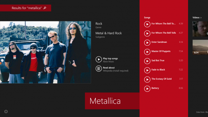
This part of search in Windows 8.1, simply summoned through the Search Charm, yields perhaps the most compelling information retrieval tool that I’ve ever used. It is holistic, broad, and links users to applications – such as the Wikipedia app – that will enrich their core Windows experience.
Search is undergoing an evolution of sorts at the moment. It’s widely understood now that search must evolve past our familiar ranks of blue links. What Microsoft has built with Search Hero, however, is an extra-browser – that is to say, a core element of Windows itself. Content of all types, ranging from pictures to listen-now buttons to pre-previewed Web links, can emerge through search. It’s a lovely experience as long as queries are for topics that are broad in scope.
If a query fails to pass the importance test, however, the results are more pedestrian:
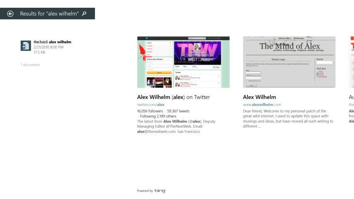
Not that you would expect a personal search to yield much more. Still, it’s important to note that the search function found a file of mine that contains my name – fitting the query – from my SkyDrive account, and included it in the results.
The search experience in Windows 8.1 is now a broad feature that will suggest all sorts of content and information, blending on-device information, application data, and Web results in a way that is quite compelling.
Image search in particular has been improved, allowing users to hone their pictoral search results by color, or to only images that contain faces. It’s a fine way to better drill down into overly diverse responses to a generic query.
Search in Windows 8.1 is a strong upgrade to what was offered in Windows 8.
New Apps
Several new applications are present in Windows 8.1. These range from small utilities in the Metro side of the operating system to a new health-focused app and a new cooking tool.
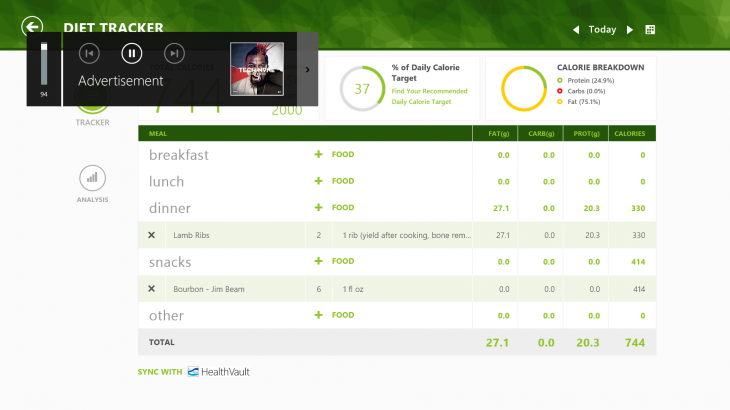
In action, here is the health application, counting calories in action:
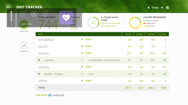
I was not able to link the application to my MyFitnessPal account. I’m unsure if that was caused by user error, or if the application currently lacks such capabilities; Health and Fitness would be thrice as useful if it had broad integration with extant solutions that individuals use to track and monitor their caloric intake and fitness regimen.
With that in mind, Health and Fitness does so much – from calorie counting to symptom guesstimation – that it loses focus. Rather than feeling “feature-complete,” the app takes kitchen-sink approach that leaves the user confused and overwhelmed.
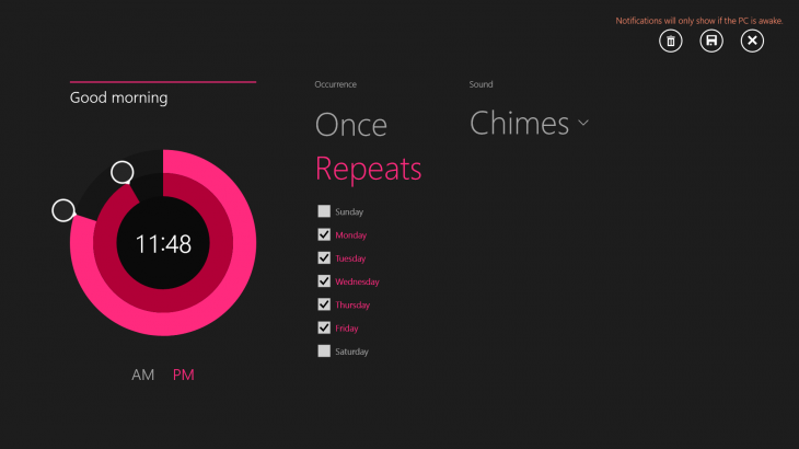
Still, Microsoft has expanded the out-of-box functionality of Windows 8 by adding a number of applications that users, in their time of specific need, will employ. Final kick, a shot of the timer application that now resides in Windows:
User Interface Changes
Important to the Windows 8.1 upgrade are interface changes that better harmonize the Metro-designed Start Screen and the desktop interface. If you ask Microsoft, they will happily tell you how intensely they love the desktop side of Windows. And with good reason: It is the warhorse that every application from the past and a large chunk of the future depend on to run. That said, Microsoft does intend to release a Metro-version of Office in the future, it disclosed. For now, however, that suite remains a fully desktop experience.
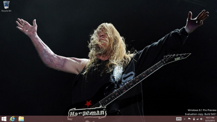
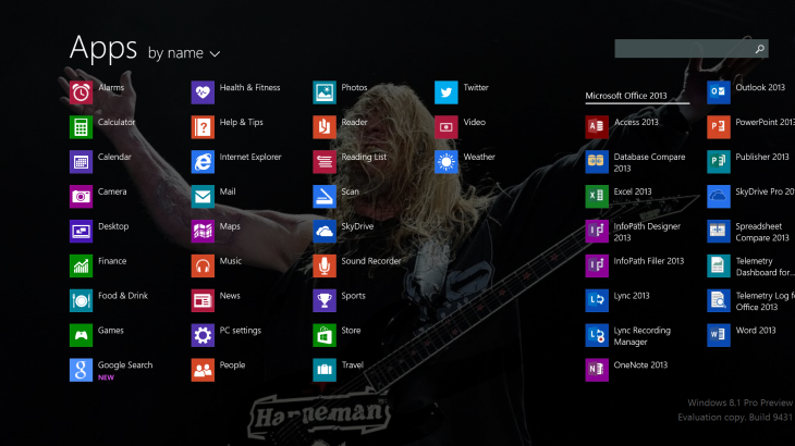
To the screenshots. Here’s my recently set up Windows 8.1 desktop background:
And my in-creation Start Screen in Windows 8.1 that now sports the same background image:
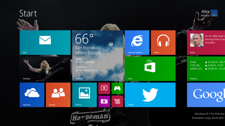
As you will note, Windows 8.1 allows for the use of the same background image for both the Start Screen and desktop. In practice, this makes the appearance of the tiles of the Start Screen feel far less intrusive, intense, and out of place. You have to experience this for yourself. The difference matters. Now that you can unify the two, the Start Screen is less jarring and more welcome.
Moving on, Microsoft has revamped the Xbox Music interface to require just two clicks to play a song, down from six as in Windows 8. The new app is quite nice, I must say, and is surprisingly ad free. Here’s what you run into when an ad plays:
Finally (and again, note that we are touching on but a fraction of the changes), the application screen that you can set as default instead of the Start Screen, if you are so inclined:
Tidbits
Another important change to Windows 8 in 8.1 is the upgrading of the Lock Screen to cycle between beautiful images that the user has stored across their digital life. Microsoft has also improved support for the BYOD trend in enterprises, and worked to enhance the security of Windows 8 in the update.
Here’s one: Windows 8.1 contains support for 3D printing. In all frankness, Windows 8.1 is a large, whole-cloth upgrade. Once you use it, you will not go back to Windows 8, nor should you.
But is it sufficient?
Enough To Smooth The Edges?
At the risk of overusing a word that should perhaps be typed only once monthly, Windows 8 is… quirky. Sadly, despite its strong improvements, Windows 8.1 does not fully assuage, or solve that fact.
A quick look at Reader, a neat way for users to save articles or application points for later reference, and Xbox Music, together in action on a Surface Pro, is somewhat explanatory:
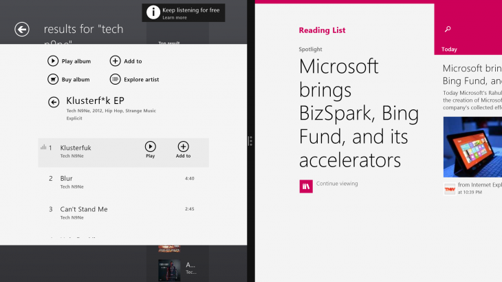
That is hardly an attractive experience. Now, try and switch applications, and watch all Hades loose the hounds:
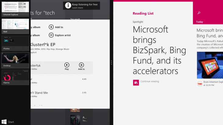
This is perhaps my biggest concern with Windows 8 and 8.1: They are not strong at intra-application management, unless you use only one or two applications. In practice, I constantly find myself trying to manage and give rise to the side menu that shows what apps are running, and after several attempts to load it, I tend to close it by accident.
Windows is the best window-managing tool on the planet. Windows 8.1 needs to live up to that potential. How the hell do you kill apps without so many damn steps?
A final screenshot to make another point is in order. Microsoft has gone out of its way to rebuild the settings menus in Windows 8.1. This unifies the point by which users can make their machine more their own. However, this still exists:
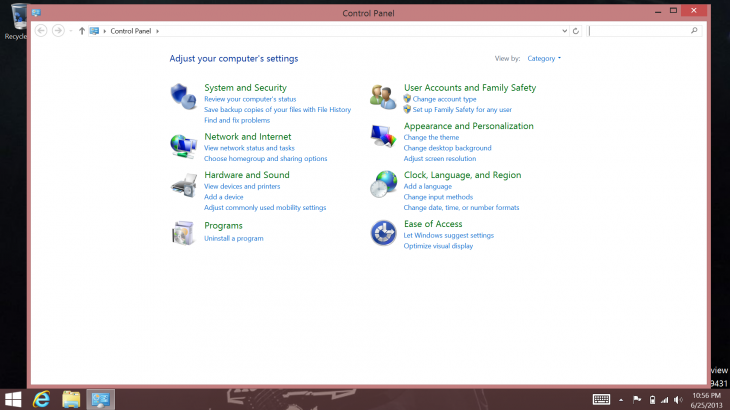
I managed to draw up that screen several times before I found the new, Metro-ified Settings interface buried in my all-application window. Pick one, please. This sort of painfully overwrought bifurcation was the principle issue that plagued Windows 8. 8.1 better unifies the new and old, but is far from chasm-closing.
All told, Windows 8.1 is a worthy and welcome upgrade, and one that stands up to testing. However, it isn’t perfect, and doesn’t correct all the flaws of its ancestor.
Top Image Credit: Mario Tama/Getty Images
Get the TNW newsletter
Get the most important tech news in your inbox each week.


