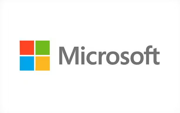
Microsoft might be overhauling its Windows and Windows Phone operating systems this year but that’s not all, because for the first time in 25 years, it has launched a brand new corporate logo, which looks to display a much more modern image for the company moving forward.

In an interview with the Seattle Times, Microsoft’s general manager of brand strategy says that the new logo is intended to “signal the heritage but also signal the future — a newness and freshness,” and utilises the Segoe font, a typeface that has been used in Microsoft’s software and branding for a number of years.
It’s also the first time that Microsoft has included a symbol in its logo, expressing “the company’s diverse portfolio of products.”
The Seattle Times says that the new logo will begin its rollout today, appearing on Microsoft.com and the company’s Twitter and Facebook accounts.
It will also make an appearance in new TV adverts released by the company in the next few weeks and will likely be plastered all over Microsoft’s upcoming products and services coming later this year.
Get the TNW newsletter
Get the most important tech news in your inbox each week.