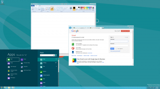
Alright, let’s do this just once: here’s how to get a semblance of a Start Menu back in Windows 8, if you are someone who prefers to look backwards from a UI perspective:
- Fire up your Windows 8 device.
- Head to this link.
- Drop in your email address.
- Hit go, initiate download.
- Install, which will take just a moment, and boom, you are all set.
And yes, I know that those directions are more than a touch pedantic. My coffee is wearing off, and along with it my good mood. Here’s what the start menu looks like in use:

Now, why should you use this? You shouldn’t. What Stardock, a company that I have a great deal of affection for, has put together is essentially a rehash of the Charms Bar and the new Start Screen, just shmushed and moved to a different part of the screen. That this effort lacks is interesting, as it underscores something that I hadn’t known: I very much like the new Windows 8 UI.
I went into this post, testing the app, expecting to love it. I installed it, and when I found out that it was simply the Windows 8 UI, ‘chopped and screwed,’ to fit an old paradigm I sighed a bit. I think that we are all going to have to realize that Microsoft is taking us down a new user interface and user experience road, and that we have little choice in the matter.
Happily, the Metro UI and Windows 8 design changes have been generally liked. This is something good, as billions of people are going to use them. Imagine if they were painfully bad. RIP Start Menu, I almost miss you.
Get the TNW newsletter
Get the most important tech news in your inbox each week.


