Windows Live has been in the process of rolling out a number of updates over the past several days, one of which was a revamped sign-in page that dramatically altered the previous design.
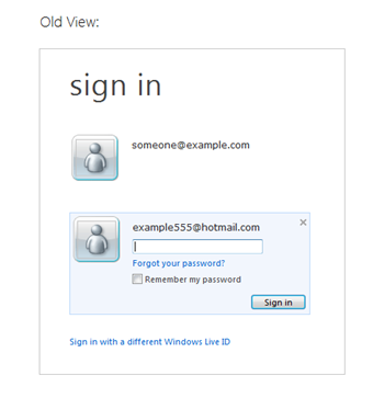
In the old view, accounts were listed in vertical rows, and each had the options to have its username and password saved. This was convenient for a family computer, or any PC that had several different people using it throughout the day. It looked like this:

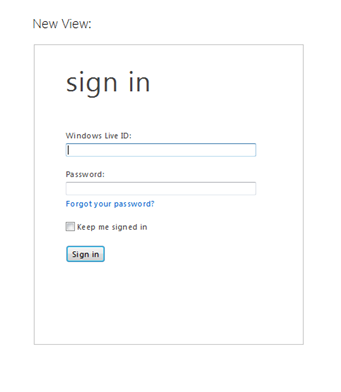
But Microsoft decided to do away with that design, and has now implemented a much simpler layout that has some users boiling over. Instead of making it easy for several accounts to be listed and logged into, Microsoft moved to showing simply one account, and a single check box to “Keep me signed in.”
As you can obviously tell, the idea was to make the page less cluttered, and to focus on allowing a single person to log in as quickly as possible. This is what the new layout looks like:

Before we hop into what certain discontented users are saying, we are going to share with you Microsoft’s perspective on the change; its reasons for executing it, if you will. The company claims that the old design had the following problems, which prompted the new version:
- Customer confusion: We got consistent reports from customers who were confused by the design. Not understanding which checkbox did what and as a result accidentally leaving account tiles at an internet cafe or a friend’s house were common complaints. Depending on your settings, sometimes you were signed in but still had to click the tile, sign-out didn’t always work as expected, sometimes you had to enter a password and sometimes not – it seemed random and confusing. To make matters worse, tiles only worked on Internet Explorer; other browsers always had the simpler experience.
- Changing trends in device ownership: As more people bought laptops and smartphones (which tend to be used by just one person), we heard more feedback that the tiles just got in the way, and what people really wanted to do was to just get to the service without interruption. We knew from our telemetry that fewer than 2% of users were using the tiles, but 100% of our users were interrupted by them in the old design.
- Consolidation on a primary account: Increasingly, customers are consolidating their Windows Live usage into one primary account. It used to be common for one person to have multiple accounts. As we’ve integrated Windows Live ID across other products like Xbox, Windows Phone, SkyDrive, and Office –the core account has become more valuable, and it’s become less necessary to switch between accounts.
If only 2% of users in fact needed the multiple account system, surely their unhappiness must be mostly mute, right? No. In the comments below the blog post that outlined the change, there were a great many annoyed users. We are not going to list the individuals names to respect their privacy.
I don’t understand how the old functionality could be so confusing that they had to remove it completely. Now I have to type in my email address every time unless I want to stay signed in which I do not want to do. This is a very weak explanation for suddenly removing functionality that is used by a lot of users I know. I don’t buy that only 2% used this.
At least there should be the choice to keep the login-assistant for the people who really use this feature (also in a safe way).
[A]re you kidding? so the few “idiots” that cant work out what “remember my password” means get priority over the rest of us? this change is a JOKE. a terrible terrible TERRIBLE change.
I cannot understand why you replaced something very easy and user-friendly with something that is so complicated.
I am afraid that this change will be the end of Windows Live and Hotmail all together for me because MS just imposed the change on me without even thinking about the consequences for my daily workflow.
I’m so unbelievably disappointed in this action. I do understand each word and decision in your blog, but despite that, I’m really pissed off.
There seems to be a simple solution to all of this, as was noted in one of the above comments: Add in an option to allow users who wish it to turn back on the old log in system. If and when the company does so, we’ll bring you the news.
Still, they didn’t see this coming?
Get the TNW newsletter
Get the most important tech news in your inbox each week.


