 The first batch of Windows Phone 7 developer devices are being made available to application developers and some industry heavyweights to review. The reviews are mixed, there’s a lot of scepticism given Microsoft’s not so good track record.
Everyone seems to like what they see and given the build on these devices is Technical Preview, there is lot of room to fix the bugs till October which is when the handsets are expected to be in market.
Here’s a round up of the (lengthy) reviews across the web:
On one side, we’re still really excited by the prospect of Metro as a viable, clean-slate approach to the mobile user experience, and there are lots of smart moves being made that could lead to greatness.
For as much crap as Internet Explorer gets (less, admittedly, now that the debacle of IE6 is finally starting to fade), we’ve got to say that web browsing on Windows Phone 7 is actually a really pleasant experience.
The email app on the phone is pretty terrific on the whole, providing a clean, clear layout and upfront options for your most-used functions.
Microsoft has done a neat job translating Bing’s well-known home page layout to the small screen, complete with gorgeous rotating imagery and hotspots that reveal factoids when you tap them.
Tight Office integration, complete with an awesome on-phone document and viewing experience, stands to be one of the biggest differentiators for Windows Phone 7 — a feature that could almost singlehandedly make these devices impossible to ignore for serious business users regardless of their seemingly consumer-centric slant.
![wp7-preview-6-sm-1[3] wp7-preview-6-sm-1[3]](https://cdn0.tnwcdn.com/files/2010/07/wp7preview6sm13.jpg)
Gartenberg on Windows Phone 7:
Microsoft’s done a very good job with a revamped user experience that’s not like anything on the market. Taking a lot of UI cues from Zune HD, the OS is heavy on the visual, using fonts, color and an interesting use of space to make for a solid experience that’s both easy to learn and pleasing to look at.
Summing up, Microsoft’s doing the right things here with Windows Phone 7. It’s visibly differentiated from the competition […]
The software looks pretty good, for the most part: Thanks to the mandatory minimum 1GHz processor, it certainly looks speedy, with a whole lot of flashy “folding” animations that are essentially an extension of the Zune HD (a good thing). There’s a nice level of consistency throughout the apps demonstrated, with the same text and same side-scrolling user interface. That kind of attractive consistency is something iPhone (and Palm WebOS) customers are well accustomed to, but something still a bit out of reach of Android.
Everyone seems to love the keyboard, rating it nearly as good as the iPhone’s and significantly better than Android’s or BlackBerry’s.
The first iPhone was incredibly limited–you could argue that it wasn’t even a smartphone, as it had no apps. Android was slow and ugly as molasses when the T-Mobile G1 launched. So Windows Phone 7 might, like most mobile OSes, need a year or so to mature.
Wired’s short take:
Redesigned from the ground up. Apple and Android were thrashing Microsoft in the mobile OS sector so it was decided that previous versions of Win-Mo would be scrapped and a new OS would be built from scratch. The result is an OS that’s graphically focused, easier to navigate, and lets you easily aggregate contact info from multiple sources (Facebook, Windows Live).
Paul Thurrott is the one who has spent more time on the platform than the rest. He’s writing a book on this after all.
The Windows Phone user interface, Metro, is a revelation. Almost laughably simple, it gets out of the way so that your phone’s content can take center stage.
It doesn’t take long to realize two things about Windows Phone. First, Microsoft gets it. In a world of me-too smart phone solutions that all take the same route down application silo hell, Microsoft has rethought how important these devices are to our everyday lives and has come up with something that’s not just different, but better. Second, you can never go back.
While much has been made of Microsoft’s reliance on an older IE version for Windows Phone, it works well with real-world sites, in my experience.
Put simply, the big picture stuff is rock solid, and undeniably exciting. The panoramic hubs and digital media experiences, in particular, are wonderful and put Windows Phone over the top, in my opinion. Consumers are going to see this stuff and fall in love.
That said, Windows Phone is also missing a number of features, mostly small things, but features that critics will quickly glom onto and seize as their rationale for this platform never taking off.
![wp7_proto_10[4] wp7_proto_10[4]](https://cdn0.tnwcdn.com/files/2010/07/wp7_proto_104.jpg)
CNet:
Overall, Windows Phone 7 provides a more pleasant navigation experience than previous iterations of Windows Mobile, mostly from an aesthetic standpoint but in other aspects too.
The e-mail app is strikingly simple in appearance, though that isn’t a reflection of the app’s capabilities. Messages are filtered by all, unread, flagged, or urgent, and also features a robust search function that can find keywords within the text of the message or within the e-mail fields. It’s also a treat that you can simply tap to the left of a message(s) and press the small trash icon at the bottom to delete it. Sometimes, it’s just the little things that impress you.
Unlike the iPhone, Google Android, and Palm webOS, WP7 is not focused on the application experience, but is centered on helping you interact with the people you want to and complete the tasks you need to complete with apps mainly working in the background or having other technologies (like Bing Search) do better at meeting your needs without more apps. The current experience is amazingly stable and fluid and I am quite impressed with what they have done.
![WindowsPhone7-12[3] WindowsPhone7-12[3]](https://cdn0.tnwcdn.com/files/2010/07/WindowsPhone7123.jpg)
Boy Genius Report seems to hate pretty much everything about the phone, the entire write-up seemed prejudiced. Here are some excerpts:
The thing is, sometimes when using Windows Phone, things are so minimalistic, that it actually feels a bit too lonely and open. Don’t get us wrong, it’s nice to feel like you’re not constrained to a certain window or foreground app, but at the same time, we can’t help but feel that there could have been so much more done.
Microsoft’s browser is fine, but it’s far from pleasurable to use. It’s not the most elegant browser […]
We have been playing around with WP7 for enough time, and the OS is well-enough along that we have got a great feel for it, regardless of any minor improvements before the first handset launches. Microsoft has no doubt broken course and gone in an entirely new direction, something that many people wish RIM would do, and we applaud them for that. They have created a brand new mobile operating system packed full of clean, modern, and sometimes even beautiful design elements.
Update
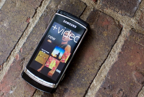
Gizmodo published their first impressions, long story short, the love it.
It’s a fresh start, and it’s neat. It’s a clean slate that Microsoft can use as a foundation to build something entirely new, and it’s not like any other phone you’ve used.
It doesn’t try to feel like anything but a flat, digital interface. There is no attempt to depict three dimensionality or any kind of real-world mimesis. No gradients, shadows, gloss or shading. Everything is crisp and flat.
The touch keyboard looks stark, almost advertising that it’s a crappy experience. […] It’s deceptive, since in terms of typability, it’s second to the iPhone. It’s a wonderful keyboard: fast, smooth, intuitive and totally natural, even this phone’s narrowish screen.
Internet Explorer is surprisingly competent, and quick, given that it’s built mostly off of the desktop version of IE7.
Office on a phone is terribly exciting, if you wear a tie five days week. It’s also terribly basic, but slick, more focused on viewing and collaboration.
Get the TNW newsletter
Get the most important tech news in your inbox each week.

