Back in July, Instapaper creator Marco Arment started thinking about what to do with The Feature. It was a section of the app in which he placed a curated selection of stories worth sharing, but it wasn’t getting the exposure that it could.
“So I started thinking ‘what if The Feature was Instapaper,” says Arment, “what if it was a special app that could only ask for those articles?”
So Arment decided to talk to the Apple folks at its Worldwide Developers Conference about whether The Feature would make a good fit for Newsstand, a combination showroom and marketplace for magazines installed by default on all iPhones and iPads since iOS 5’s release in 2011. The general consensus, says Arment, was that the situation was too sticky, because it still involved other people’s content being offered inside what would be a subscription app. “At that point,” says Arment, “I said why don’t I just do it with my own content?”
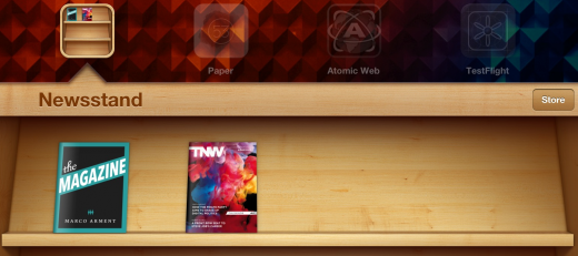
And that was the genesis of The Magazine. A periodical publication for Apple’s Newsstand that featured content curated and edited by Arment and solicited explicitly for each issue. It would be a collection of four articles, twice a month, from authors familiar to its target audience. All presented cleanly in a crisp, lightweight package designed by Arment and hot young design studio Pacific Helm.
As far as the name, Arment says that it came about — much like Instapaper — as an accident. “I just started sending emails talking about the project with people and referred to it as ‘the magazine’.” When it came time to actually name it, he said that just capitalizing it felt right.
The Magazine is, at its heart, a publication that is about the things that people who love tech are interested in, says Arment, but not necessarily about tech itself.
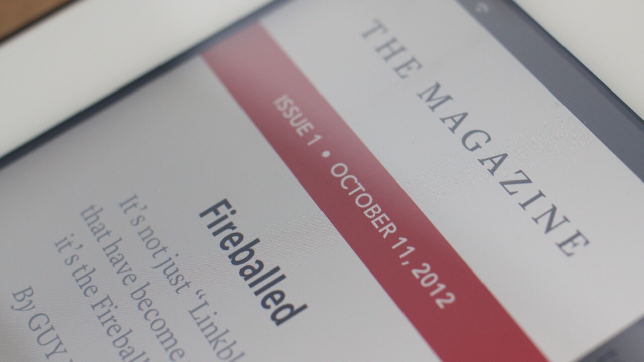
And that freedom to flex outside of the bounds of tech is evident in the first issue, which features articles from IDG’s editorial director Jason Snell, ex-CTO of Simple Alex Payne, iOS and Mac developer Guy English and Michael Lopp, who pens the popular blog Rands in Repose. Disclosure: I’ve talked to Arment about the possibility of contributing to the magazine in the future, but have not done so at this time.
None of the four stories in the first issue are directly about technology, though the skeins are woven throughout. Mostly, they’re about people, but the topics touched on include linked list publishing, the deceptive division between geeks and jocks, the raveling and unraveling of a life and the dark matter at the heart of a successful product evolution. You know, just the small stuff.
And that, I think, is where the success of The Magazine could lie. The focus on the ‘macro’ vs. the ‘micro’, on articles of lasting value and subject matter, rather than the fleeting ephemera of the tech carousel. I write between 5 and 9 articles a day on average, and many of them have a half-life of a few hours unless someone goes searching for a very specific topic at some point in the future. That’s the nature of the beast when it comes to covering the rapidly moving world of tech, but a periodical needs to operate differently, to work outside of that narrow envelope, if it’s going to work.
So far, at least judging by the initial set of articles, Arment is picking his content well. I could imagine reading any of these pieces months or years from now and being just as happy I did.
The Design
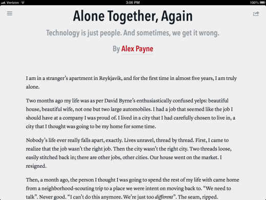
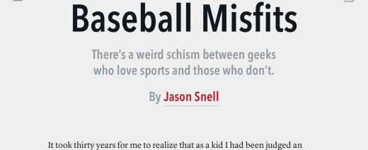
The content of the The Magazine is presented in restrained fashion as a singe reader-friendly HTML template with Lyon Text as the body font and headlines and other sans-serifs are from the Avenir family, which is new to iOS 6. The design is bold and extremely minimal, which Arment says was very difficult to do for a magazine in Newsstand.
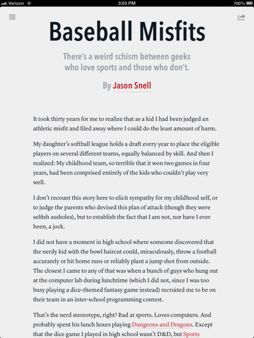
There are normally a lot of logistics involved in presenting Newsstand publications, including a table of content page, a bevy of controls to do with margins and removing older issues. Working closely with Pacific Helm, including ex-Apple designer Louie Mantia, Arment says that he was able to strip out all of the extraneous bits to leave behind a pure reading experience.
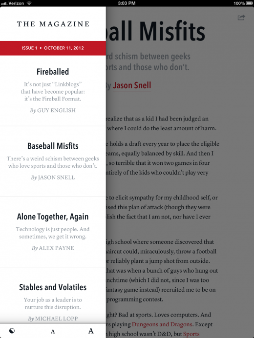
The level of thought that went into the design is impressive. The entire interface can be navigated with a simple left or right swipe and vertical scrolling. There are no pages to flip or interface widgets to play with besides a single slide-out pane that comes in from the left side of the screen. This makes navigating The Magazine uncomplicated and simple. There are no distractions, there are no additional elements, it’s the app equivalent of bold calligraphy on a white page. When the app is so simple, mistakes and errors jump out at you, and there is very little to complain about here.
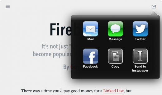
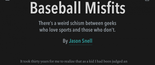
The main view of the iPad version has two small buttons, one indicating the navigation pane for those that wish to tap instead of swipe, and one that allows for sharing out to services, including Instapaper. Even logging out of Instapaper is done via the modified pane (it’s black, instead of the normal dark blue, so that it blends with the color scheme of the app).
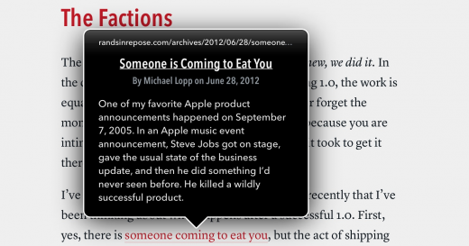
Links are presented in similarly customized popups, which removes the tapdoubt from them, giving you a small preview that Arment can customize easily using his web-based CMS, rather than dropping you out of the app immediately. The same goes for the popup footnotes, like those in Instapaper.
Arment says that he was able to play with the design and formatting of the text sections more than Instapaper because that app always has to present things neutrally, as there is no telling what kind of content people will be reading.
The lack of a settings pane in the app was also a very conscious decision, and there are only three small settings buttons for dark mode and font sizing tucked away at the bottom of the navigation pane. That pane will fill up with issues as you download them, and they can be deleted with a traditional iOS swipe to the right on each issue’s date bar.
I found the design to be extremely pleasant and serene in its simplicity. It’s everything that many magazines using the Adobe or Conde Nast-style publishing packages are not. Light instead of heavy, uncomplicated instead of full of every conceivable option. It presents the content beautifully and removes the weight of thought process from the navigation.
It’s a template for the future of lightweight Newsstand publications.
The Future of Newsstand Publications
The Magazine will be published every 2 weeks at a subscription rate of $1.99 per month, with 4 ‘medium-length’ articles in each issue. Initially, there is a fixed fee for authors publishing an article, but that fee will grow as the subscriber base does. Since he is working alone on the collection and curation of the issue, the overhead is initially very low. Arment says that he’s planned to shutter The Magazine if it hasn’t turned a profit within the first two months.
“I stayed away from mentioning ads at all [in the foreword],” Arment says, “because I really think this is sustainable, but didn’t want to rule out the possibility in the future.” For now, though, the sole way that The Magazine will bring in income is the subscription fee.
And the very low rate, just $2 a month, is one that Arment hopes is a lower barrier of entry for those looking for a different kind of periodical. “When Newsstand was launched,” he says ” there was this huge rush of publications to support it. A lot of that was that because there was this new category in the App Store, and it was heavily promoted. But part of that was also that there was this new folder on the phone that you can’t delete, and you can’t put into another folder and this folder is on every iOS device for the last two [versions of the OS].”
And that placement of Newsstand where it can’t be removed or hidden away is no accident. The virtual storefront property that it offers was an enticement for publishers to get products out there that people would want to stock their shelves with. And Apple wanted them to know it.
“I feel that I’m doing what Apple wants me to do,” says Arment of publishing in Newsstand, “and because of that they’re going to be supporting and promoting it and creating new APIs for it.” This is a sound strategy and one that many savvy iOS and Mac developers have been doing for years. When Apple introduces a new feature, one that they prominently advertise and tout on stage, it’s only tactically sound to support it. Look at the recent featured section for Passbook apps and you’ll see the effect that has on app downloads for those developers supporting the feature.
Newsstand apps are also their own kind of royalty when you compare them to regular apps. “They have background downloads, which is extremely valuable,” says Arment. “Background downloading would help so many apps, but it’s only available to Newsstand apps.” That, coupled with the lowered friction of individual issue purchase through subscriptions, and you can see why publishers are attracted to Newsstand.
But major publishers have had mixed success with Newsstand so far. Some have reported great sales, but slim profits or poor recurring readership. Some of this likely has to do with these publishers applying an outdated print model to their digital publishing efforts. Enormous packages of magazines downloaded every month, with heavy, static layouts and huge staffs to support.
Arment is headed in the opposite direction, charging just $2 a month for a solo publishing effort. “Looking at Newsstand, that’s cheap, so it’s at the low end,” says Arment, “but, over a year, that’s $24 bucks. But the perception is that it’s a very low cost app. People have no problem risking $4 bucks on a drink at a restaurant and then not liking it. ‘Oh well, $4 bucks’. Those same people will scream bloody murder if they pay for an app in the App Store and they don’t like it.”
“A $5 app is expensive, so you’re stuck within this pricing model, and you have to figure out how to make it work,” Arment says. Subscriptions are a way to do that, keeping the individual costs low, but building a larger array of customers. And doing it with a lightweight staff and low costs, so you’re not trying to support the massive budget of a publishing empire through a Newsstand offering.
It seems that there is a massive amount of untapped potential in Newsstand. The advantages of it are many, both for developers and consumers, it just hasn’t quite been cracked yet. The pricing umbrella alone has left a lot of room for smaller, more nimble publishers to capitalize on it and I’d expect to see a lot more of these kinds of publications popping up as time goes on. For now, Arment is
The Magazine is out now in the Newsstand section of the App Store, and there is a 7-day free trial for the first issue, so there’s no cost to check it out, and I suggest you do. There’s nothing exactly like it out there right now, though I bet there will be soon.
A new wave of lightweight magazines with meticulous design, great content and sustainable models for small teams of publishers? Sign me up.
Get the TNW newsletter
Get the most important tech news in your inbox each week.

