The world’s largest Arabic speaking news channel and 3rd largest international news network has launched their entirely new and overhauled English website and we thought we’d give you our opinion on it.
The renovated portal comes with some major improvements the most important would be:
- Simpler design with focus on major news topics and the types of media they’re presented in
- Bigger more readable text
- Improved branding, colors and more whitespace
- Better Navigational structure that push three new sections InDepth, Video, and Blogs
- Better Sharing capabilities and Social networking integration
- Brilliant navigational multipurpose footer
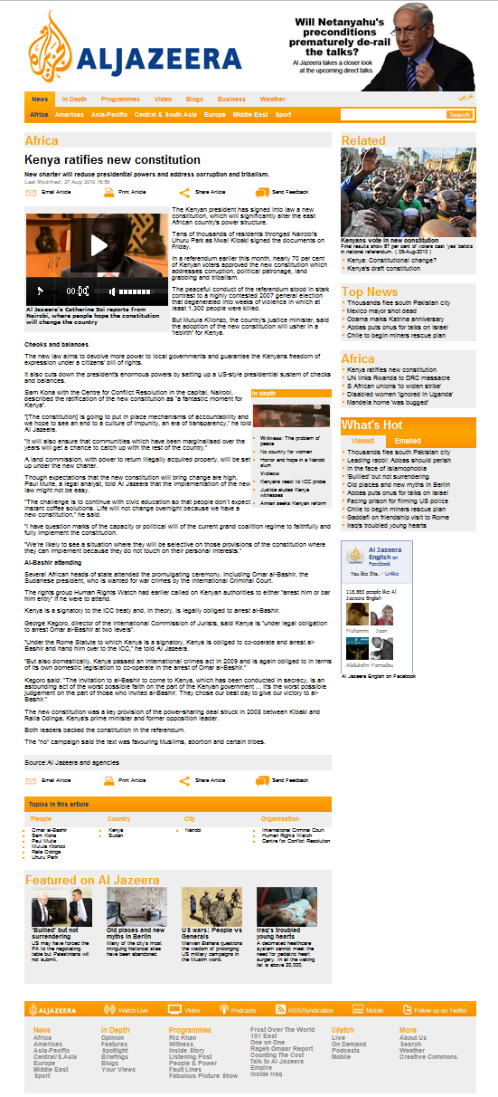
We thought we’d let you judge for yourself and put together some before and after shots to compare the improvement:
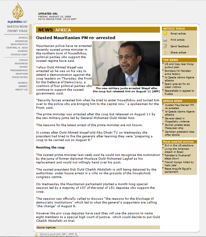
Its English speaking website hasn’t received as much attention as it’s Arabic counterpart which got 3 redesigns during the past 4 years while AlJazeera English basically been the same since 2006, of course minor improvements were applied but none worth mentioning.
Although not exactly an epic work of art, the design comes as a needed first iteration for their English portal, which in my opinion is far more usable and accessible than their previous portal and their current Arabic interface. Opportunity to improve is quite large with not all of the homepage optimally utilized, such as the section immediately below the main story images.
I personally favor the almost minimalist design they went with, but it appears they launched a day too early because of some design inconsistencies that exist in the design, a portal like AlJazeera should definitely avoid.
All in all it’s a good start for better portals to come, which we hope other regional news agencies will follow in the footsteps of.


honestly speaking i found the old website much better and much more professional looking
Everyone’s entitled to an opinion, you never know they might just change it back if enough people share yours.
Is the link http://english.aljazeera.net/ ??? From what I can see, its gone down.
Ah. Its just come back up.
The front page is an improvement – the previous version looked poky and was difficult to read. But what are they doing with the articles? The measure is painful to read in that 13px arial – which may have been appropriate in the last, narrower layout, but definitely isn’t in this spacious update.
It would look significantly better at 16px and a 150% line-height. Someone tell them.
We’ll definitely see to them getting word of your suggestion.
Hm hm to be honest, I liked the old page much more, because (attention, just my impression):
- the old colours were much more decent, pleasant to look at, and respectable
- the new page has by far too many bold fonts – this a) wastes a lot of space and b) looks like the kind of newspapers which have to attract using big bold fonts and red boxes
- the image in the upper right consumes even more space and shifts the content down
- I have a high resolution screen, und had a fair instant overview before. Now I have to scroll twice as much as before.
First I thought that something bad happened and the orange bold-font version was just a quick emergency layout.
Sorry that I don’t share your excitement.
old one better dude
new website looks trashy and cheap. This is not the first time the channel has been accused of getting too main stream and commercial with more dumbed down reports.
The site is really bad. I can’t open multiple tabs anymore … I won’t be going to this site anymore …. sigh ….
I think your going a bit overboard pal, although it’s expected not everyone will like the new design, I don’t think it’ll affect the quality of content. Moreover it has nothing to do with multiple tab functionality, you might want to check your browser settings for that. Thanks for the feedback anyway.
The old one looks much more elegant and professional. Honestly, I feel like the new website looks a bit… cheap. It also has a less clean feel to it, and feels much more clunky, and flashy, like it’s trying to get my attention. The color scheme is also a bit unfortunate. Overall, the new website isn’t horrible, but I definitely don’t like it.