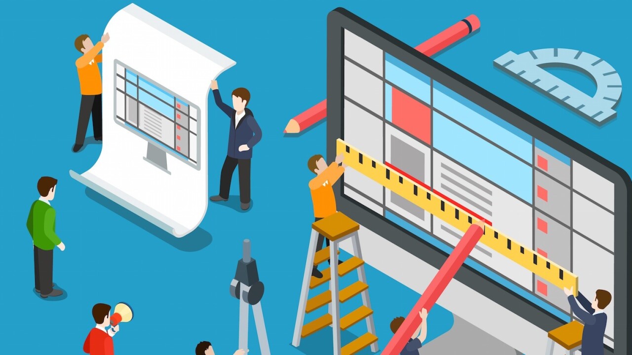
To answer the headline above, we had an interview with our senior designer Jeff Andries, who has contributed to various TNW projects, and chief designer Alexander Griffioen, who manages and supervises all design projects at TNW.
Tell us a bit about yourself
Jeff: I’m Jeff Andries, senior designer for The Next Web. I’m a multidisciplinary designer with a focus on UX & UI design. Here at TNW, I work together with five awesome designers, specifically graphic designers, illustrators and Web designers.
I’ve been working for TNW for the past 6 months on various projects.
Before diving into what you do at TNW, could you tell us how you first got into the world of design, specifically UX design?
Jeff: I clearly remember the moment when my father wanted to teach me how to program a game called Lingo. I was 12 years-old and already a computer addict. While I was amazed by my father’s coding skills, I was more interested in changing the colors and shapes of this game. That must’ve been the moment I fell in love with this work.
In the years that followed I learned how to code websites by studying HTML and playing around in image editors.
Fast forward to 2008 I had my first job with the title of UX designer at a tech agency in Amsterdam.
Twelve years old? That was so young! Did you feel like you had to sacrifice a lot for the sake of designing?
Jeff: Yes, in fact I didn’t spend much time with friends between age 12 and 16. I was too busy making websites. This was the time just before the dot-com bubble. Everything was possible.
Way before Facebook existed, for fun I made a website with personal timelines and chatting functionality. Even though I couldn’t code, I managed to connect all sorts of scripts together and make it work somehow.
This thrill of breathing life into a design is one of the most satisfying things in the world. But I lacked the age and entrepreneurial spirit to actually turn it into a successful business.
Did you ever regret you didn’t monetize the idea?
Jeff: Well, considering Mark Zuckerberg is one of the richest guys around, yes I do. But actually I don’t care much about the money, I care about creating cool products.

How does our company do UX design?
Jeff: At TNW we have a pragmatic approach towards UX design. We use the tools and techniques that fit the project. I love this approach because it saves time and makes the design process much more creative and iterative.
Rather than having different specialists work on their own part of the product, each team member, from designers to developers to marketeers, have their share in creating the end product. It’s a collaborative process.
In UX design, some decisions may come from data and measurements. However, a big part of UX design is about making the right assumptions. It’s about putting yourself in the role of a user. This requires research but also gut-feeling and a good sense of empathy.
So we have talked about your background and our UX processes here at TNW. Can you tell us something about our current UX projects?
Jeff: Our website is going to get a design upgrade very soon. My colleague Alexander Griffioen has been working on this project.
One of the main goals is to reduce the loading time of the site. According to a recent study, every one second extra loading time causes satisfaction to drop by 16 percent. That’s a shocking number and an easy way to improve user experience.
We also reviewed the design of our homepage and articles. Right now we have what we call shelves, showing articles on a horizontal row per topic. In the new design, content is grouped more efficiently, making it easier to browse articles.
Speaking about upgrades, how do you keep tabs on user satisfaction? Do we have some sort of process where we receive user feedback?
Alex: We have Matt Navarra who keeps tabs on Twitter. Whenever a user complains about something, I’ll usually hear about it pretty soon. Last year, we allowed readers to “test-drive” our new design at beta.thenextweb.com and send their feedback to beta@thenextweb.com.
We opened this feedback on the redesign back in April 2015. We also still get emails there every week.
How satisfied do you think our users are with our current UX design?
Alex: No idea, haha. You usually only hear complainers, but with 9 million page views and just a handful of (mostly Canvas and Push Notification related) complaints per month, I’d say we’re doing pretty well. And I’m sure we’ll even do better after the update.
When talking about UX design, one can’t simply forget about UI design. Could you please tell us the difference between UI and UX design?
Jeff: UI design is about the composition of an interface. It deals with visual hierarchy, typography, color and to some extent also brand expression. It deals with aesthetics and ergonomy.
UX design is more analytical. For a large part, it’s about understanding the user, their behaviour and how they relate to your product. It’s also about simplicity and noise reduction.
Since you have been in the design world for about 20 years now, how fast do you think UX design changes? Are you always having to keep learning new stuff?
Jeff: There are some universal concepts in human perception and behaviour that don’t change. However, the work of a UX designer does constantly change in terms of our toolset and the devices we design for.
Mobile usage has skyrocketed in the past few years. Responsive design brought a whole different angle to designing websites and applications. Also, recently there has been a surge in UX design tools, for example Adobe XD or Atomic.io.
It’s impossible to learn them all so I tend to stick with good old Photoshop. This year however I do want to make a transition. Probably Adobe’s XD.
What advice would you give to aspiring UX designers?
Jeff: Practice, practice, practice. Just make stuff for the fun of it, for yourself, for friends or imaginary companies.. Keep your eyes open to experience the world around you at its fullest. Always look for inspiration, through books, movies, music or simple things.
Try to see music, smell colors, taste scent. Try to understand the human mind and how it can be tricked, persuaded, guided, etc. Use the internet to learn, its resources are unlimited.
Be curious and never compromise (at least not in your mind).
Any suggestions for books or online tools?
Jeff: The Design of Everyday Things is a must read for any designer. This is a book by Don Norman (UX architect in the early days of Apple Inc.) about product design. Don’t Make Me Think is also a classic. You won’t find much theory in this book but its no-nonsense approach is funny and informative.
Is there anything else you’d like to share that we haven’t covered before?
Jeff: We are always looking for new design talent. Interested? Leave us a message with your portfolio.
Interested in learning more about UX design?
Just as Jeff said, there has been a surge in mobile usage – which in itself has changed many aspects of UX design.
With UI & UX Design Bootcamp on TNW Deals, you will get to learn the complete guide of mobile user experience, how to build habit-forming products, effectively manage your UX projects and many more for only $39.
Get the TNW newsletter
Get the most important tech news in your inbox each week.


