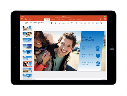
Giving a presentation? Not sure where to get started? The first step is to break the rules that you’ve always been told.
Human attention spans are shorter than ever: some studies say that people are tougher to engage than goldfish. Bad puns aside, you need something to hook your audiences and reel them into the valuable message that you have to share. Delight your audiences with the unexpected with these five tips.
Rule to break: You need a cohesive theme
What to do instead: Give your audience a tasteful curveball
It’s common for presenters to use a standard template or theme between slides and frames. But this approach may put your audiences to sleep. Pattern recognition is important from a storytelling perspective, but it’s equally important to throw a curveball every once in a while.

“If you really want to keep your audiences engaged and awake, try throwing in a completely one-off and random picture that still tie into your message,” says Johnathan Dane, founder at marketing agency KlientBoost.
Dane put this idea to the test at a recent conference where he spoke. He found that the most engagement came from slides that looked out of place but paradoxically, served a fundamental purpose in delivering his message.
“These slides also carried an important takeaway point that was actionable and easy for our audience to implement,” says Dane.
Rule to break: Your slides need to be perfect
What to do instead: Optimize your environment
If you’re giving a presentation, you probably want your slides to be perfect. It’s important to keep in mind, however, that slides don’t exist in a vacuum. The quality of your presentation will come from your design and the context in which you’re giving your talk.
“When you’re presenting, the slides aren’t your only vehicle to getting your point across,” says Annie Pryatel, brand strategist at advertising agency Northlich. “Your environment is your canvas. Think about how your presentation can extend beyond the presentation. This could be through room décor, body language, or even sounds.”

Know what you’re getting into, before you give your talk. Customize your presentations with elements of the unexpected. Shock people. Wow people. Delight people. Most importantly, have fun.
Rule to break: Follow a proven template
What to do instead: Craft a story that shines
It’s tough for people to sit still, especially when they’re in the middle of a 9+ hour workday. If you’re creating a presentation, the last thing that you want is to leave your audience hanging with dry, boring details. Instead, craft a story.
“My #1 tip for presentation design: timing and imagery are your best tools to tell an effective visual story, to complement the story you’re telling verbally,” says Paige Paquette, marketing manager at software development firm Axiom Zen.
Use case studies to supplement your tips. Interject yourself into your narrative. Pull your audiences into your experiences, anecdotes, and perspectives.
Who needs templates when you can chart your own path forward?
Rule to break: Be blunt
What to do instead: Use subtle cues
Oftentimes, presenters rely on text, glaring images, or blunt takeaways to move ideas forward. This approach, however, will often lose people in the weeds of an idea. Instead, use more subtle cues, through interactive elements, to move ideas forward.

“I use software that lets me zoom in and out of the content I’m sharing,” says Isaac K. Oommen, marketing manager at hardware distributor McGregor Thompson. For me, this means going into the details of a graphic or photo, which helps hold my audience’s attention attention.”
The world doesn’t operate in two dimensions, so why should your presentations? Replace blunt messages with subtle cues, and empower your audiences to think for themselves.
Rule to break: Break rules
What to do instead: Use your best UX judgment
An earlier part of this blog post encouraged presenters to break rules and try new things. There is one caveat to this point: you do not want to, at any cost, sacrifice your design’s readability.
“Presentation designers will sometimes try to use wildly creative fonts or unusual colors to make their presentation stand out,” says Vladimir Gendelman, founder at software firm Company Folders. “But that often comes at the cost of readability. If the text has a lot of elegant curlicues or is in a color that blends in with the background, your audience will have a hard time following along.”

You’ll want to break some rules: just not all of them. A rule that you should never, ever break is the importance of keeping things readable.
“Any text you include, whether it’s on a PowerPoint slide or on a printed handout, should be in a simple, readable font,” says Gendelman. “Sans serif fonts such as Lucida Console tend to work best for headings. Make sure that there is enough contrast between the text and the background behind it. For digital slides, you should also ensure that the text is large enough that even people in the back of the room will be able to read it.”
When in doubt, err towards a simple UX. This overarching presentation design tip will always win. Do not underestimate its power.
Read Next: How to stay calm and smash your next public presentation
Image credit: Shutterstock
Get the TNW newsletter
Get the most important tech news in your inbox each week.
This post was brought to you by Prezi, the presentation software that uses motion, zoom, and spatial relationships to bring your ideas to life and make you a great presenter.


