Update July 31, 2015: BuzzFeed reports that this new design is “getting widely released” today. Our original report follows below.
Twitter’s tweaked new homepage finally captures the spirit of the social network for the first time.
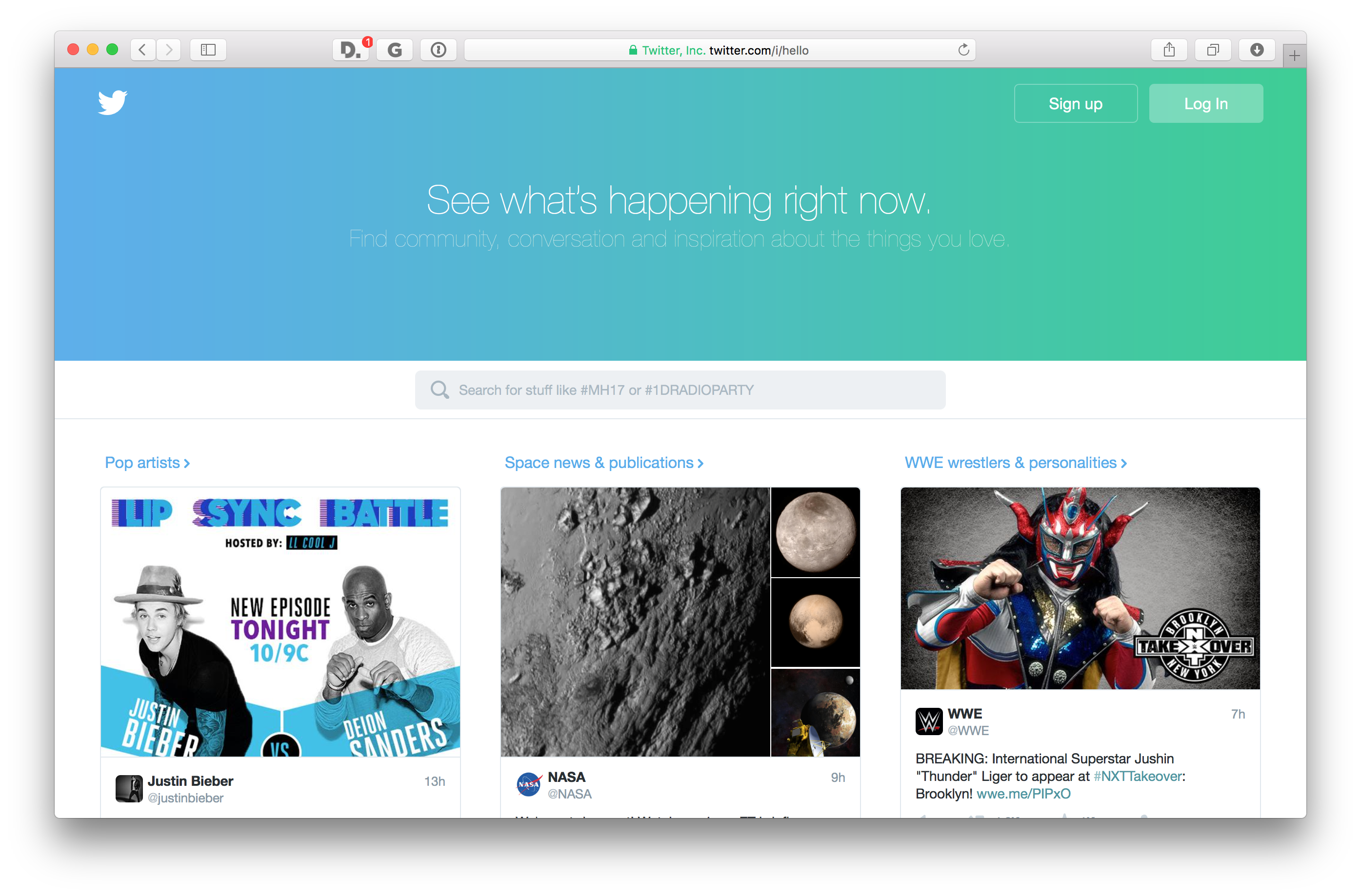
The new page features a curated collections of tweets from across the social network and appears for users that are logged out in the United States. Those outside the US can access it manually by visiting this page, though it doesn’t stick for next time you sign out.

Twitter announced a new homepage back in April that looks somewhat similar, but that version only showed categories of people on Twitter and no tweets.
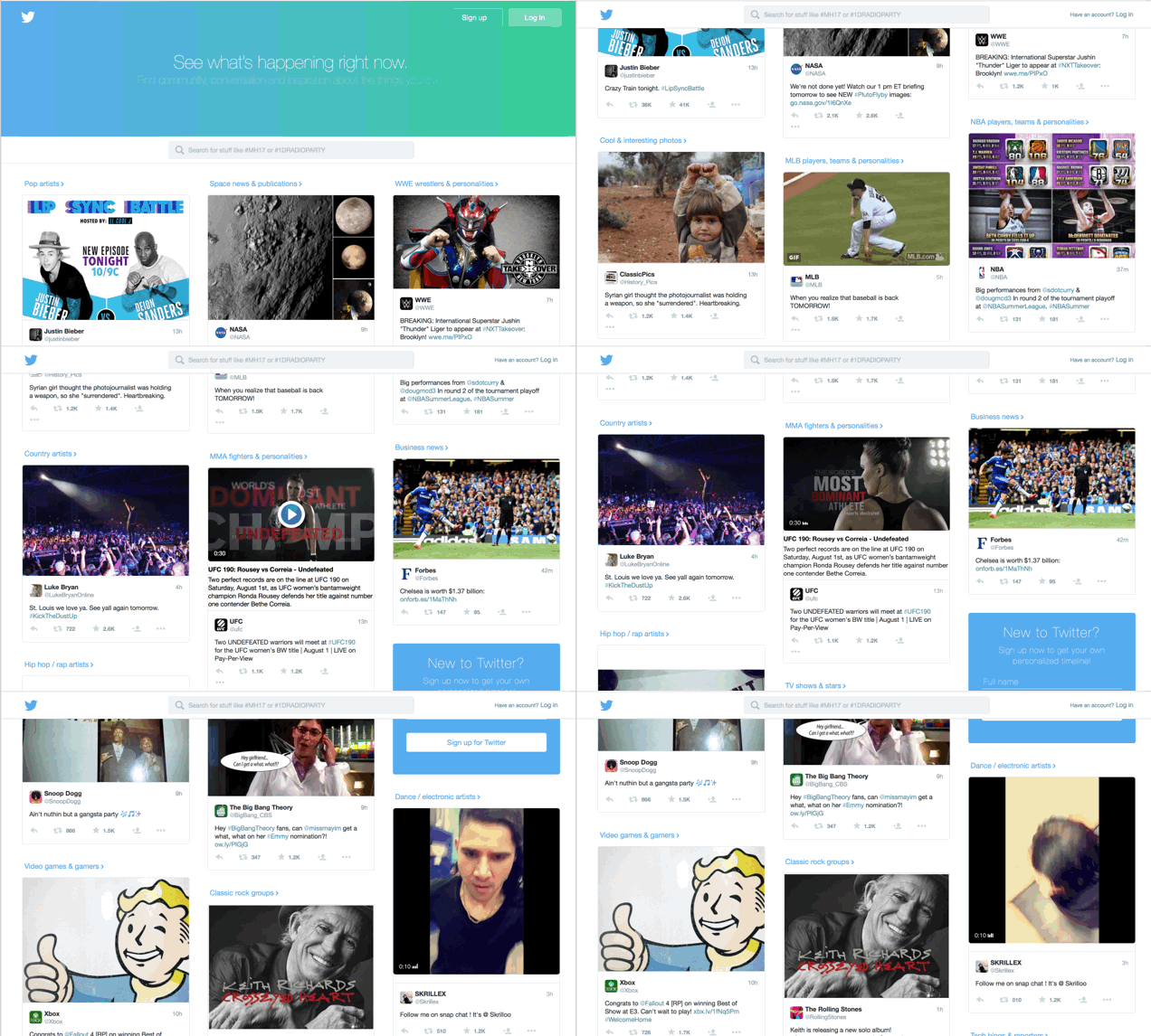
This new test is broken into categories with tweets embedded directly on the front page. Instead of those categories just being a box linking to a new page a relevant tweet is embedded directly.
All of the featured tweets include media – either a video or picture – to increase their appeal. Embedded videos and GIFS automatically play as you scroll past, which makes the page feel more alive than it did previously.

In essence, it surfaces the best of the site to help show why the service is compelling and alive in a way that the old start pages never did.
Categories are broken up into generic labels, like ‘entertainment’ and ‘sports’ which further break down into specific areas of expertise.
Sports, for example, has into 11 specific subcategories like “NFL players, teams & personalities.”

Each category contains a curated “stream” of tweets from related accounts. It’s not clear if these are automatically generated or curated by Twitter employees, though large time gaps in some streams indicate that it’s manually curated.
The older homepages never quite explained why Twitter is so valuable to its fans or surfaced its best content, they just presented visitors with a wall of things to choose from. Twitter finally gets what makes it so valuable to its users.
As Twitter pushes for better “logged out” experiences, this is a huge step toward grabbing the attention of people who still don’t understand the service and making it useful even to those who don’t have an account.
The company is also working on a way to surface tweets during events in your timeline, dubbed ‘project lightning.’ When it launches, you’ll be able to follow events on the site and have curated tweets dispersed throughout your timeline without needing to follow specific people.
When I asked Twitter for comment a spokesperson told me “We will continue to iterate on the logged out home page for users in the U.S.” but wouldn’t provide details on a global rollout.
In the meantime, you can try it for yourself here.
Read Next: Twitter’s Project Lightning will showcase human-curated trending tweets
Get the TNW newsletter
Get the most important tech news in your inbox each week.


