Des Traynor is the co-founder of Intercom, the easiest way for Web and mobile businesses to understand and communicate with their customers. This is an excerpt from the book Intercom on Product Management, available for free download.
Let’s start at the beginning. You’re a product manager? A startup founder? CEO? CTO? Whatever your job title let’s assume you’re making the decisions about your product. What features to develop, when to develop them, how to get users to start using them – that kind of thing.
As product people we all have great hopes and dreams for our products and how they are going to fare once they hit the big bad world. You’re probably filling notebooks full of ideas that will make you the next Uber, Slack or Facebook. But before you start creating a product roadmap that’s going to lead to greatness it’s time to take stock and see what’s currently going on in your product.
What are people actually doing in your product? Are all users using all the features in your product? Of course they’re not. Let’s start by talking about that.
When planning your roadmap, and where your team spend their time, it’s useful to ask “how many people are actually using each of our product’s features?”. This is product management 101 and will probably take you a few minutes of SQL, or a couple of seconds of Intercom. A simple way to visualize feature usage is to plot out all your features on two axes: how many people use a feature, and how often. You’ll most likely see trends like this:
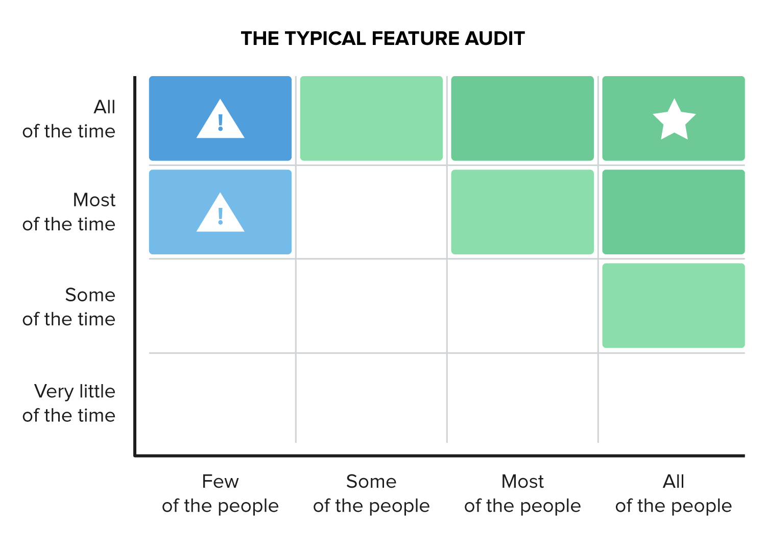
The core value of your product is in the top right area, up where the star is, because that’s what people are actually using your product for.
Sidenote: Exclude administrative features like account creation, password reset, etc. from this exercise. They’re not relevant here. Also exclude features that only certain users (e.g. enterprise customers) can access. They should be evaluated separately.
If you have features in the top left it’s a sign of features with poor adoption. In other words, there are a small amount of customers depending on this feature, but most rarely touch it.
An even simpler way to think about it is this: What percentage of your customers or users have adopted each feature? You can do this with simple bar charts. Shown here is a dream product. The one we all think we’re creating when we have Photoshop open. All my users are going to use and love all these features, right?
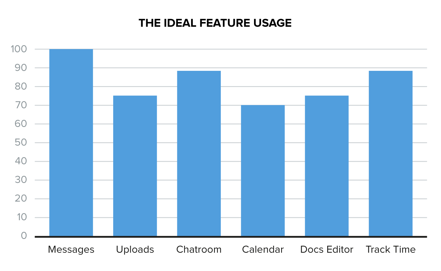
But as every product manager discovers, the messy reality of a product looks a lot more like this.

How did you get here? You built a product that had solid messaging, files and document editing features. These key features were highlighted on your marketing site, documented clearly with great screenshots, included in your product tour, and every new sign-up loved them.
But success can be a lousy teacher. You believed you could do no wrong and that you could build lots more.
So you added a chat room, but it didn’t go so well, you kinda botched the launch of it. Then you added a calendar and that went worse. No one created more than one event and it’s still not even mentioned on your marketing site. Now you’ve built this time tracking features that’s kind of popular, but only with a certain type of user.
This is your product, you need to fix this.
A sidenote on disruption

If you’re looking at this sort of feature breakdown, you have an excellent product for one precise workflow, but you’ve added all these other pieces no one. Think of Hangouts inside Google+ as an example here, or primitive document editing (i.e. BUI) inside Microsoft Word.
If you are looking at a chart like this you are vulnerable to disruption, in the true Clay Christensen sense of the phrase. Someone can build a simple product, focussing on that one key feature that’s superior in just one way (cheaper, faster, collaborative, easier to use, mobile etc.), and you’ll struggle to compete, because you’re carrying all those other junk features around too.
What do you do with your feature audit?
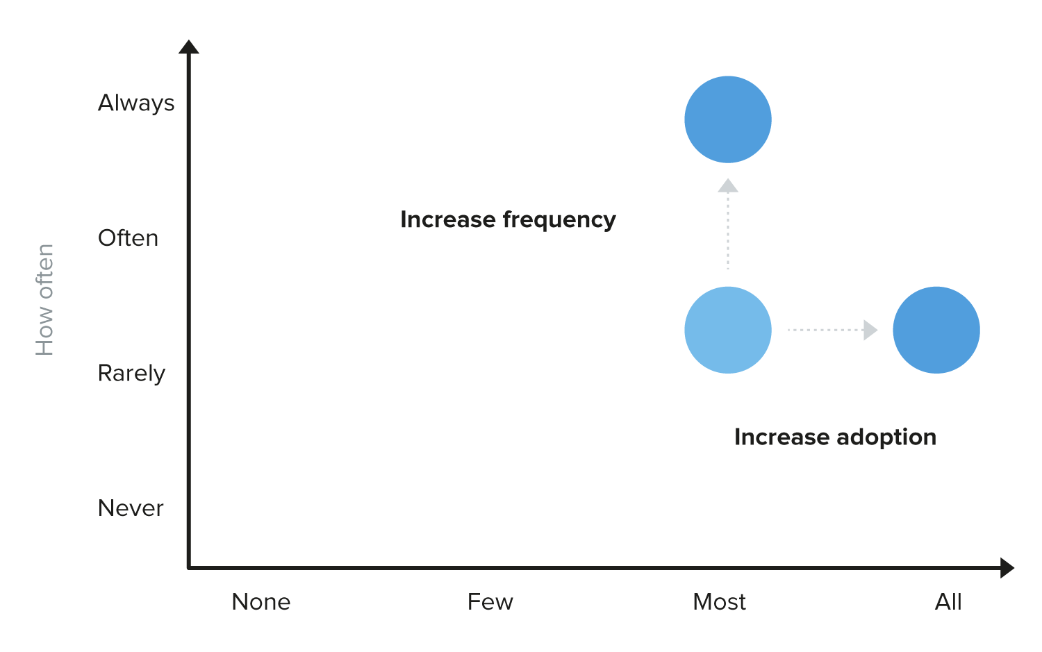
For any given feature with limited adoption, you have four choices:
- Kill it: admit defeat, and start to remove it from your product.
- Increase the adoption rate: get more people to use it.
- Increase the frequency: get people to use it more often.
- Deliberately improve it: make it quantifiably better for those who use it.
Roughly, you can visualize it like this:
By being ruthless with how you look at your product, and how others use it means you’re less likely to be caught unawares by a more nimble start-up that focuses on only one aspect of your product.
Download the free book Intercom on Product Management to learn more about how to evaluate your product, decide which new features to build, and get those new features used.
Read Next: Why economists are wrong about tech
Get the TNW newsletter
Get the most important tech news in your inbox each week.