A lot of people are aware of TED because of the global conferences that take place around the world, discussing and provoking thought and discussion on a wide range of topics. Maybe you’ve been to one.
Whether you have or not, there’s still a good chance you’ll have seen a TED Talk somewhere, maybe on Netflix and you’ve probably also checked out TED.com, home to thousands of TED Talks all under one roof.
I, like millions of other people, love TED Talks but there’s a problem with the website: it looks like it was built a long time ago, which it was, and it’s not very user-friendly.
However, tomorrow TED will lift the lid on its private beta of the new TED.com home page and video player; remade from scratch to work more seamlessly with a world that now draws as many views from mobile visitors as desktop.
Ahead of the launch, I caught up with June Cohen, Executive Producer of TED Media at TED, to get a sneak peek at the new platform.
A long time coming
The project actually began last year, and while a private beta is now just poised to open, the full relaunch won’t happen until the beginning of next year; meaning it will have been nearly two years in the making. Far more than any standard redesign.
But why now and not, say, three years ago?
“It’s more of a rebuild than a redesign, although it will be referred to both ways; when you have a redesign you have a rebrand or a new look, this is really a rebuild. The impetus behind it is entirely restructuring and rebuilding the site from the ground up.
“The timing is interesting, we launched TED.com in 2007 … and launched TED Talks about a year or so after the first video iPod came out, so TED.com was really part of that first wave in online video. So, it’s significant in some ways that our first rebuild comes with the next big sea change in online video, which is really the seamless connection of computers and other devices.”
So rather than a new lick of paint, TED wants a whole new outfit built for the future of content consumption, whatever that ends up being.

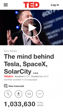
In order to support this ambition, underpinning the restructure is a mix of HTML5, JavaScript and CSS; combining to make an adaptive framework that changes the layout of the page according to the size of the display, just like this page does, in fact.
This means that whether you’re visiting TED.com from a desktop, smartphone or a tablet it’ll always reformat itself into the easiest to use and most appropriate configuration.
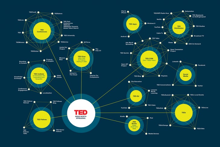
Even though providing a seamless experience across devices is one of the aims of the revamp, consideration for a rethought TED homepage goes a little deeper than simply making sure it looks nice and is easier to use on a range of devices. The organization as a whole has ballooned since its early days and now reaches people in many different ways.
When it was first launched, the TED.com homepage had to accommodate about 100 TED Talks in one language, drawn from two events per year, uploaded at a rate of about two per week. Now, TED is home to more than 1,600 Talks subtitled in more than 100 languages drawn from not only TED’s own two events, but from the thousands of other independent TEDx events that take place around the world.
“We also have tens of thousands of people around the world that consider themselves a part of the TED team, whether that’s translators, TEDx organizers and so on, so our world at TED has completely changed.
“If you think about the industry when we launched TED.com we thought about making sure that people knew how to use the video player, which is really not a problem we have anymore. We were also launching an unknown content type. No-one knew what a ‘talk’ was so a lot of our combined thinking went into contextualizing what a [TED] Talk was. Neither of those things we have to work as hard at any more.”
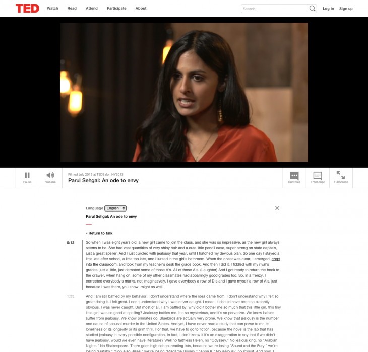
Indeed, the transcription and subtitling of TED Talks (an example of which is shown above) into more than 100 different languages now provides subtitling for the videos, all in a searchable, easy to find way, and all indexed by search engines making the content a whole lot more discoverable. Other organisations might not have pushed for 100 languages, but when you’re TED, there’s a commitment to making sure that people all over the world have access to and can benefit from the discussions taking place on your platform – particularly when your tagline is ‘ideas worth spreading’.
Part of understanding some of the considerations meant providing access as widely as possible, not just for different devices, but for users in places where broadband infrastructure is second-rate and downstream speeds are slow. The result is that the individual TED Talks now use variable bitrate streaming, meaning it’ll deliver the highest quality video that your connection speed can handle. Videos are also click-to-play now, rather than autoplaying to cut down on wasted bandwidth.
Interestingly, Cohen says while TED has perfectly capable mobile apps, feedback from users said that they wanted a far better video experience on the main site itself, and not just in native apps. The result is the responsive design on the TED.com beta and the complete absence (or need for) a separate mobile site.
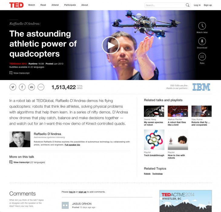
Other than the video player itself being redesigned and far more prominent on the page, it also brings new features to Playlists (first introduced about a year ago) and a docked video player mode. For example, if you start scrolling down the page to read more information, a mini version of the video player will dock at the top of the screen automatically so you can scroll down but also carry on watching.
There’s also better integration of the Watch Later feature and a choice of three different quality downloads if you want it for offline viewing – plus the option to download the subtitles too.
The future of TED.com
While the team continues to introduce new features over the course of the next phase, there will actually be an overlap between the old and new sites for about six months as users are transferred across to the new platform.
Some of these changes in the coming weeks include new ways to find content – one of the biggest issues with an ever-growing catalogue of talks to choose from. For example, the TED.com home page will include options for filtering content by ‘Latest Talks’, ‘All time favorites’, ‘Hidden Gems’ and a few other categories.
It’s the Hidden Gems option that uses a combination of human curation and algorithms to suggest overlooked but worthy TED talks, that Cohen seems most excited about, and proud of, on the home page, though.
“It’s about helping people to find the talks that are best for them. When we had just 100 talks that was less relevant, now it’s 1,600 it’s far more critical.”
The home page filters won’t just be superficial categorization tools though, you’ll also be able to search for, say, a video of less than six minutes, or of less than six minutes that is from a TEDx event specifically and with Spanish subtitles. A far cry from what is available today.
Cohen says the organization’s successful foray onto the Netflix platform convinced it to pay more attention to curation and themed content with things like ‘Playlists’ too.
“They pull together 5 – 10 talks around a specific theme. They tend to be very TED-like themes that are designed to intrigue people. We thought about this Playlist like we thought about programming a session at TED itself. Trying to get a great mix that work well together and are varied in their tone and subject matter.
Part of the inspiration on these was an [agreement] we have with Netflix. We started distributing TED talks on Netflix around a year and a half ago… That programme has proved incredibly popular, we have many millions of views each month on Netflix, we’ve way exceeded our expectations and people just really seem drawn to these thematic TED talks, so that’s what we’ve carried over here.”
More than just a tool for finding and discussing TED videos though, Cohen wants TED.com to also act as a platform for research.
Over time this will mean the addition of features to help viewers in finding out more about a particular topic through things like providing additional information given by the speaker alongside the talk, or the speakers’ recommended reading list. And yes, for the first time, there will also be footnotes and citations offered alongside the video and transcription service, making TED.com a much more useful research pool.
“When a talk inspires someone they don’t want to just watch it, they really want to do something. When a talk really grabs them, they want to take some kind of action – whether that’s learning more about the subject or finding out what happened next after the talk because some of our talks are 7, 8, 10, 15 years old now. Or whether it’s getting involved somehow.
“So one of the things we’ll be building in to this new homepage is a number of ways to really allow our audience to build on that curiosity once they have watched the talk.
“We’ll be adding a number of things to allow them to follow that interest by providing more information to help the audience keep learning and also in some cases have action items – whether that’s volunteering or joining a research project, or signing a petition or making a change in their own life, like becoming a weekly vegetarian or thinking more deeply about the relationships in any way.”
While TED.com doesn’t quite offer these features just yet, it’s exciting to see how what started as 100 videos, all subtitled in English, has become a global platform being re-tooled for more universal access and as a hub for research, as well as a destination for content consumption.
If you want to check it out for yourself, take a look at the Get Invited page for details and to put your name on the waiting list. TED will be adding more users to the beta over the course of the rest of 2013.
Featured Image Credit – hello.ted.com. All other images provided by TED
Get the TNW newsletter
Get the most important tech news in your inbox each week.


