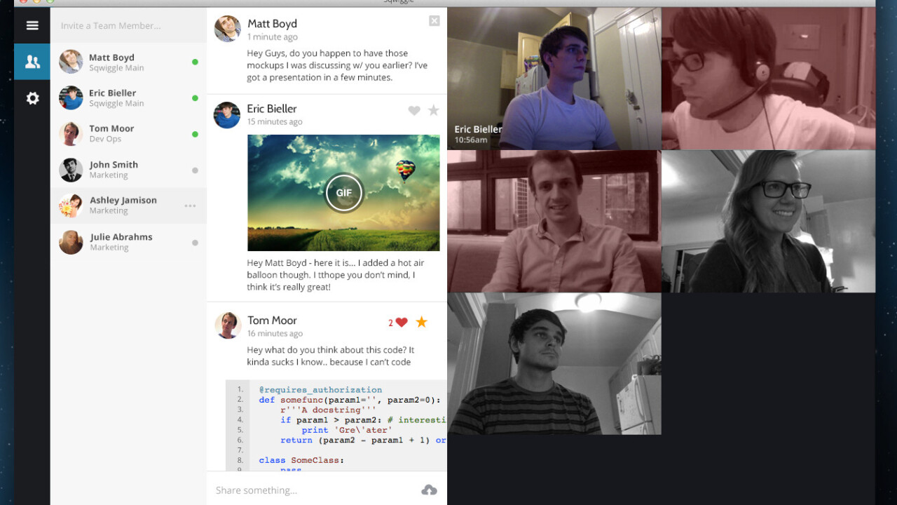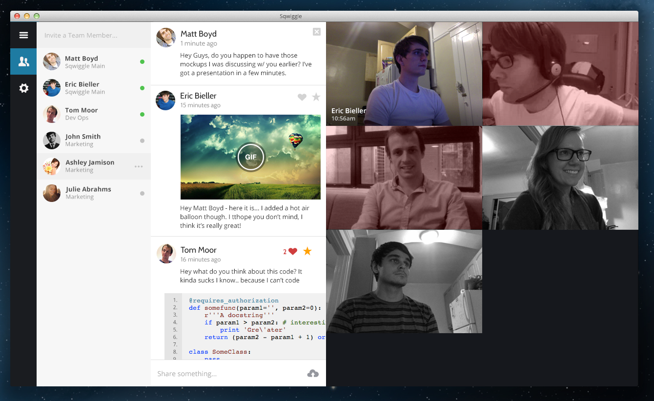
Sqwiggle has redesigned its browser-based remote workplace and collaboration app, switching the sidebar and chat area over to the left-hand side. It’s a subtle revision, but one that streamlines the overall messaging experience and emphasizes the new, larger video feeds throughout the app.
As before, you can click on a colleague’s monochrome thumbnail to start a video call at any time. Sqwiggle has now added blue and red color coding though to indicate when other users are already chatting to one another.
(Perhaps more importantly, you can also view animated GIFs now just by hovering over them in the chat window.)
Everything is just that little bit cleaner, from the persistent chat window to redesigned team and workroom menus. An update to the Mac app is in the works, and Swiggle says it’s already developing a swathe of new features including screen sharing and drag-and-drop file distribution.
➤ Sqwiggle
Get the TNW newsletter
Get the most important tech news in your inbox each week.


