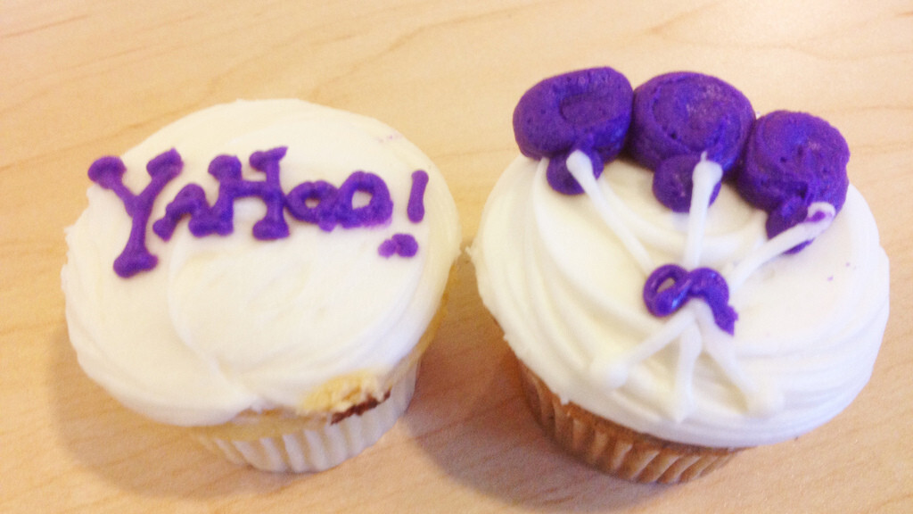
Last month, Yahoo said it would introduce a new logo but keep its infamous exclamation point. Today, after 30 days of showing off alternative versions of its badge, the company has delivered.
Here’s the new logo that the 18-year-old Internet company will use going forward:
What do you think of new logo?
The general consensus is that people really don’t like it (or really aren’t fussed) — does anyone out there actually like it?
That’s not quite all…here’s a video that the company has released in conjunction with its new logo:
Glenn Tokunaga, Art Director and Senior Brand Specialist at Yahoo, explains more:
For Yahoo! employees, this isn’t new. We’ve been bleeding purple since 1996 when we anointed it as our corporate color. Why purple? Lore has it that our notoriously frugal co-founder, David Filo, got a great deal on lavender paint for our decrepit offices. But ultimately, purple evokes everything that makes working here so unique. Now we want to share that energy with you.
Marissa Mayer has also weighed in, providing some back story behind the new logo:
So, one weekend this summer, I rolled up my sleeves and dove into the trenches with our logo design team: Bob Stohrer, Marc DeBartolomeis, Russ Khaydarov, and our intern Max Ma. We spent the majority of Saturday and Sunday designing the logo from start to finish, and we had a ton of fun weighing every minute detail.
A number of companies have jumped on Yahoo’s revamp and proposed alternative new logos. 99designs crowdsourced a new logo from its user base of designers — who contributed over 5,000 entries — while consumer survey company Survata put its logo testing tool to work to discover that the logo from day 10 was the most popular among consumers.
Headline image via craigles75 / Flickr
Get the TNW newsletter
Get the most important tech news in your inbox each week.


