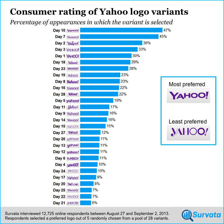
In preparation for the announcement of its new logo, Yahoo has been running a “30 Days of Change” campaign for the past month that showcases different logo designs each day. Consumer survey company Survata put its logo testing tool to work to discover that the logo from day 10 was the most popular among consumers.
 The company quizzed over 12,000 respondents, asking them to pick their favorite among five logos randomly pulled from the first 28. Day 29 was unfortunately not included in the survey.
The day 21 logo was the least favorite of the lot:

Yahoo will reveal its new logo on Thursday.

The 💜 of EU tech
The latest rumblings from the EU tech scene, a story from our wise ol' founder Boris, and some questionable AI art. It's free, every week, in your inbox. Sign up now!
For the curious, here’s the breakdown on how each design fared:
➤ Yahoo showed us 30 days of logos. Here’s the one consumers liked best. [Survata]
See also: 99designs ran a contest to find the best alternative Yahoo logo – here’s the winner
Image credits: David Paul Morris / Getty Images, Yahoo, Survata
Get the TNW newsletter
Get the most important tech news in your inbox each week.