
18 months ago, if you made an infographic, chances are that it was going to get widely spread. But people grew tired of the format quickly, perhaps largely because most of the examples were light on both info and graphics. But Column Five Media co-founder Ross Crooks thinks that there’s still plenty to be done in the space. His upcoming TNW Academy course can teach you what works, what doesn’t and how to make the favor fall toward your content. We had a chance to talk to Ross, and his insights are pretty fantastic.
Infographics have perhaps gotten a bad rap because of over-use. What separates the good stuff from the mediocre?
The infographic medium has gained popularity over the last few years as marketers used them as editorial content to drive traffic and promote their brands. While this can still be effective if done right, this is the use case that has become a bit hackneyed. However, infographics as a medium of communication are nothing new. Weather maps, reporting dashboards, anatomical diagrams- these are all examples of informational graphics as well that have been used in newspapers, reports and textbooks for years. The common familiarity with infographics is in need of expansion – the realization that there are more tools in the belt that can be used.
The popularity of any medium often leads to a saturation of poor quality content (looking at you, YouTube) – but this shouldn’t discredit its efficacy altogether. What separates the good from the bad? The same factors that apply to quality video or articles – an interesting and unique concept, sound research/data collection and engaging copywriting. Beautiful design also helps attract viewers by appealing to them aesthetically. Those that give infographics a bad rap are poorly thought out and quickly thrown together, lacking a compelling narrative and advanced design, ultimately failing to achieve the communication objectives.
When you talk about building trust through visualization, how do you do that?
Visualization can provide context that helps people gain a holistic understanding of a topic very quickly. When people are given this context, instead of just a sound bite statistic, they are able to form their own opinions about the content. This relationship with the information builds trust.
For example, if I told you that unemployment has decreased 10% in the U.S. – some people might think this is good, while many others would want more information in order to make a judgement. What is the trend over time? How do various geographic regions differ? Does male vs. female unemployment differ dramatically? Is the total number of unemployed people high or low historically? All these answers and more can be visualized in a concise way – allowing the viewer to extract the information they feel is necessary to come to their own conclusion.
What’s the most interesting use case of visualization that you’ve seen so far?
Certainly there are many diverse uses of visualization that can be interesting. From a technical perspective, I am particularly interested in how the combination of animation and interactivity can combine to tell better stories visually. Some really cool things can be done using a combination of passive and active user experience. Topically, I have seen a lot of interesting use cases in the financial industry as well as the communication of environmental and social issues. In both cases, there are complex concepts that need to be communicated clearly in order to incite audience action. This is visualization’s sweet spot.
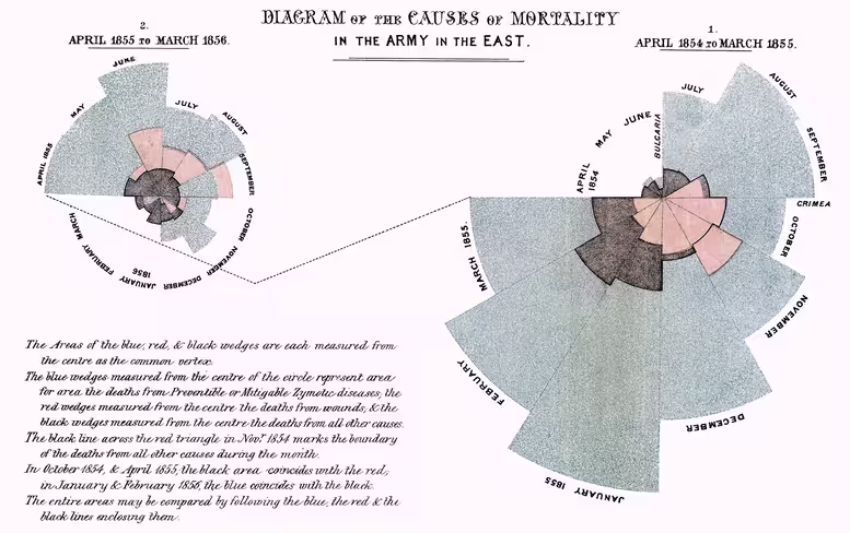
I am also enamored of old graphics such as Minard’s Map of Napolean’s March and Florence Nightingale’s Diagram of Causes of Mortality because of the social impact they had. In a time when data and information was much less accessible to the common man – this type of public insight, portrayed in a clear visualization, must have been like seeing in color for the first time.
What common mistakes are companies making when trying to push out graphics?
The most common mistakes I see are brands not knowing their audience, or not being disciplined about targeting their content to a specific audience. As brands increasingly become content publishers, many are still getting used to creating and distributing editorial content. They are tempted to inject typical marketing messaging that plays up the brand, as this is what brand communication has always been about. They fail to realize that this is not the purpose of this content type, and their audience will not respond well to it. It is essential to understand when it is appropriate to talk about your brand, products and services, and when to be purely editorial and educational to attract and engage a broad audience. Both can utilize infographics and data visualization, but the objectives are much different – thus requiring a unique approach to each.
With the shift toward responsive design, how do infographics and visualization work within these confines?
Great question. We already see a lot of companies wanting to create content in a modular way as to be utilized in various contexts. An example of this is the design of a long-form infographic in a way that can be easily divided into a slide show format. This same approach can be used to divide and reorganize layouts into sections to optimize for varied display dimensions.
How do you see companies using infographics in new ways?
Progressive companies are finding great use for infographics outside of the content marketing and editorial application. Many are incorporating visualization into their products, presentations, collateral, and reports. Adding more data and information into these experiences and displaying it beautifully can transform these communication channels and change how people perceive and understand the company and their work.
What is the best way for a company to approach infographics?
It is really beneficial for companies to take a holistic look at their visual communication strategy, not just infographics as they relate to content marketing. Developing a consistent style of visualization across the company ensures that visualizations are not only impactful in their message, but also support their association with the brand. Having focus and understanding of how visualization can impact various parts of your business and taking a strategic approach to implementation will pay dividends over time.
Make sure to catch Infographics: Build Trust Through Visualization, an online course via TNW Academy. There are still a few seats left, so get yours while you can.
Get the TNW newsletter
Get the most important tech news in your inbox each week.