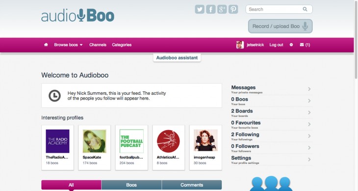
The social audio platform Audioboo has started rolling out the first part of its redesigned website today, which the company says has been built to look “fresher, shinier and modern”.
The new homepage is the most prominent part of the refresh, showing an activity feed at the very top and most of your user settings and tools down the right-hand side, including private messages, your favorite ‘Boo’ audio clips and follower/following lists.
Suggested profiles hang just underneath, helping users to find other Audioboo advocates who are uploading either interesting, high quality or frequent content. Meanwhile, towards the bottom of the homepage Audioboo now shows some of your own activity, such as who you have followed, your most recent ‘Boos’ and comments.

If you haven’t heard of Audioboo before, it’s a platform for self produced and often short audio content. This can be personal messages for sharing with your friends, podcasts that you’ve produced or the audio equivalent of a vlog.
For the most part, the new homepage is a nice improvement and brings most of what you really want to see and access to the fore, rather than buried behind sub-menus or a separate webpage.
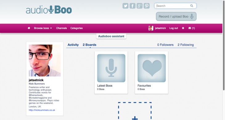
That alone is unlikely to be enough to topple its greatest competitor, SoundCloud, as well as other audio hosting sites such as Bandcamp. As part of its continued fightback, Audioboo is also introducing “Boo Boards”, which is essentially a rebrand of the company’s existing playlists feature.
A blog post on the Audioboo website said: “We think that boards gives a greater idea of the full scope of what they can be used for. Now you can curate Boos into boards – both your own and those of other people, so that they can be listened to together.”
Users can also upload an image to represent the board in various parts of the Audioboo website. Although it’s easy to roll your eyes when you think of yet another Pinterest-inspired community, be assured that it’s been implemented to improve the browsing experience, and not just piggyback on the succes of the pin happy social network.

Not only does it make the Audioboo website feel far more visual, but the company also promises that it will be doing “much more with Boards in the new year – so stay tuned.”
The final part of Audioboo’s website refresh is the introduction of categories. More than a million ‘Boos’ have now been uploaded to the audio platform, making it difficult to look at groups of clips relating to a particular topic or genre. “Now when you upload a Boo through our website you’ll be asked to select a category – so that casual browsers will be able to find something to listen to,” the company says.
The refresh follows the appointment of Rob Proctor as the company’s CEO back in October.
Audioboo is also working on new apps for almost every mobile operating system; iOS, Android, Symbian, Windows Phone and BlackBerry. There’s no word on when they’ll be going live, but we would hazard a guess that it’ll be within the next month or two.
Image Credit: creepyhalloweenimages
Get the TNW newsletter
Get the most important tech news in your inbox each week.


