On Feburary 7th, 2011, the entire Gawker Media style changed from a typical one you’d see on a blog to a hipper more programmed feel. The design focused on a top story and then listed out others along the side in a static bar.
Some people called it horrific, some used the word “satanic“. Well all of those negative words about Gawker’s redesign can probably be put to rest.
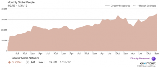
According to a few tweets from Gawker head honcho Nick Denton today, the network saw a lift of over 10 million monthly unique visitors from this point last year:
Yep, January’s in. 35.6m people globally: tinyurl.com/janglobal Interesting: no lift from trade shows. yfrog.com/mmg26xp
— Nick Denton (@nicknotned) February 2, 2012
For obsessive Gawker watchers and redesign doom-mongers: the 35.6m uniques in Jan 2012 is record and 55% up from last April’s nadir.
— Nick Denton (@nicknotned) February 2, 2012
It seems like the redesign didn’t scare people away after all, as you can tell by the graph that Denton includes with this tweet. With 35.6m unique visitors in January, the network just saw its best traffic ever.
So just when you think something is so radical and can’t work simply because it’s different, remember Gawker’s redesign. It actually worked.
Get the TNW newsletter
Get the most important tech news in your inbox each week.


