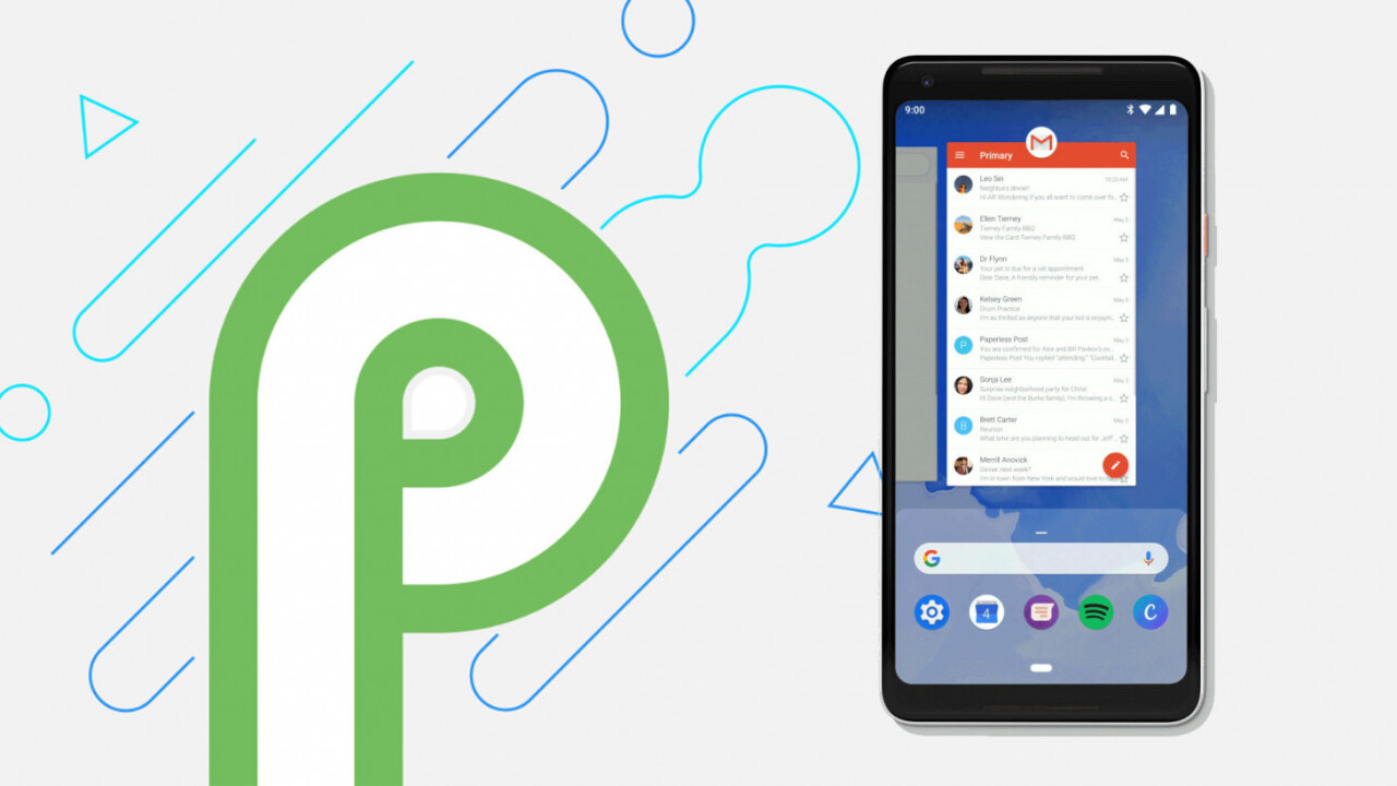
Just as rumored, Android P will officially bring gestures to Team Google, replacing the classic trio of buttons at the bottom of your screen with finger dances reminiscent of the iPhone X (or the Palm Pre, anyone?). The new interface centers around a single pill-shaped home button, which allows you to access a redesigned multi-tasking interface. Here’s how it all works.
First things first: right now, the gestures are optional. In fact, when I installed the beta build on my Pixel 2 XL, the feature was turned off. It’s possible that it’s the default on a fresh installation – I installed Android P as an update – but if you’re running the beta and don’t see the new interface, you can toggle it in Settings> System> Gestures> Swipe up on home screen.

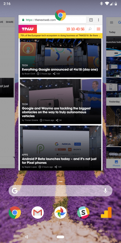
Swipe up from the bottom of your screen, and you’re greeted with your recent apps in new hub called the ‘Overview’. Unlike the old Recents screen, Google will also suggest some apps you might want to launch at the bottom of the display, as well as a search bar to quickly look up information.
If you swipe up once more, you’ll get a full view of your app drawer. That essentially replaces the need to use your launcher to open new apps, as you can simply access you launcher from anywhere now. Meanwhile dragging the home button right lets you quickly scroll through your recent apps in horizontal card view (it doesn’t work if you drag to the left). A fast swipe to the right functions like Alt+Tab on Windows, switching to the previous app. Just tapping on the button still goes home, and holding it still invokes the Assistant.
There’s a clear emphasis on multi-tasking with the new gestures. On that front, there’s a neat trick with the new cards: because of the larger previews, you can now select text right from from the Overview. That means you copy text between apps more quickly, handy for things like pasting a friend’s address into Google Maps. Selections also work with Google’s Smart Actions allowing you to select the name of a song and immediately play it in Spotify, for instance.
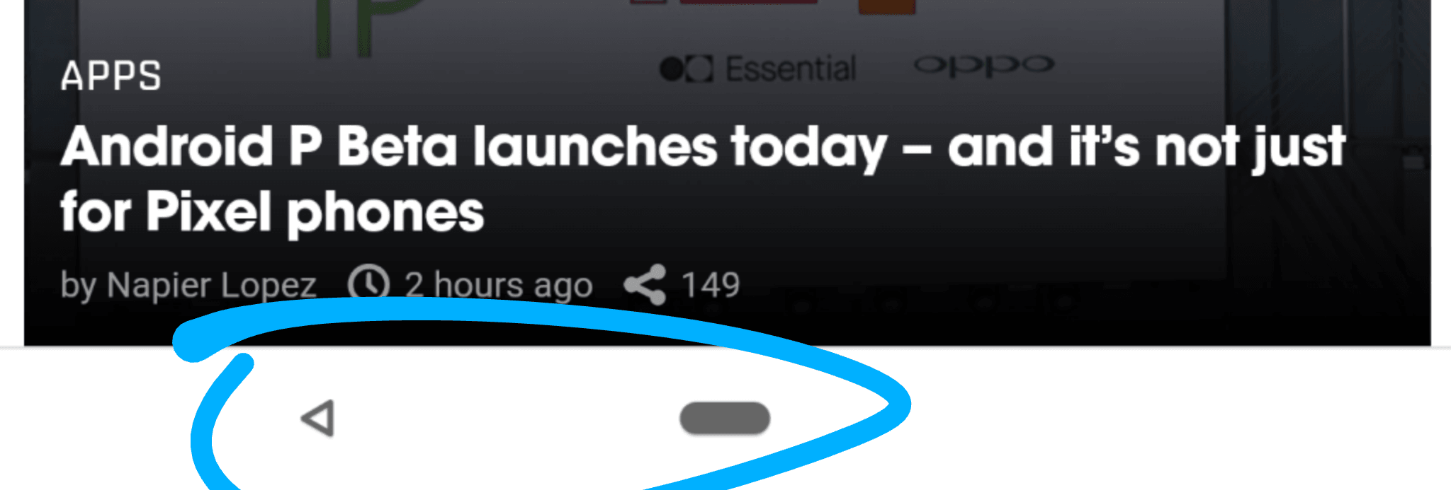
But what about the back button? Google has opted to make that most classic of Android buttons a little more contextual; basically, it hides from view when you don’t need it, such as on your home screen. I think the change is a little considering the back button is used all the time in Android, but it shouldn’t affect functionality.

On a related note, the extra space at the bottom does free up your phone for some new features. For instance, if you have rotation lock turned on, you’ll be able to unlock it from a contextual button that will show up when you turn the device. I imagine Google is thinking up other ways to use the bottom of the phone now that it has the real estate; I wouldn’t be surprised to see more contextual buttons show up in future updates to Android.

Keep in mind this update is just for phones running Google’s UI. It doesn’t seem manufacturers will be required to adopt Google’s gestures, and many Android OEMs like Huawei and Motorola already include gestures of their own. Nonetheless, expect gestures to become a lot more prominent in Android devices to come; I’ve only been using them for about an hour, but despite some small complaints, it’s a welcome improvement.
Check out our event page for more Google I/O stories this week, or follow our reporters on the ground until the event wraps on Thursday:@bryanclark and @mrgreene1977
Get the TNW newsletter
Get the most important tech news in your inbox each week.


