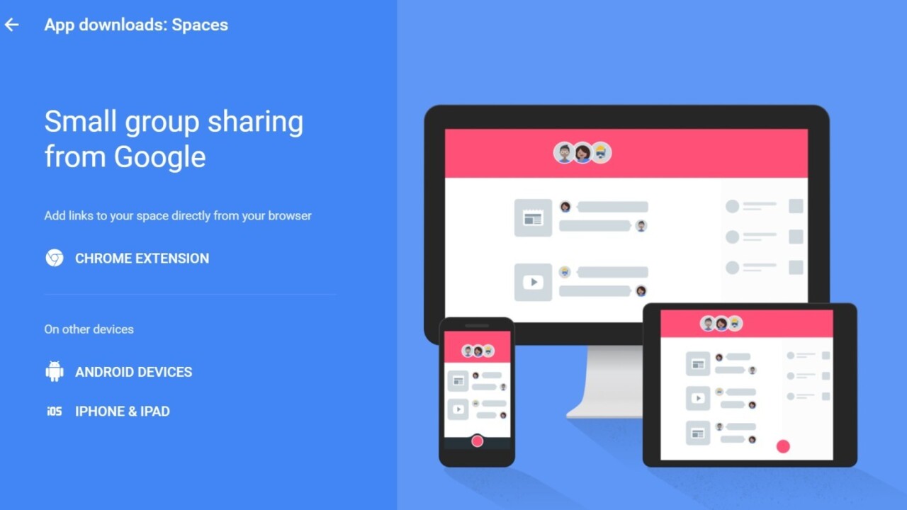
In case you haven’t heard, Google today released a new messaging app called Spaces. Or is it aPinterest competitor? Maybe it’s the future of Google+? Truth be told, we’re not really sure what Google wants it to be, but it’s certainly interesting.
If you’re on the fence about giving Spaces a try – it’s available now for Android, iOS and both the desktop and mobile Web – here’s our guide to everything you should know about Google’s latest app venture.
Spaces vs. messaging apps
Conversations are a central aspect of Spaces, but it’s not a traditional messaging app in the way Messenger, WhatsApp or Google’s own Hangouts are. Your conversations each live within the namesake ‘spaces,’ which cater to specific topics rather than particular people.
You can have a space for activities like your next vacation or planning a book club, or you can simply use it to collecting images, links and videos of things that catch your attention. There are currently three post types: links (including YouTube videos and GIFs), photos, and text.
Importantly, these all open right within the Spaces app if you’re on a mobile device, so you’re not constantly switching between apps. You can also comment on each post individual post, and even maintain a conversation while reading a link or watching a video.
You could, in theory, make spaces just for chatting with individual people, but doing so involves too many steps. This is not a Hangouts replacement – text is the last option among post types.
Discussions around content take priority over your independent thoughts. As such, Google envisions Spaces being used mainly by small groups of friends, family or coworkers who may need to coordinate a plan or simply want to discuss common interests. That said, I can also see it coming in handy for Pinterest-style link-and-image collection.
Creating a space
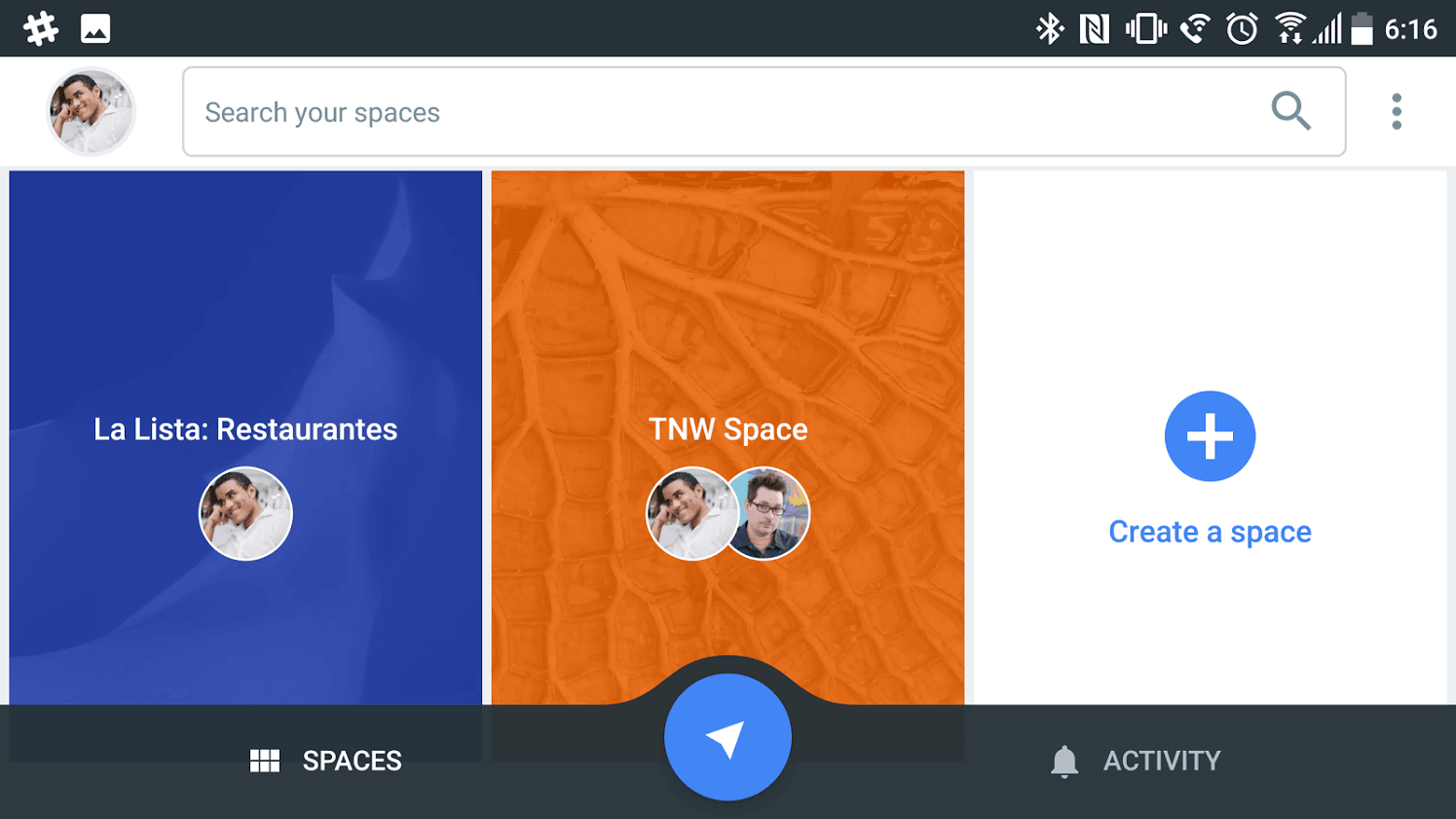
Log in to spaces.google.com or open up the Spaces app, and you’re greeted with a home screen showing off your current spaces, and given the option to create a new one. Each space shows little avatar bubbles of current participants, and an Activity tab lets you view any recent posts or comments by your friends.
If you have something you need to share immediately, you can click the blue arrow button and copy in the link or photo. You can either post it to a current space or create a completely new one around that item.
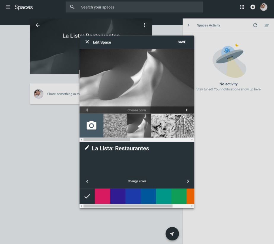
Google automatically assigns a color and cover image to new spaces, but once open, you can change the space’s look by clicking on the three-dot menu and hitting “customize space.” You can rename it, pick one of nine color themes, and choose one of ten cover images (or upload your own).
Then hit ‘Invite via’ to send people a link to join. On the Web, you can copy a link or send an email or Facebook post, but the mobile apps let you invite others through a standard share sheet. Or you can keep the list to yourself – no one’s judging.
Posting stuff
Now that you’re all settled, you can start posting stuff. Spaces gives you a few post type options:
- Links: Copy and paste URLs. Video and image files are automatically embedded, and GIF files play back automatically on your feed. On mobile, you can use this for Google Search or previewing URLs.
- YouTube (mobile-only): Searches specifically for YouTube videos, and shows your recently watches videos to speed up the process. You can still post YouTube videos on the desktop by copying the URL, but on mobile the integration helps save you some taps.
- Photos: Upload photos from your camera roll or Google Photos. You can post multiple images at once.
- Text: Barebones text posts, unfortunately missing formatting options.
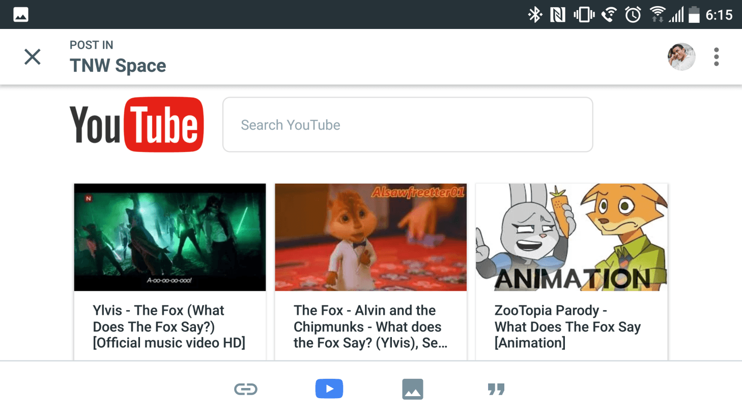
The mobile apps are particularly versatile in the Links and YouTube view because they open up an internal Chrome-based browser rather than switching into your browser; you can basically look up the entire Web or YouTube catalog without ever having to leave the Spaces app.
On the desktop you can only paste links in, but that’s no big deal as it’s only a matter of switching tabs.
The posts then occupy a standard vertical feed in reverse chronological order. GIFs autoplay as you scroll, and videos and Web links open up right within the app – again making sure you never have to leave.
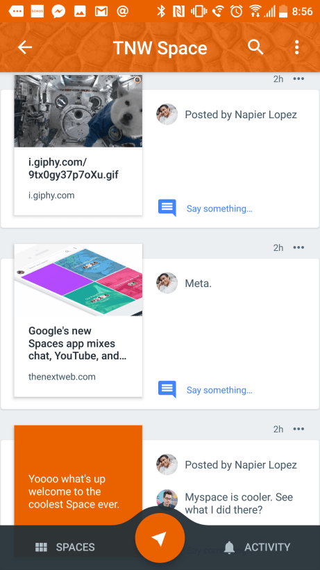
That said, the feed sometimes looks pretty wonky on iOS right now:
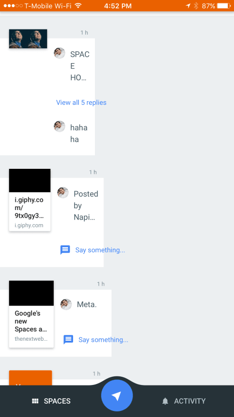
Bugs aside, there are some legitimate design issues; for an app that’s supposed to be all about content, it also does a poor job it of showing it off. Image and video posts should be larger, so you can get a better idea of what you’re tapping on, particularly on tiny mobile screens. Even on a maximized desktop windows, there’s simply too much unused space.
Conversations
The small image size is partly because the the right side posts is occupied by a space for previewing conversations.
Click on on ‘Say something,’ and you can comment on any post using a surprisingly complete interface. That includes standard text messages, embed links or photos, or even use the same set of stickers available in Hangouts. Also like Hangouts, you can see the latest message someone’s read.
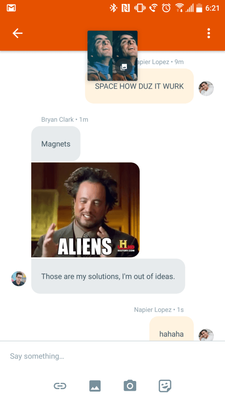
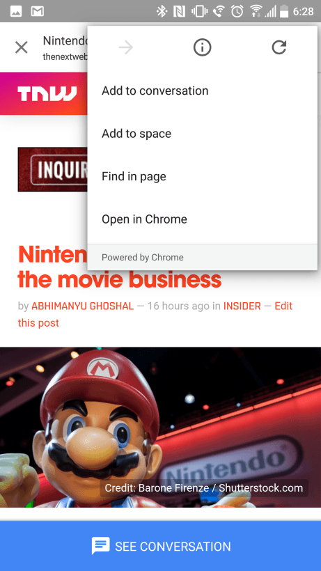
Keeping with the trend of the day, embedded links and videos will open right within the app. More interestingly, you can keep the conversation going while you’re watching a video or reading a post on mobile devices.
Simply tap the “See full conversation” button at the bottom of the screen and you’ll be able to chat while whatever viral video you’re watching plays in the background.
It’s in fact similar to the conversation model Google began rolling out on YouTube for Android last week. With the upcoming Android N supporting a split-screen mode, it seems multi-tasking is the theme of the year.
One big caveat: notifications aren’t working right now. Try after try, the app simply refused to show any notifications from new posts or comments despite having notifications enabled in settings.. The activity tab also remained empty despite filling spaces with posts. I assume these are just growing pains – it’s been out for less then a day, after all – but it’s a disappointing oversight for a major new app launch.
Search
It’s a Google app, so Spaces has a powerful search feature for previous posts. It looks through posts and conversations on all your spaces, and you can specify whether it’s a link image, or video.
It’s the photo search that particularly impresses though. Much like Google Photos proper, Spaces can look for the content inside your photos, instead of just doing a simple metadata search. For example, I was able to type in “flowers” to pick up some images of spring foliage I’d uploaded onto the app, while typing in ‘building’ brought me images I’d shot of the New York skyline.
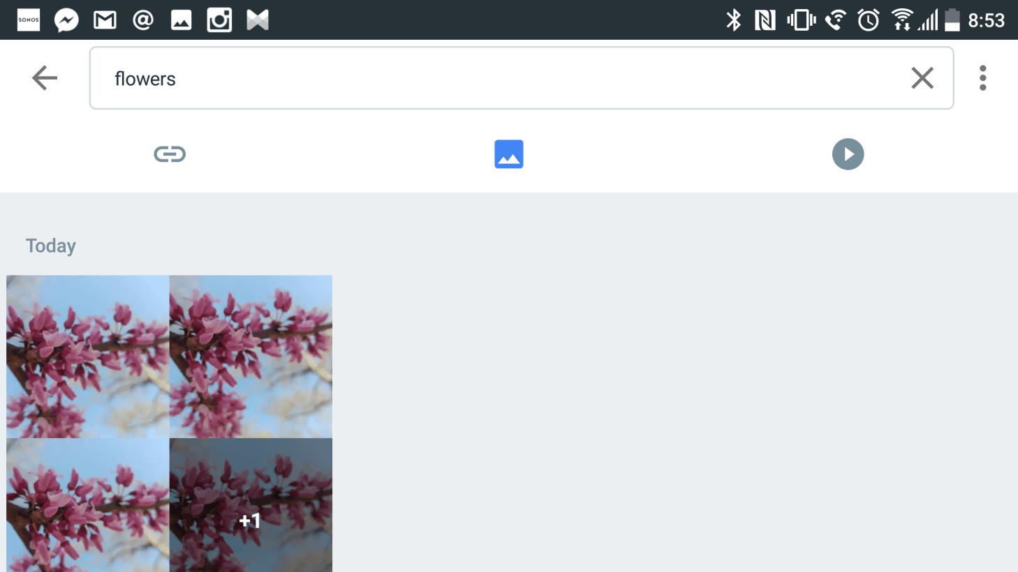
To be clear, it’ll only pull up photos you’ve already uploaded onto the app, not a general Web search or photos from your online albums – that only happens when you make new post. It’ll search through all your chat messages too, so make sure you’re comfortable sending your chats up to Google’s cloud.
First impressions
So far, so good. Some bugs and odd design choices aside, Spaces looks like it can build out its own little niche. I can see myself using it as a bookmarking tool with my friends before planning a party or trip, or even something as simple as keeping a list of recipes.
Of course, Pinterest can do that too, but the collaborative nature of Spaces makes it particularly enticing.
That said, it’s hard to see where Google wants the platform to go in the long run. The chat functionality has the potential replace Hangouts if the company made it easier to start one-on-one conversations, while the sharing aspect makes it seem the company is mulling it as an alternative to Google+
For now, the company seems content to let Spaces live in a relatively unoccupied middle ground. Whether it’ll stick around with the masses, only time will tell.
Get the TNW newsletter
Get the most important tech news in your inbox each week.

