Google’s well-known for tweaking and testing every aspect of its products, and as Search underpins a huge part of the company’s performance, eking out every single benefit can translate into a huge win for the company.
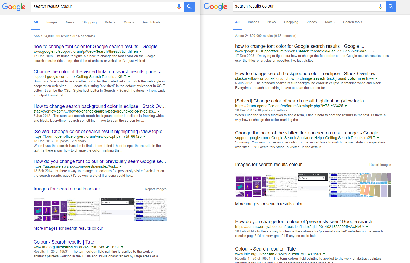
Now, it’s testing a different color font on its Search results page for titles – potentially paving the way to move from its particular shade of blue to black…. Who cares, right?
Not only are people incredibly forthright when companies change functionality they’ve gotten awfully familiar with but they’re also pretty vocal when it comes to design changes. And this is no different.
I really feel like I'm frenemies with #Google. Black links instead of blue in the search results? No. Just No. Bad Google. Bad Google.
— Denise Foster (@denisemfoster) May 8, 2016
In our testing, there’s no dependable way to enable the black links instead of blue, but in some cases, opening a private tab in Chrome and navigating to Google brought the ‘desired’ results.

The same trick didn’t work for me in Firefox, however.
The company’s obsession with tiny details like this are what help it to stay ahead of its rivals – raising revenues through changing font color is one hell of a way to bring in an additional $200 million, so it’s a potentially significant change for both users and the company.
Obsessing over every tiny detail doesn’t mean it’s always the most fun place to work for designers though.
Via The Telegraph
Read next: YouTube is getting Google’s Material Design, here’s how to enable it now
Get the TNW newsletter
Get the most important tech news in your inbox each week.


