Our own Owen Williams went digging in the image assets on Google’s design site and discovered some of the alternatives it considered during its highly-trumpeted logo redesign:
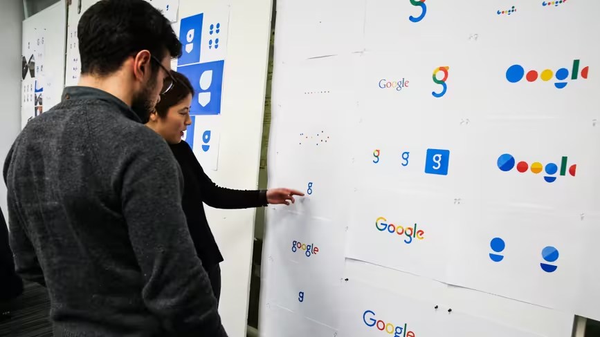
It’s clear that the designers were open to being a lot more radical than the relatively safe refresh we’ve seen today. It’s probably wise, however, that the letters weren’t replaced with impressionistic renderings or a cloud of dots.
There’s a new Google Maps logo here. And check our piece on how Google created a new typeface to go with the new logo.
If you come across any other changes springing from today’s logo change or spot any other bits of work in progress from Google, let us know in the comments. And feel free to weigh in on whether you’d have preferred any of the alternative ideas showcased on that board.
Get the TNW newsletter
Get the most important tech news in your inbox each week.