YouTube has received an ever so minor redesign.
When I kicked back with a few videos this morning (is there a better way to start the day?) I noticed the information pane underneath the video had been tweaked slightly. If memory serves, the Add To, Share and More buttons weren’t tucked quite so far towards the left-hand side of the page. YouTube is being a tad more economical with space, but on a large monitor it can also look a little stretched.
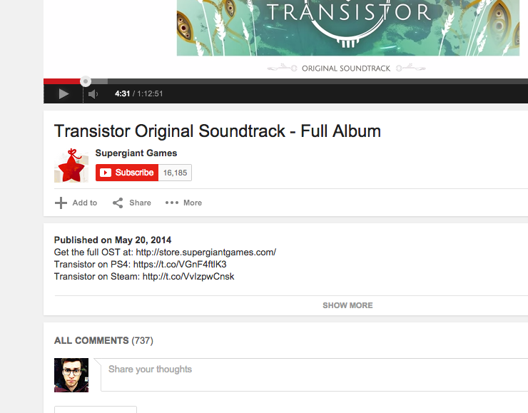
Other elements also appear to have been cleared up, such as the related videos section on the right. Everything just looks cleaner and flatter than before.
Clicking on your account picture in the upper right-hand corner also reveals a marginally reworked account switcher. The new design mimicks an overlay, with dark grey sub-headers separating your various accounts:
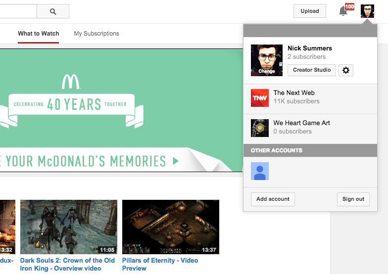
Although I don’t have the previous design for reference, I’m also fairly certain the ‘What to Watch’ homepage has been given a quick refresh. I can’t put my finger on exactly what’s changed, but the overall look is a little more rectangular and regimented in my eyes. (Or am I just dreaming?)
At the very least, I’m not the only one to have spotted YouTube’s latest design alterations. Here are some reactions from the Twittersphere:
YouTube’s watch page got a redesign.. Or should I say… stretched.
— myuu (@myuusic) August 29, 2014
…did they redesign Youtube AGAIN? all hard edges now
— DarkChaplain (@TheDarkChaplain) August 29, 2014
They’ve redesigned YouTube again. I’m only going to tweet when they redesign YouTube and during Halloween.
— Super Cool (@barnaclebucket) August 29, 2014
Have you noticed any other design tweaks on YouTube? Let us know in the comments section below. (I’ll update this piece accordingly.)
Read Next: YouTube will soon give you the option to import Google+ videos
Top image credit: ERIC PIERMONT/AFP/Getty Images
Get the TNW newsletter
Get the most important tech news in your inbox each week.