
When Google unveiled its ‘L Developer Preview‘ for Android yesterday, it did so alongside a new “visual language” called Material Design. The vibrant aesthetic will be rolled out across all of Google’s platforms, including Chrome OS and the Web, creating a unified look that binds all of its products together.
The flat design throws in splashes of bright color to reflect a lightweight, welcoming look. Animations have been tweaked to make the experience more playful, while ensuring the maximum amount of content is always visible.
Over on Google+, the company has released some artwork for a printed kit given to I/O attendees. The featured postcards are not only beautiful, but feature small captions that explain the principles behind the new design language.
Google offers the following introduction:
“Design is the art of considered creation. Our goal is to satisfy the diverse spectrum of human needs. As those needs evolve, so too must our designs, practices, and philosophies.
We challenged ourselves to create a visual language for our users that synthesizes the classic principles of good design with the innovation and possibility of technology and science.
This is Material Design.”

The 💜 of EU tech
The latest rumblings from the EU tech scene, a story from our wise ol' founder Boris, and some questionable AI art. It's free, every week, in your inbox. Sign up now!
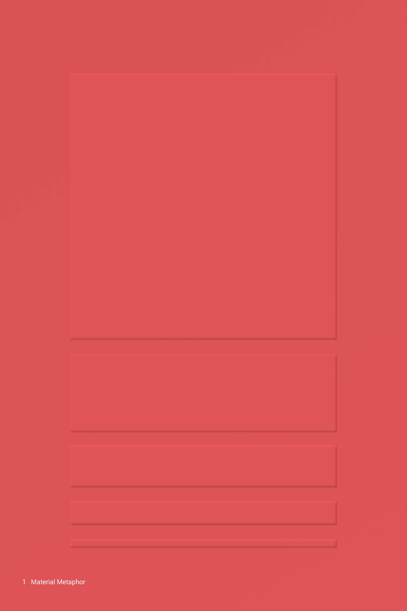
1: Material is the metaphor
A material metaphor is the unifying theory of a rationalized space and a system of motion. Our material is grounded in tactile reality, inspired by our study of paper and ink, yet open to imagination and magic.

2: Surfaces are intuitive and natural
Surfaces and edges provide visual cues that are grounded in our experience of reality. The use of familiar tactile attributes speaks to primal parts of our brains and helps us quickly understand affordances.
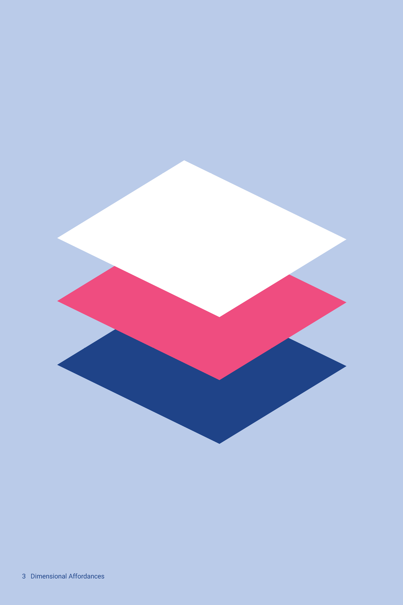
3: Dimensionality affords interaction
The fundamentals of light, surface, and movement are key to conveying how objects interact. Realistic lighting shows seams, divides space, and indicates moving parts.
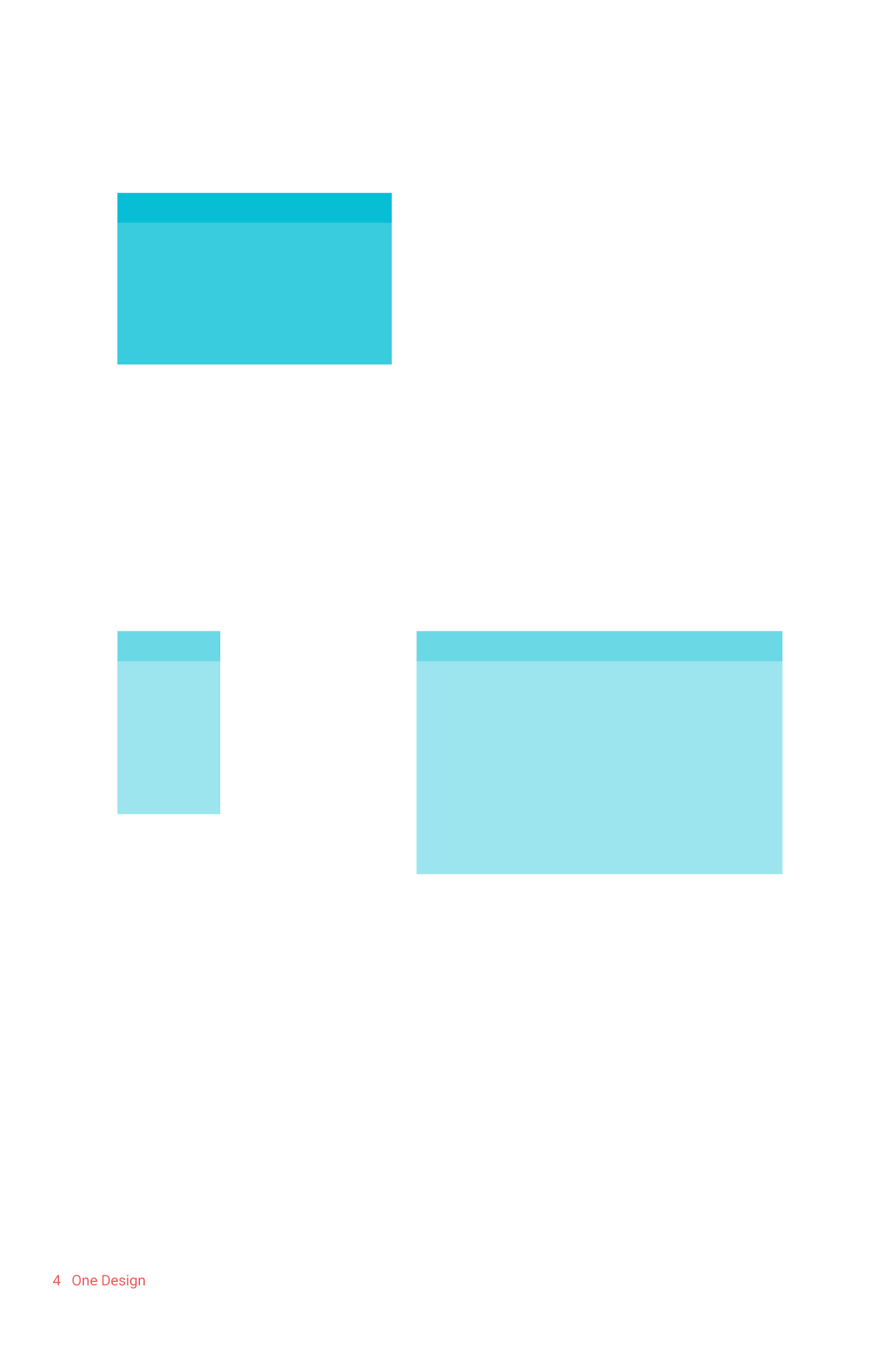
4: One adaptive design
A single underlying design system organizes interactions and space. Each device reflects a different view of the same underlying system. Each view is tailored to the size and interaction appropriate for that device. Colors, iconography, hierarchy, and spatial relationships remain constant.

5: Content is bold, graphic, and intentional
Bold design creates hierarchy, meaning, and focus. Deliberate color choices, edge-to-edge imagery, large-scale typography, and intentional white space create immersion and clarity.
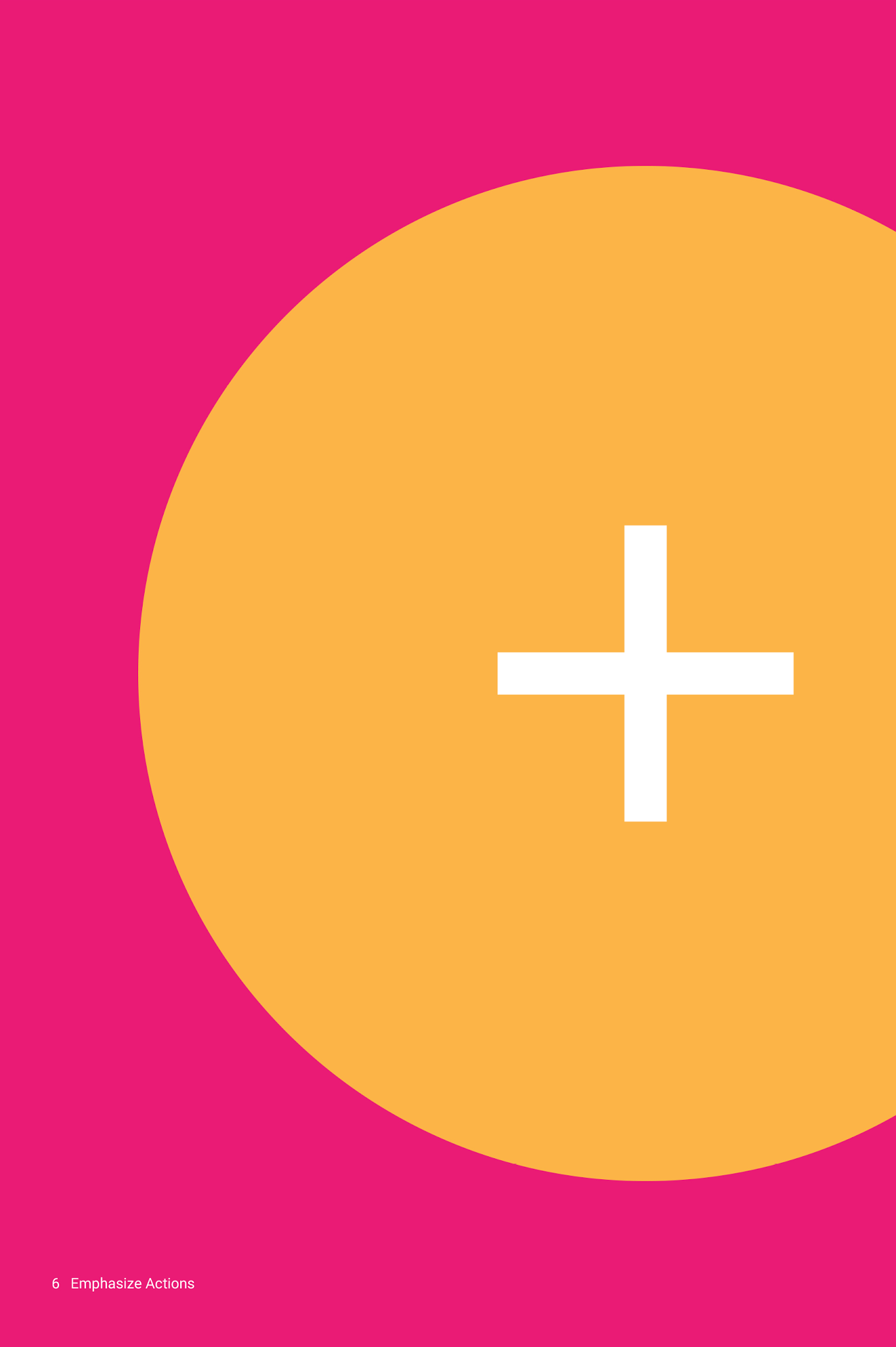
6: Color, surface, and iconography emphasize actions
User action is the essence of experience design. The primary actions are inflection points that transform the whole design. Their emphasis makes core functionality immediately apparent and provides waypoints for the user.
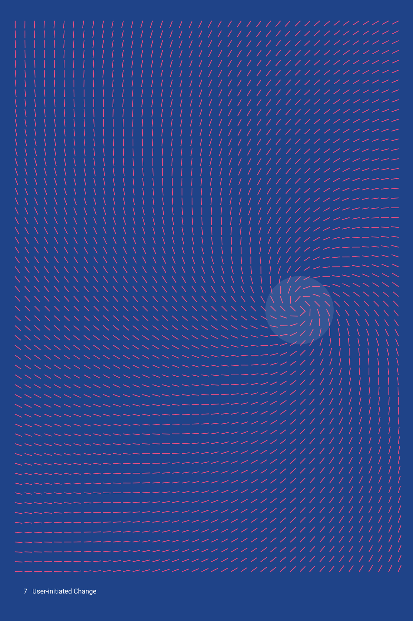
7: Users initiate change
Changes in the interface derive their energy from user actions. Motion that cascades from touch respects and reinforces the user as the prime mover.
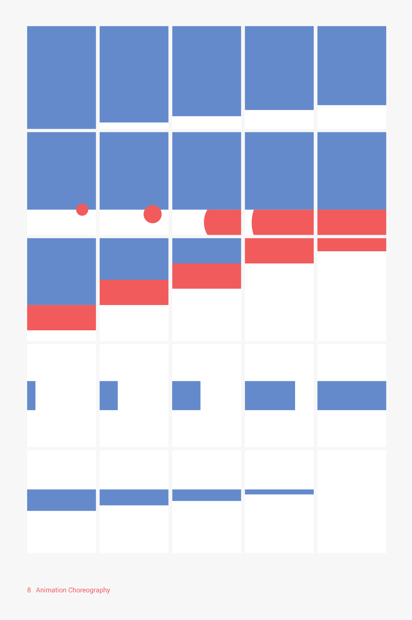
8: Animation is choreographed on a shared stage
All action takes place in a single environment. Objects are presented to the user without breaking the continuity of experience even as they transform and reorganize.

9: Motion provides meaning
Motion is meaningful and appropriate, serving to focus attention and maintain continuity. Feedback is subtle yet clear. Transitions are efficient yet coherent.
Head here to learn more about Google’s new design direction and download its latest guidelines, assets and resources.
Read Next: Everything Google announced at Google I/O 2014 in one handy list
Get the TNW newsletter
Get the most important tech news in your inbox each week.