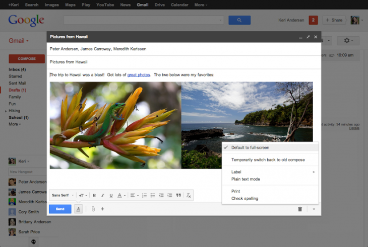
Google today announced a big change to Gmail’s compose window: a full-screen option and a switch to set it as the default. The new feature is rolling out worldwide “over the next couple of days.”
When you enable this new option (click on the expand button in the top right), the compose window will become centered in your inbox, expanded to fit on your screen, and the formatting toolbar will be turned on by default. Furthermore, and even more importantly, you set full-screen as the default by selecting “Default to full-screen” in the more options menu at the bottom-right.
If you don’t use Gmail, this probably doesn’t seem like a big deal to you. For those that do, however, the new compose window for the email service has been a big source of frustration, and this tweak is meant to alleviate that a bit.
The feature was first launched in October 2012 and Google has been trying to improve it ever since, usually in response to user feedback. Google’s main argument for the new design was that it let you reference your inbox while writing a new email, but many argued this was more distracting than useful.
“After Gmail’s new compose rolled out to everyone in March, many of you sent us requests for features you’d like to see added,” Google says. “We listened carefully to your feedback and as result, the new compose now offers a full-screen option.”
With this change, Google is throwing its hands in the air and admitting that not everyone likes the new compose window, and some simply want it to work like before. Others of course prefer the change, and so the company is relenting by offering a new option, as opposed to reverting to the old way.
See also – Gmail now lets you insert up to 10GB of Google Drive files directly into an email and Gmail graduates 3 Labs features: Send and archive, Default reply to all, and Quote selected text
Top Image Credit: Johannes Eisele/Getty Images
Get the TNW newsletter
Get the most important tech news in your inbox each week.


