Google on Tuesday announced a redesign of its Google+ social network for the mobile Web. The revamp is meant to bring the mobile version of Google+ in line with the last redesign of the service.
Here’s what’s new:
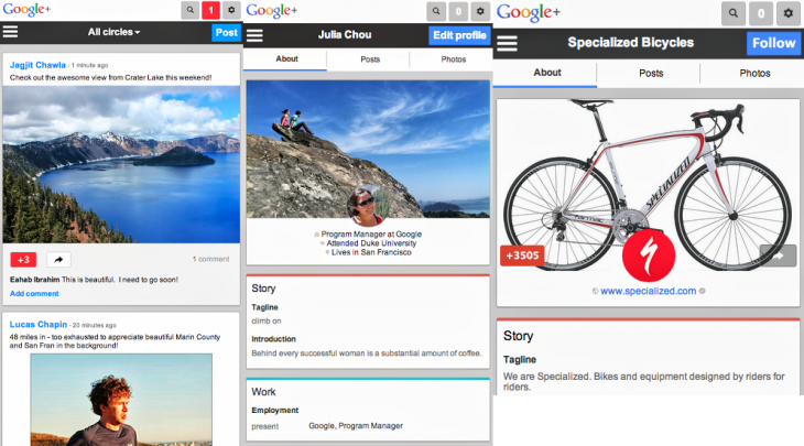
- Posts now appear as “cards” in the stream, making it easier to read, +1 and re-share them.
- We’ve also redesigned the Profile and Page experiences to include cover photos, larger tap targets, and much more.
More importantly, here’s how all that looks:
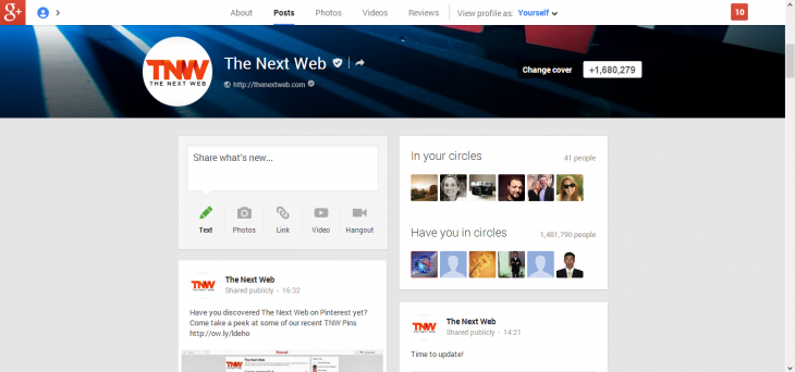
As you can see, posts are now shown as cards, just like on Google+ for the desktop. Furthermore, the right-most screenshot above shows the addition of cover photos, which both profiles and pages now utilize. Larger tap targets are only really noticeable if you’re using the social network on a touchscreen device.
Last week at Google I/O 2013, the company announced 41 new features that affect the Stream, Hangouts, and Photos sections of the service. An Android app update followed yesterday and the mobile Web version has been updated today.
Many have noted that the emphasis on cards makes the service look like Pinterest. Whether you agree with that or not, Google+ is now more consistent across desktop, apps, and the mobile Web, although the iOS app has yet to join the fray (though it has had cards for a while now).
Personally, I find the new design to be worse than what Google+ offered before. On my low-resolution monitor, there is simply less content displayed, which results in a lot more scrolling.
On a mobile screen that is usually held vertically, this may be okay. Still, just because something works on mobile doesn’t mean it should be forced on the desktop.
See also – Google targets mobile Web publishers with content recommendation tool built on Google+ activity
Top Image Credit: Kimihiro Hoshino / Getty Images
Get the TNW newsletter
Get the most important tech news in your inbox each week.


