Google appears to be testing a new design for its various websites which completely removes the black navigation bar at the top. The change follows a separate test in which Google replaced the navigation bar with a menu similar to the one found in Chrome OS.
While the latter has its advantages, we don’t understand the former: why would Google completely removing the navigation bar? It’s currently the only element that links its various Web services together.
Here’s what the Google.com homepage looks like now for almost everyone (we’re seeing the same design on the latest version of Chrome, Firefox, and Internet Explorer):
Here’s what it looks like in the latest Canary build (“the most bleeding-edge official version of Chrome” according to Google):
The navigation bar is not present whether you are signed in or not, and is still not there even after you search (if it reappeared, that would make a little more sense to us):
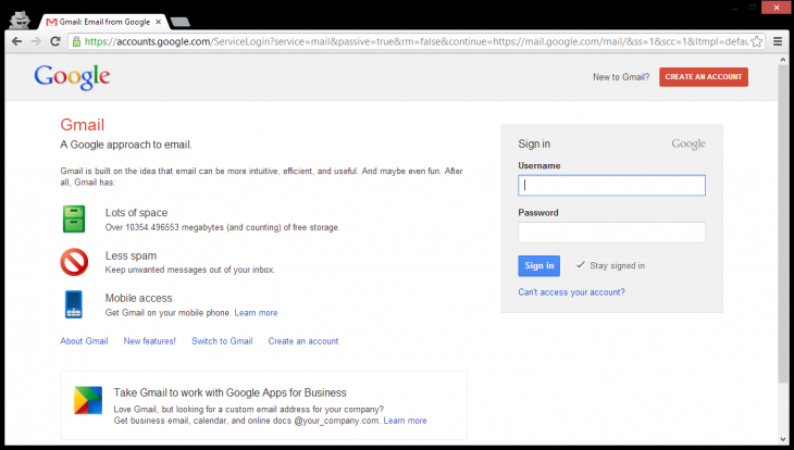
Again, this isn’t limited to just Google.com. On Canary, it happens on all of Google’s services. Here’s Gmail:
Google loves tweaking its homepage design to keep it as minimal as possible. Yet this changer clearly sacrifices functionality for form.
As we’ve already mentioned, this is the odder of the two redesigns Google has been testing this year. Last month, as pointed out by Google Operating System, the company was experimenting with a new navigation bar that looks to be borrowed from Chrome OS:
This screenshot is for Google.com, though we have no information as to what browser it was accessed from (though Canary seems likely). It’s also unclear if the option appeared across all of Google’s services or just the homepage.
We can understand Google replacing the navigation bar with a menu button: it saves horizontal space and works well with the goal of keeping things minimal. That being said, it adds a click to every action.
Still, it could be good for mobile: the menu button might be better for touch-only devices, the sites could load faster since Google can choose to only load the navigation section when the user needs it, and again it’s a more minimal design.
Yet we’re not seeing a navigation bar nor a navigation menu. It’s an odd change, to say the least, and we hope Google has a good reason for it. We just can’t figure out what that might be.
See also – Google experiments with a search box in Chrome’s new tab page, keeping queries in the omnibox
Image credit: AFP/Getty Images
Get the TNW newsletter
Get the most important tech news in your inbox each week.


