From the beginning, Google’s design sensibilities on the web and Android have been unique. Whether you were a fan of the spare, utilitarian feel of products like Search or not, you knew when you were looking at something built by Google.
To a degree, that’s still very true. Android apps built by the company have taken on the trappings of overarching design shifts like those introduced with Ice Cream Sandwich. But you still know that they’re Android apps. The same goes for the web apps, which retain many similar traits to the company’s first efforts. Use of primary or off-primary colors, white space, text prominence and brusque attempts at user interface chrome.
And there’s something to be said for maintaining that sense of self. ICS and its successor Jelly Bean look better than the platform has ever looked. The Holo language — which Google is doing a lot to promote the adoption of by developers — is bold and different, without being too sparse.
But Google doesn’t just make apps for Android and the web. It also makes them for Apple’s iOS — 25 different apps at last count. That’s more apps than Apple offers on its own store. Unfortunately, when it comes to design on the iPhone and iPad, its offerings have left a lot to be desired. That is until recently when, suddenly, its apps started getting very very good.

The 💜 of EU tech
The latest rumblings from the EU tech scene, a story from our wise ol' founder Boris, and some questionable AI art. It's free, every week, in your inbox. Sign up now!
It all began with the release of a startlingly good iOS app for Google+. Clean, well put together on both iPhone and iPad, spare yet bold. Somehow very Google and very iOS at the same time.
The app impressed a lot of the folks in the iOS community, who took notice, regardless of whether they actually used Google+ or not. A recent update to the Google+ app has improved it even further, removing a lot of the dark colors in the app and emphasizing bold colors as an invitation to action. It’s actually pretty gorgeous, and it’s got a lovely pull-to-refresh animation:
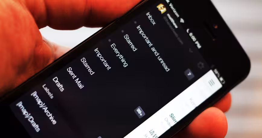
The string of well designed, if not exactly perfect, app updates continued. In no particular order, YouTube, Chrome, Google Search, YouTube Capture and of course, Google Maps all displayed a much surer design hand on Apple’s platform. They obeyed the right conventions for things like the back button and the bottom-oriented navigation bar, but they maintained a sense of what Google has been about from the beginning.
In order to convey just how much Google’s language has changed, here’s a juxtaposition of Google’s design language on iOS ‘before’ and ‘after’ its rebirth. Google Translate, still not updated for the iPhone 5 on the left and the new Google+ app on the right:

The difference is evident. The Google+ app reveals the navigation chrome only when you’re not scrolling downwards, allowing it to display more content. The margins have been trimmed back and the color blocking draws your attention to the interaction points. But the sparseness isn’t as harsh any more. There are now textures used to give it a layered feeling that is noticeably absent from its older apps.
A group of apps placed side by side, all of the ‘new breed’, emphasize just how coherent and assured they feel:

To contrast that, here’s a similar grouping that I created when talking about the combined divergence and homogeny of Apple’s designs on iOS 6:

Apple’s designs move towards textured, friendly designs that mimic real-world objects. The original Mac’s desktop paradigm is still informing the design that the company does. It’s very much a school of thought that places the needs of the 80% front and center. It’s also a look championed both by founder Steve Jobs and outgoing iOS chief Scott Forstall. And not as much by incoming head of all design Jony Ive. It will be interesting to see how it evolves.
But as far as Google is concerned, it appears to be firing on all cylinders. Creating a suite of apps that combines its web design sensibilities with interfaces that make sense on iOS for the first time in a long time. Some small elements still stand out as foreign. the drawer tab in Maps, the clever but different tab browser in Chrome. But overall the interfaces feel like they’re being more honest to the underlying iOS platform and obeying the conventions there.
The Desirability Factor
I wanted to make sure I wasn’t imagining the changes I was seeing in the new apps, so I spoke with Jason Cornwell, lead designer on the Gmail for iOS project, one of the well-received new apps in the modern suite. What he told me drove home that Google knows very well where its bread is buttered, and it’s looking to make big strides into better apps for iOS.
“A number of teams at Google, ourselves included, were looking to up our game on iOS and put out significantly higher quality releases,” Cornwell told me. “It was a shared desire to start making more beautiful apps.”
A bunch of team members working on apps like Maps and Gmail all got together to hash out a common visual language that all of the apps would adopt. This would replace the hodgepodge of light blue and black and whatever interfaces that the previous generation of apps that Google had released. The way that apps are supposed to work on iOS was also a big consideration.

The team worried about how it would “create a design language for iOS that was honest to the platform, that felt like it belonged there. But that also retained its essential ‘Googleiness’,” says Cornwell, “that felt like it was something we had produced.”
This bottom-up process involved the group of designers that bounced their work off of one another in order to figure out what the standards for Google apps on iOS were going to be. This included a lot of team members that worked on the redesign of the web app last year.
“A lot of what we were trying to do was trying to apply some of the same design philosphy” as that web version, Cornwell says. “Drawing inspiration from the Google search box as far as focus and simplicity goes. But also sparing use of color to articulate the interactions in a consistent way.”
The update to Google’s suite was sorely needed. The apps used a lot of fairly standard Apple UI kit stuff with Google’s color palette sprinkled on top. This felt lazy for a company with the resources of Google, and it didn’t do any wonders for the love that people were giving its efforts on the platform. I asked Cornwell if it was a relief for the Google iOS apps team to finally have representative offerings on the platform, ones that they could be proud of.
“It’s a huge relief, and really exciting to see. Google’s becoming much more of a design-focused company. It’s been clear inside the company for a while, but it’s becoming clear outside of Google as well,” he says. “The amount of effort and emphasis that we’re putting on really well-designed apps that still have the other characteristics that other Google apps have had.”
Those features include speed and a deep feature-set that mimics their web counterparts. But, Cornwell adds, they wanted to really “up the desirability factor this time around.”
Digital, Not Physical
A lot of this process involved bringing the iOS apps into the same visual family as the web offerings, without losing the ‘iOS reference points’ that would strike a balance between what Google does and what feels natural on the platform. That conversation, says Cornwell, is a constant one that informs each subsequent release. Elements that appear in Maps may show up in future apps as the team figures out what works and what strikes the proper tone.
That includes evolving the look of even the newer apps rapidly. The Google+ app, for instance, moved away from the heavy black interface elements of the first version, lightening the background and using color as touch points. As color works at a higher level than text or even symbology, this provides a welcoming influence on interaction points. Of course, the iconography is still strong to serve the color blind.

And the process for Google is still significantly different from what Apple is doing with its designs. Cornwell specifically calls out the fact that it’s doing things that feel ‘digital’, rather than physical.
“What we’re shooting for here is something that feels authentic and digital, that isn’t trying to be a physical thing. But at the same time has some depth to it,” he says. “When you start to interact with it, you get a sense of sophistication, that there’s a lot there, but the initial presentation is very simple and very clean.”
Human
When it comes to the Gmail app, which Cornwell led design on, the effort was to make it feel more human. The team that came to Google with the Sparrow acquisition is now ‘very integrated’ into the Gmail team. While the new app isn’t built off of the Sparrow engine, there are definitely ideas from the app present. Those ideas, elements from other apps around Google and the current state of interaction standards on iOS all fed into the new Gmail.
One of the Sparrow concepts that made its way to Gmail was the idea of capping each email with a profile picture.
“One of the things that we’ve been trying to do with Gmail specifically is to make it feel more human, more personal. And pictures are absolutely a big part of that strategy, to make it feel like you’re having a conversation with a person.”
When a profile picture isn’t present, it’s replaced by a bold, colored square filled with the sendee’s first initial.
“One of our designers had this idea to use the initials, which I thought was a clever way to deal with the fairly significant chunk of email that you get without any profile associated with it,” says Cornwell. “On the web, the previous approach was to use a default avatar and then colorize it, which doesn’t have the personality of an initial.”

I also quizzed Cornwell a bit about the reason that the new Gmail app uses web views so heavily. The interface has grown on me since I initially dismissed it as too slow, but it still suffers from some glitches that appear to be tied to the fact that it displays the main content entirely in a web view, rather than with native frameworks. These glitches include somewhat slower tap recognition than Sparrow and emails that have been deleted remaining in the inbox and highlighted until the view is refreshed.
“This is a constant and interesting issue, because you have to use web views to display HTML mail. So it’s really a balancing act that has to do with animation performance,” says Cornwell. “And we spent a lot of time optimizing it. We really wanted there to not be any issues about whether this was a hybrid or native app. It should just feel fluid and like it fights right on the platform. We spent a lot of time making it work properly.”
They got most of the way there with Gmail. I’ve been using it as my primary email app alongside Sparrow for a few days now and just today replaced Sparrow with it in my dock. We’ll see how long it stays there, but so far its lightweight colors, support for push notifications and excellent handling of Gmail-centric actions like tagging have me liking it.
There’s also the fact that, as with other apps like Google+ and YouTube, the Gmail app focuses heavily on the content. The colors and textures are sparingly used, so mail content pops in place, making it more visible. The margins are trimmed down too, with very little given over to interface chrome in the view and compose modes.
“It’s a huge emphasis. If you look at the new compose on the web, that was the predominant philosophy there…to make the content the hero,” Cornwell opines. “The more UI you put around the content the less and less you’re featuring the content. When you’re communicating with somebody, we want the mechanics of the communication to disappear.”
He says that an immense amount of time was spent on trying ‘not to get in your way’ with the interface. To pare down what is presented so that you can get to your content without it being weighed down with ‘so much junk’. That goes for Gmail, but it also goes for the other apps that are taking part in this sift as well.
iPhone Natives
“Google, in general, wants to be where our users are. So being on iOS continues to be pretty important. I think what you’re seeing is a result of a fairly significant, slightly longer term investment in the quality of these apps,” says Cornwell.
He’s responding to my question about why it took so long for Google to bring a better class of apps to iOS. It’s been focused on improving the experience on Android so much, but a huge amount of people use Google services on iOS. Public statements from Chairman Eric Schmidt have even indicated that a majority of Google’s revenue in search advertising comes from iOS users. It’s a major component of Google’s business, and it deserves top-notch apps.
The Gmail app posed unique challenges in this area, because it has a very web-centric origin. The team needed to translate that web experience to a ‘mostly native thing’ that works logically on iOS. Cornwell and the team also knew that they had to bring a ‘coherent’ release that had a bunch of features integral to the Gmail experience.
“And we just weren’t willing to rush it,” he says. “Things like animation performance and how the app responded and how native the app felt. It was more important to get that right than to do it quickly.”
Along with this has to come a willingness to steep yourself in the logic of a given platform. You can make wonderful apps for Android and have the technical skills to translate those to iOS, but not have a grasp on the spirit of a platform. Things work a certain way for a reason, and they don’t always do them for the same reasons on iOS as they do on Android. Cornwell is adamant that you have to commit to a platform in order to develop for it.
“You have to live on the platform you’re developing for. The designers and developers that work on this app are iPhone natives and use iPhones all the time as their main phone,” he says.
“You have to live on a platform to understand the subtlety of the patterns…and what represents good design on that platform.”
That doesn’t mean, however, that you get to skate on the standard elements of iOS with a ‘Googley’ color scheme. That’s what got them into this pickle in the first place.
“If you use what Apple provides…without modifying it, it feels old out of the box. All of the great iOS apps take Apple’s patterns and make them their own to exactly the right extent,” says Cornwell. “It’s this balancing act between ‘what does the platform represent’ and what the developer is trying to express on that platform. It took us some iteration to get that balancing act…to tune that correctly.”
Cornwell says that he thinks that the Google design teams for iOS have hit their stride. The visual language and design interactions are beginning to gel in a way that mixes Google and iOS in the right ratios, adding that “it just took a while to get it right.”
Now that it has, iOS users are getting the best of both worlds, with some of the best Google experiences they’ve ever had access to.
Get the TNW newsletter
Get the most important tech news in your inbox each week.