On Tuesday, Google announced an update available exclusively for Apple iPad users on the US English version of the search engine. Starting today, these users get to use a new, interactive experience when they search for restaurants, bars, and other local places on Google.
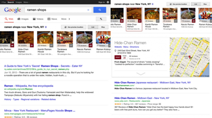
Here’s how it looks (when searching New York City for “ramen shops”):
As you can see, in addition to the regular search results, Google has added a horizontal carousel of local results at the top of the page. This is specifically designed for the touch world of tablets, but for now at least, Google is limiting it for iPad users for some reason.
The carousel lets you quickly glance at a place’s overall review-based score, address. and a picture related to its location. Since this is designed for touch, you can also swipe to display additional results.
If you find a place you’re interested in, Google says you can “simply click on its image” but I’m pretty sure the company means “tap.” Doing so will bring up a card that can be expanded to show more detailed information such as reviews, ratings, and so on.
Furthermore, you can also browse businesses by specific geographic area. Tap on the Map button in the upper right corner to view an interactive map from where you can swipe around.
The update is a much-needed one. Although Google has certainly made a point to embrace tablets and touch devices in general, the company’s products and services certainly have a long way to go in offering experiences specific to different mobile devices. This is to be expect: Google was once only used on desktops. Now there are desktops, laptops, smartphones, tablets, and a bunch of devices in between to contend with.
The only question on our minds is: will this new local experience be the same across Android tablets and iPads, or will Google differentiate the two?
Image credit: Hans Thoursie
Get the TNW newsletter
Get the most important tech news in your inbox each week.


