Only two weeks after releasing a redesign on iOS, a brand new version of Google+ for Android is here with a fresher, sleeker look and heaps of additional features. Most notably, Android users can now start a hangout on the go and edit posts inline.
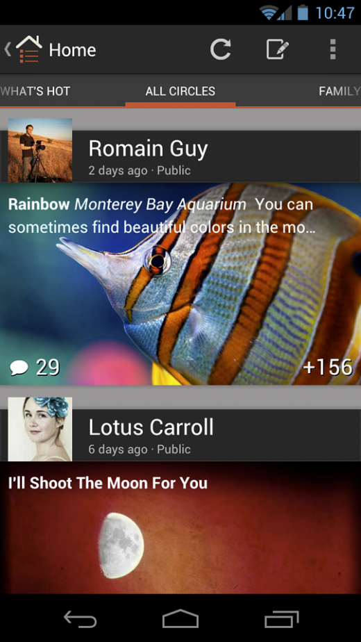
Just like in iOS, this update features crisper fonts, larger profile pics and a friendlier home-screen. More specifically, Google seems particularly proud of the stream, and has made it easier to scan and easier on the eyes, with overlays, gradients and other visual elements.
From Vic Gundotra, Senior Vice President at Google:
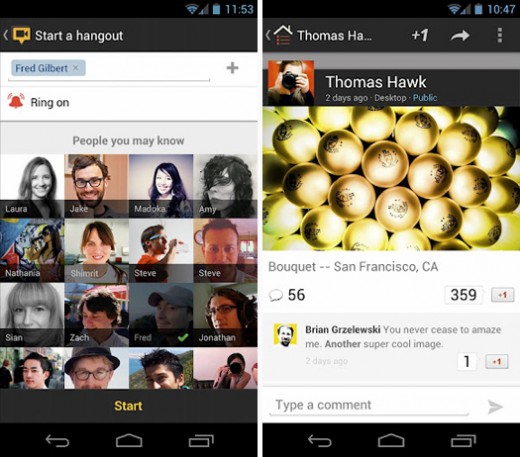
Start a hangout from anywhere, and ring the folks that matter most
With Hangouts we want to help people connect face-to-face-to-face—at any time, from anywhere. Of course, there’s really only one device that’s always by your side—your phone—so we’ve invested in mobile hangouts since early on. Today we’re adding another important feature to the mix: the ability to start a hangout directly from your mobile device.To get started, tap “Hangout” in the (new) navigation ribbon, add some friends and tap “Start.” We’ll ring their phones (if you want), and if someone misses the hangout, they can ring you back with a single tap.
Share your favorites, and feel awesome afterward
When you share with your circles, we owe you an experience that’s both intimate and immersive. Your time and your relationships are precious, after all, so your posts should make you feel proud. Today’s new Android app takes this to heart, with full-screen media in the stream, conversations that fade into view and instantly-touchable actions like +1.
Aesthetics aside, Google also touts a number of improvements, including:
- A navigation ribbon that slides in and out, providing quick access to just about everything
- The ability to download photos directly from Google+, and turn them into wallpaper
- The chance to edit posts inline, in case you make any mistakes while on the go
We’ve speculated in the past that the acquihire of Kevin Rose and the Milk team played a major part in this redesign, and given how greatly improved both new Google+ apps are on iOS and Android, my intuition leads me to believe that this is true. Remember: Google actually confirmed that Rose would be focusing on “social efforts.”
All in all, this appears to be a successful move forward, and it’s great to see that Google is really working to combine quality design with actual utility (“do more, in less time”). For more, take a peek at the Google+ for Android announcement and download the update via the link below:
➤ Google+ for Android (version 2.6)
Get the TNW newsletter
Get the most important tech news in your inbox each week.


