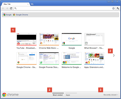
If you use the Google pre-release version of Chrome, Canary, this probably won’t be all that new to you. But in the latest stable release of Chrome, the redesigned New Tab homepage is now available to one and all. In a blog post today, Google announced that “It’s more streamlined, so it’s easier to access and organize your apps in different sections on the page”.
So, it’s now easier to access your favorite apps and your most visited websites. You’ll see thumbnails of the websites you visit the most, and you can also see your ‘recently closed’ pages at the bottom right of the page, which lets you restore a closed tab or window.
You can add more apps to your New Tab page by clicking on the Chrome Web Store icon and, in case you missed it, the Web Store also has a new makeover from today. Apps and extensions are now being presented in a wall of images that’s updated every time you visit the store.
Meanwhile, here’s Google official video demonstrating its New Tab homepage layout:
Get the TNW newsletter
Get the most important tech news in your inbox each week.


