You might remember a few months ago when Google launched Google Docs for Android. At the time it was a welcome change from trying to navigate websites, and it was given a fantastic reception. But it was universal, which means that it looked the same on your Droid Incredible as it did on your Galaxy Tab.
Today, according to the Google Docs Blog, we’re getting a whole new experience for tablets:
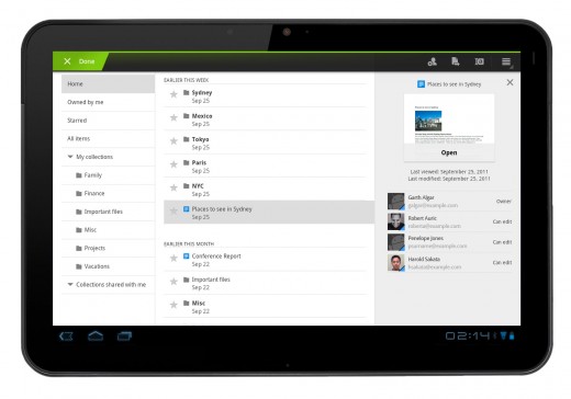
With an entirely new design, we’ve customized the look to make the most of the larger screen space on tablets. The layout includes a three-panel view, which allows you to navigate through filters and collections, view your document list, and see document details, all at once.

Google tells us that there’s also a better autocomplete function for sharing your documents, so when you bring up the sharing window, it will pull from your Google contacts as you are typing.
Want to get in on the new Google Docs for Android goodness? You can do so by heading over to the Android Market and giving it a download. The app is still universal, but the new additions for Android tablets are fantastic.
There’s no word yet on an update to Google Docs for iOS, but you can rest assured that TNW Apple and TNW Apps will have the news when it happens.
Get the TNW newsletter
Get the most important tech news in your inbox each week.


