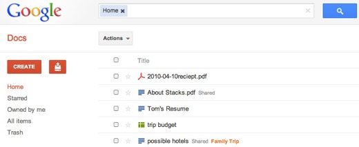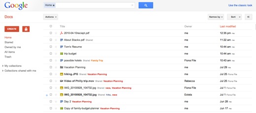
Google is rolling out a new-look version of Google Docs which brings it into line with the design the company has already adopted across properties like Gmail and Calendar.
The redesign emphasises clean, open space, with larger gaps between documents listed in the main menu. You also get the big red buttons the Google design team seems fond of these days. The actual document editing pages are unchanged, however.
Keyboard shortcuts have also been added for faster navigation, too. The up and down arrows let you highlight documents to open; Shift + T to creates a new text document; Shift + S creates a spreadsheet, and Shift + C creates a new collection. Meanwhile, ‘?’ opens a guide to all the available shortcuts. Meanwhile, if the gap between each listed document annoys you, you can adjust this by clicking on the gear icon in the upper-right corner of the screen and going to Documents settings. Under ‘Row height’, there’s an option to select a denser view.
The new look and shortcuts are being rolled out to all users over the next few days, but you can access it immediately by clicking the small gear icon next to your name in the Google navigation bar at the top of the screen. Select ‘Try the new look’ and it’s yours.
Thanks, @imrogb
Get the TNW newsletter
Get the most important tech news in your inbox each week.


