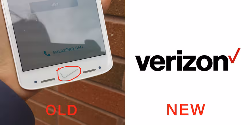
In case you haven’t heard, Verizon announced a new ‘shatterproof’ phone today. While giving the Droid Turbo 2 a run-down, however, we noticed something odd – the phone uses Verizon’s old logo.
Early September, Verizon refreshed its logo to something a bit less terrible (maybe). Albeit still incredibly boring, at the very least, the giant, bane-of-the-New-York-skyline checkmark was replaced by a tiny, less pompous one.
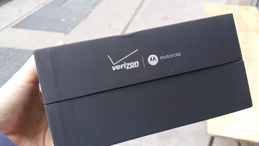
Or so we thought. The old one still shows up on the front of the Droid Turbo 2. At first I thought it may be because it hasn’t established a textless glyph for the new logo, but even the phone’s packaging still uses the old branding.
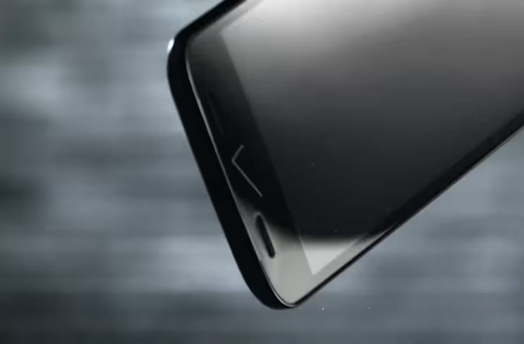
Okay, so maybe it’s because the phone hasn’t been released yet? Well, aside from the fact it’s going on sale in two days, the phone’s first full ad still shows the old logo on the front of the device:

The 💜 of EU tech
The latest rumblings from the EU tech scene, a story from our wise ol' founder Boris, and some questionable AI art. It's free, every week, in your inbox. Sign up now!
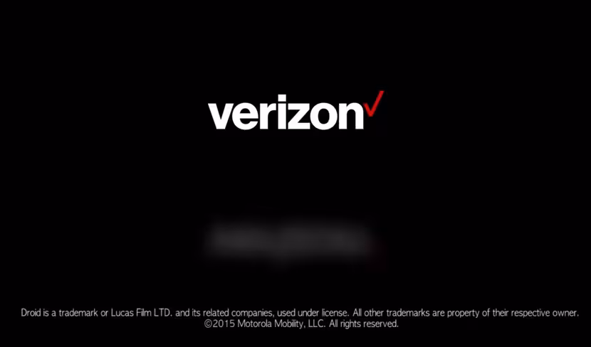
But then uses the the new one at the end of the video:
Say what?
It’s one thing for Verizon to not update all of its old apps and devices with the new logo, but releasing a completely new device without updating its branding is just flat-out lazy. If Verizon is trying to build a ‘friendlier’ identity, it seems like it’s not that commited.
It could be the new Droids began production before the logo change was official, but then Verizon should’ve told Motorola – these decisions don’t happen on a whim.
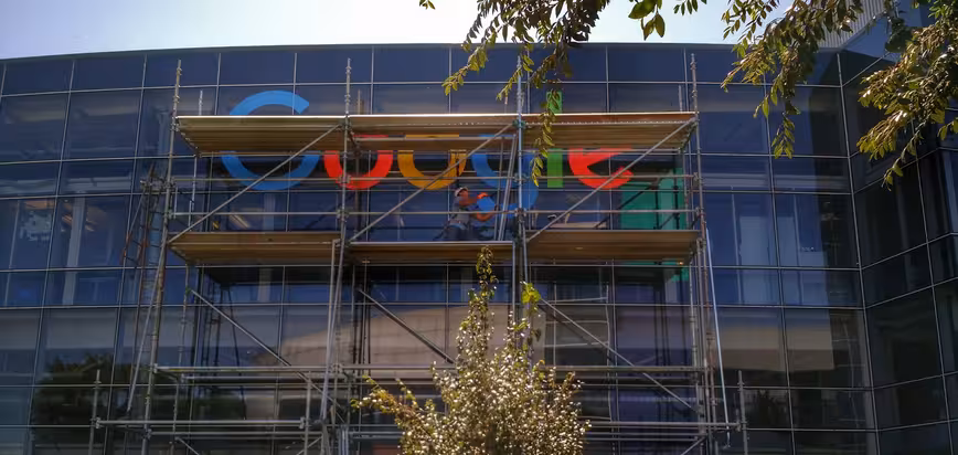
Contrast that with Google, which changed the giant logo on its offices to its new branding pretty much immediately:
Meanwhile, New Yorkers still have to deal with this monstrosity every day:

Of course, no logo at all on its phones would be ideal, but Verizon should at least keep the look consistent where it can. Unless the company is pulling a Gap and reverting to its old design, I guess the new logo was so boring, Verizon forgot about it too.
Get the TNW newsletter
Get the most important tech news in your inbox each week.