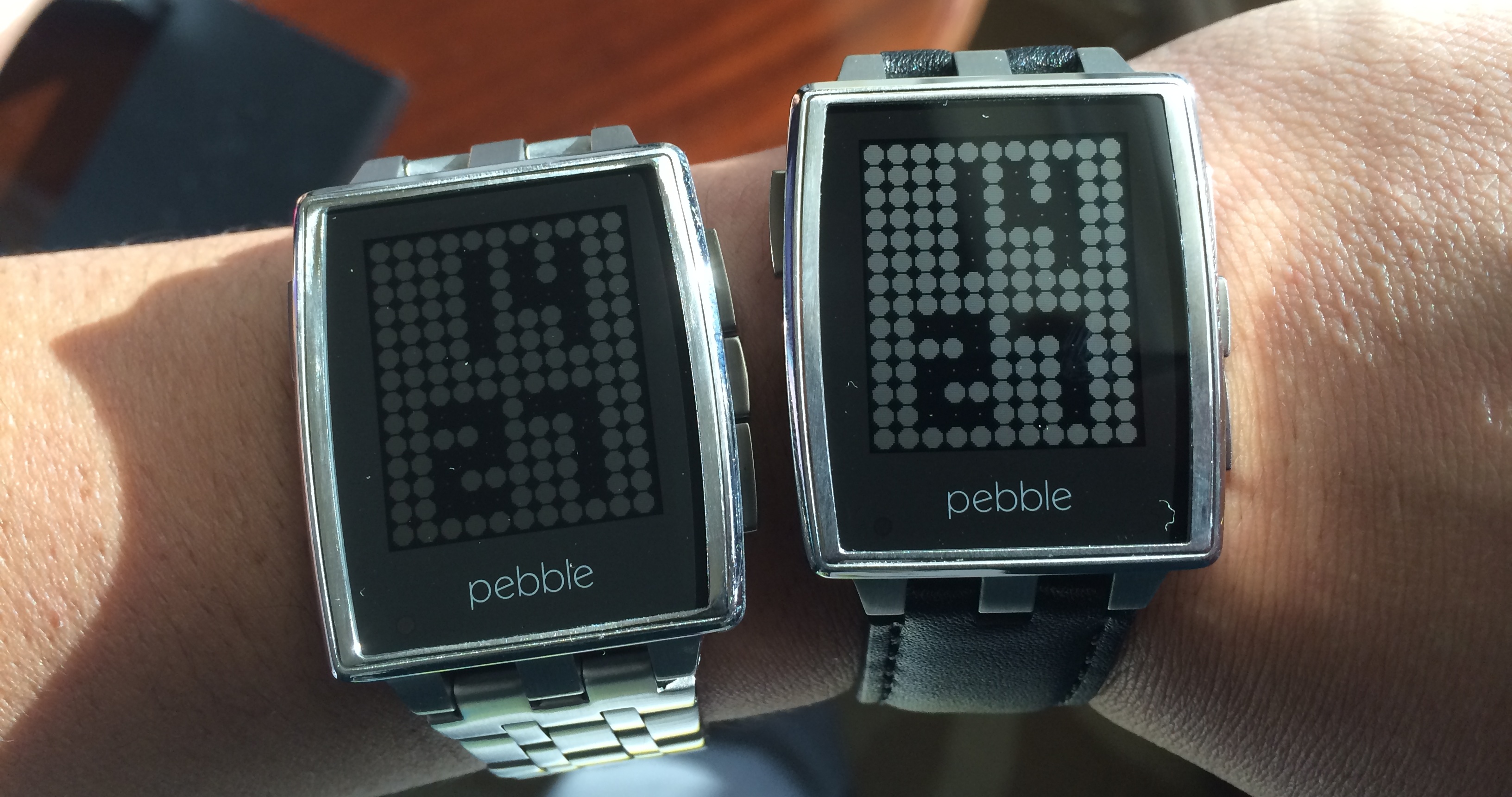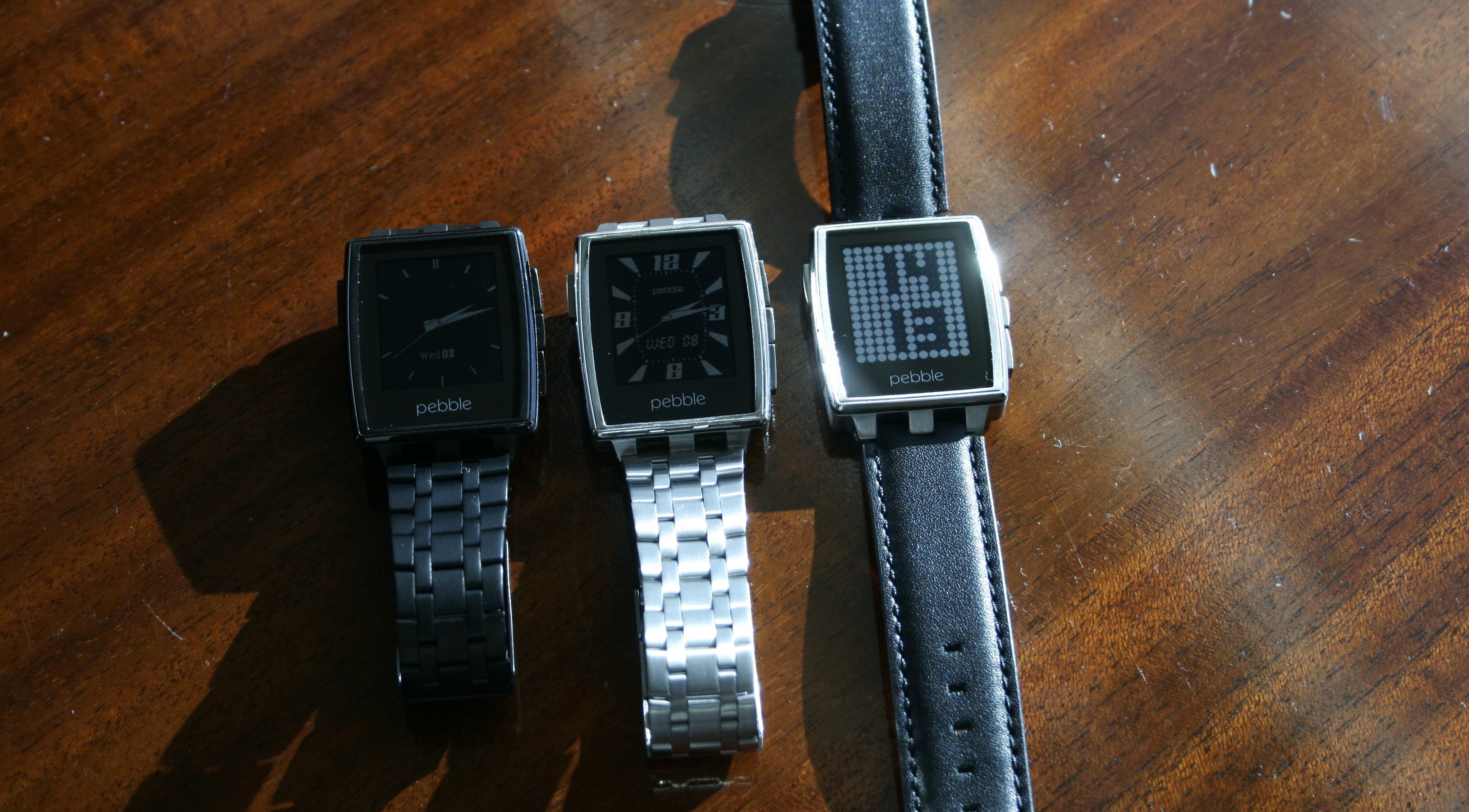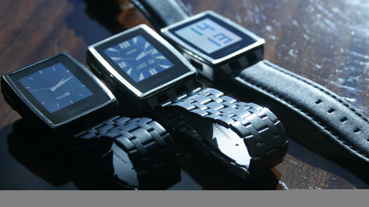
Pebble announced a high-end addition to its smartwatch lineup earlier this week at CES. The new timepiece includes a band with metal links and a leather strap, as well as a few subtle improvements from the original polycarbonate design.
As watches go, Pebble Steel looks pretty non-descript. With either the metal band or the leather strap, the Steel fits in among any number of mid-range watches that you could wear to a business meeting or an evening out. Pebble created Steel as a response to frequent requests from users for a classier design that’s appropriate for all sorts of occasions. The only big difference in appearance between the Steel and a watch used for keeping time is that its watchface is thicker.
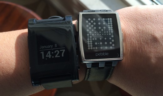
Meawhile, as smartwatches go, Pebble Steel is the best-looking one I’ve seen (caveat: that’s not saying much). I’d still like to see a smartwatch design that offers up a modern design without looking like deformed robot detritus, but for now I’ll settle for one that blends in among dumbwatches.
Steel costs $249 and begins shipping on January 28. It also includes a new tricolor LED that will be used for notifications when Pebble opens it up to developers. The new design shortens the length of the watch by 4mm from lug to lug, and it also runs the antenna along the outside of the watchface for better signal propagation.
Pebble evangelist Myriam Joire also took some time to show off some of the new apps coming to the platform when the company opens up its Pebble appstore at the end of the month.
The Foursquare app works great on the Pebble, offering one-button check-ins. I’m borderline religious with my check-ins, but whipping out a phone whenever I get somewhere isn’t always appropriate. Being able to check-in quickly from the watch is killer – assuming, of course, that you actually care about Foursquare.
Yelp’s Pebble app also adds a ton of utility. You’ll be able to shake your wrist to get a recommendation on a nearby place. You can scroll through nearby venues and even click through to see reviews. I’d advise against reading a full review on the Pebble’s tiny screen, but snippets will help users better make up their minds.
We took a quick look at upcoming Pebble apps from Pandora, ESPN and Mercedes and were pleasantly surprised by how well-thought out they were. Rather than trying to mimic a full native mobile app, the developers thought through simple micro-interactions so you don’t have to pull out your phone that often.
With Steel and the upcoming app ecosystem, Pebble has proven again that it’s pretty much the only smartwatch maker that’s doing it right. As Pebble expands beyond notifications to deeper third-party app integrations, things are going to get even better.
Related: Qualcomm Toq smartwatch review: An interesting concept with unfortunate execution
Get the TNW newsletter
Get the most important tech news in your inbox each week.
