HTC’s newest addition to its One series, the One max, might only just have been announced today, but I was fortunate enough to spend time getting acquainted with the monster handset and had the chance to put it through its paces.
Prices haven’t yet been announced, but we can expect it to be planted firmly in premium territory. So, is the One max size with a purpose or is it simply ticking the boxes to dabble in the phablet category? Read on to find out…
Design and hardware
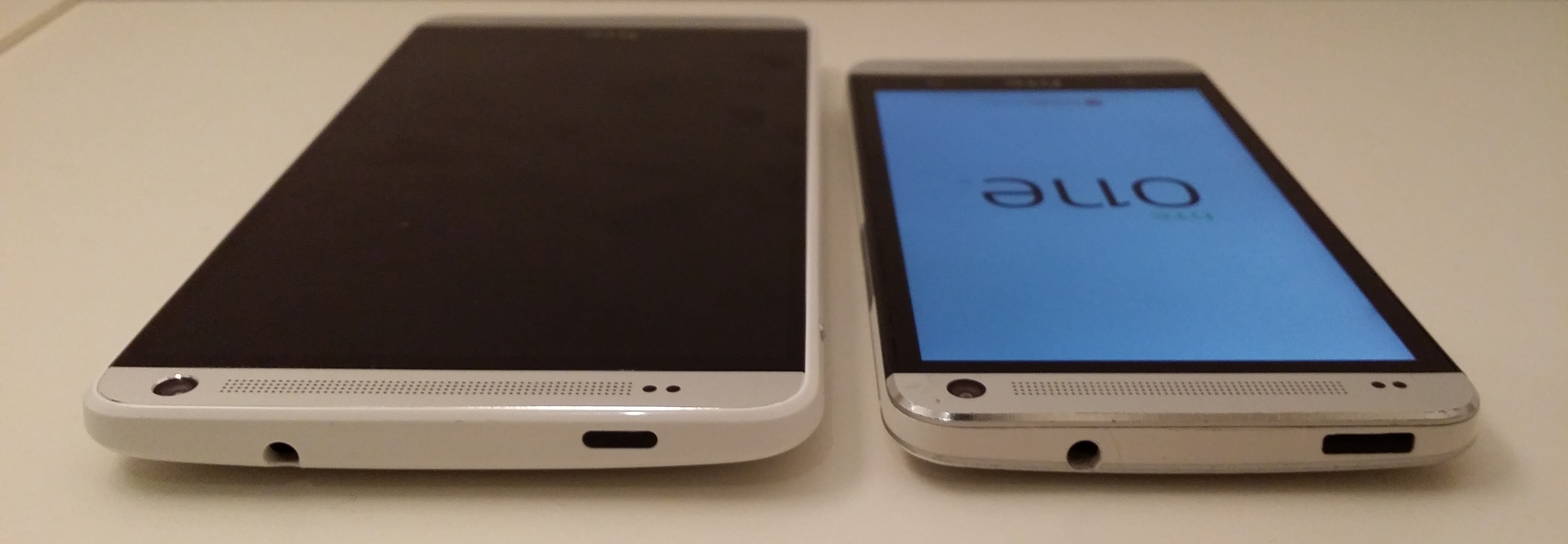
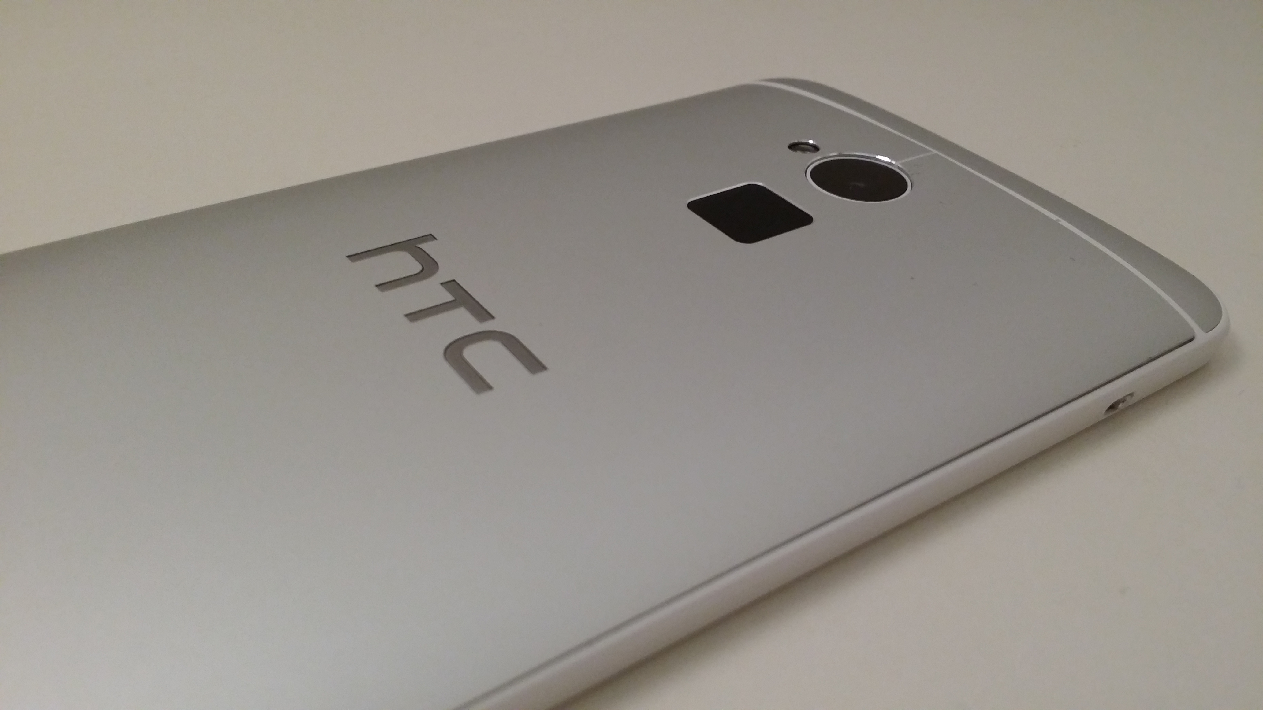
The HTC One max, at first glance, looks just like the One and One mini keeping as it does the all metal chassis of the series. Sadly, it also keeps the plastic surround found on the One mini rather than the metal surround found on the One.
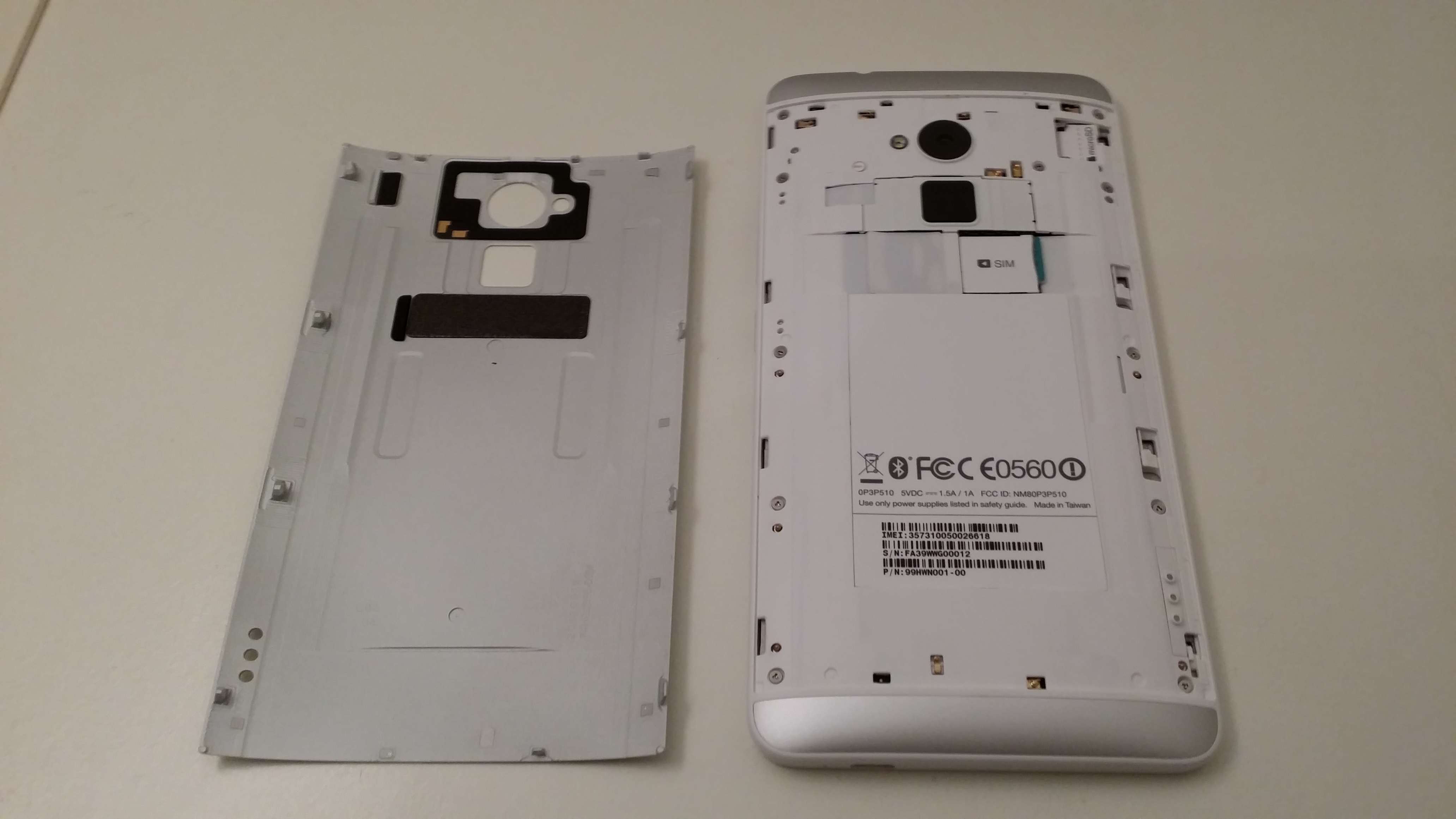
The design also differs slightly from the other devices as the rear panel is removable on the One max. Before you pry it off, you need to slide the metal catch on the left-hand side of the chassis. It’s easy enough to remove, but it’s a little fiddly to get back on again. Still, it’s not a deal-breaker.
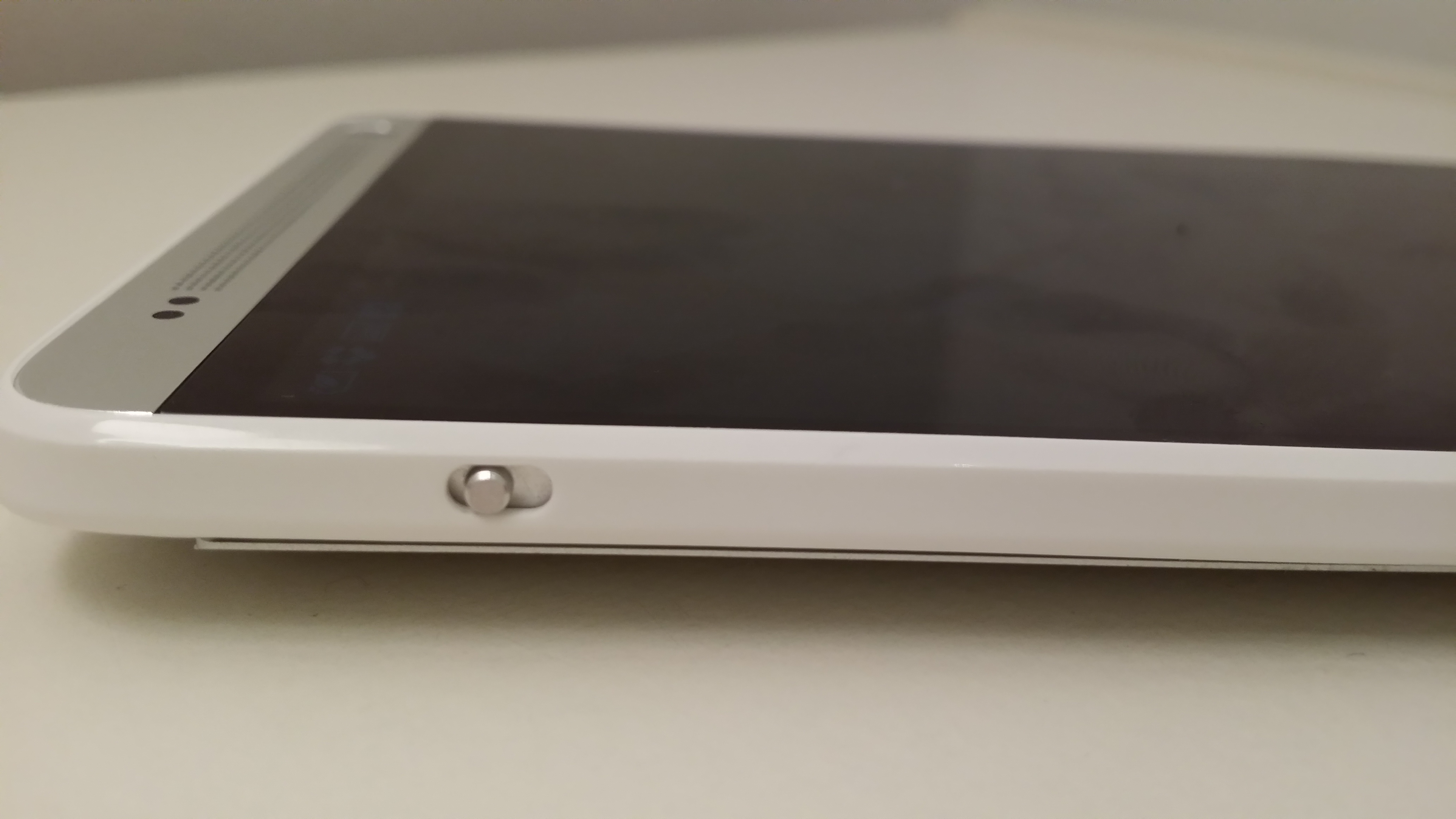
One of the other design changes is the decision to move the power button from the top of the phone to the right-hand side instead. This is a little confusing at first as it still looks like there’s a button on top, but it’s actually an IR blaster port for controlling your TV or set-top box.
Underneath the removable rear cover you’ll find the micro SIM slot and space for a micro SD card; it will support cards up to 64GB in capacity. While it’s the first to support micro SD cards in the range, and the extra storage always comes in handy, it’s a shame it came at such a cost to the overall design, which feels notably chunkier than the others.
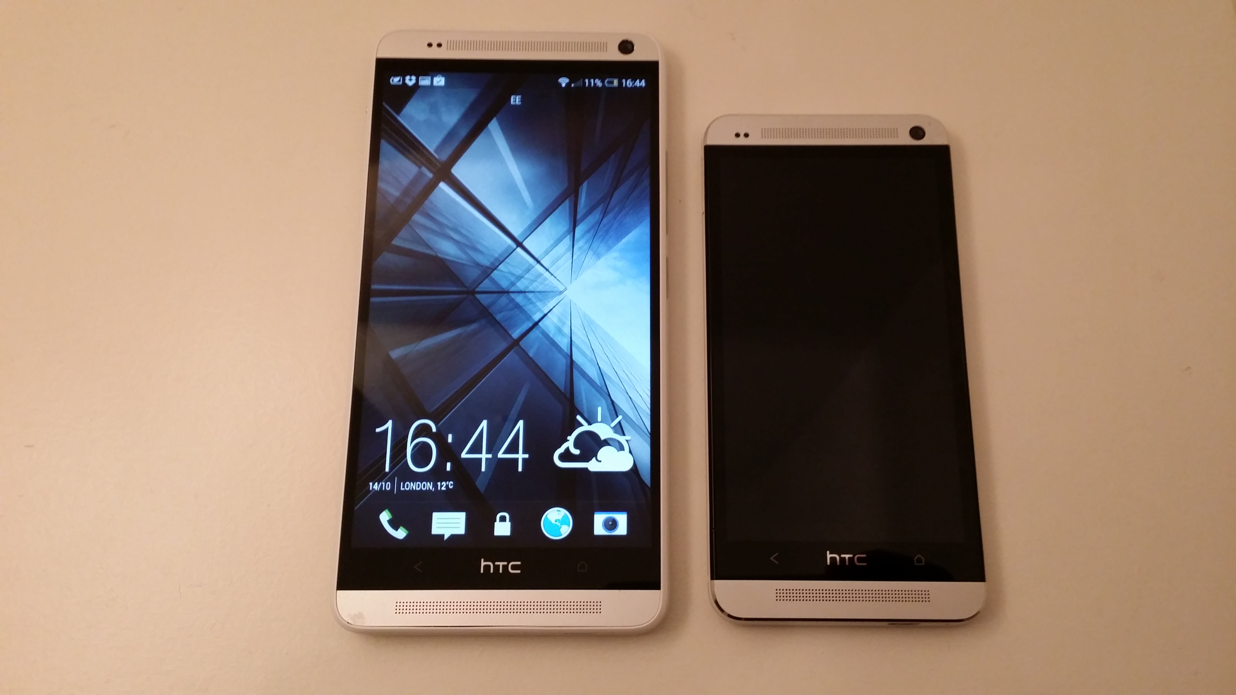
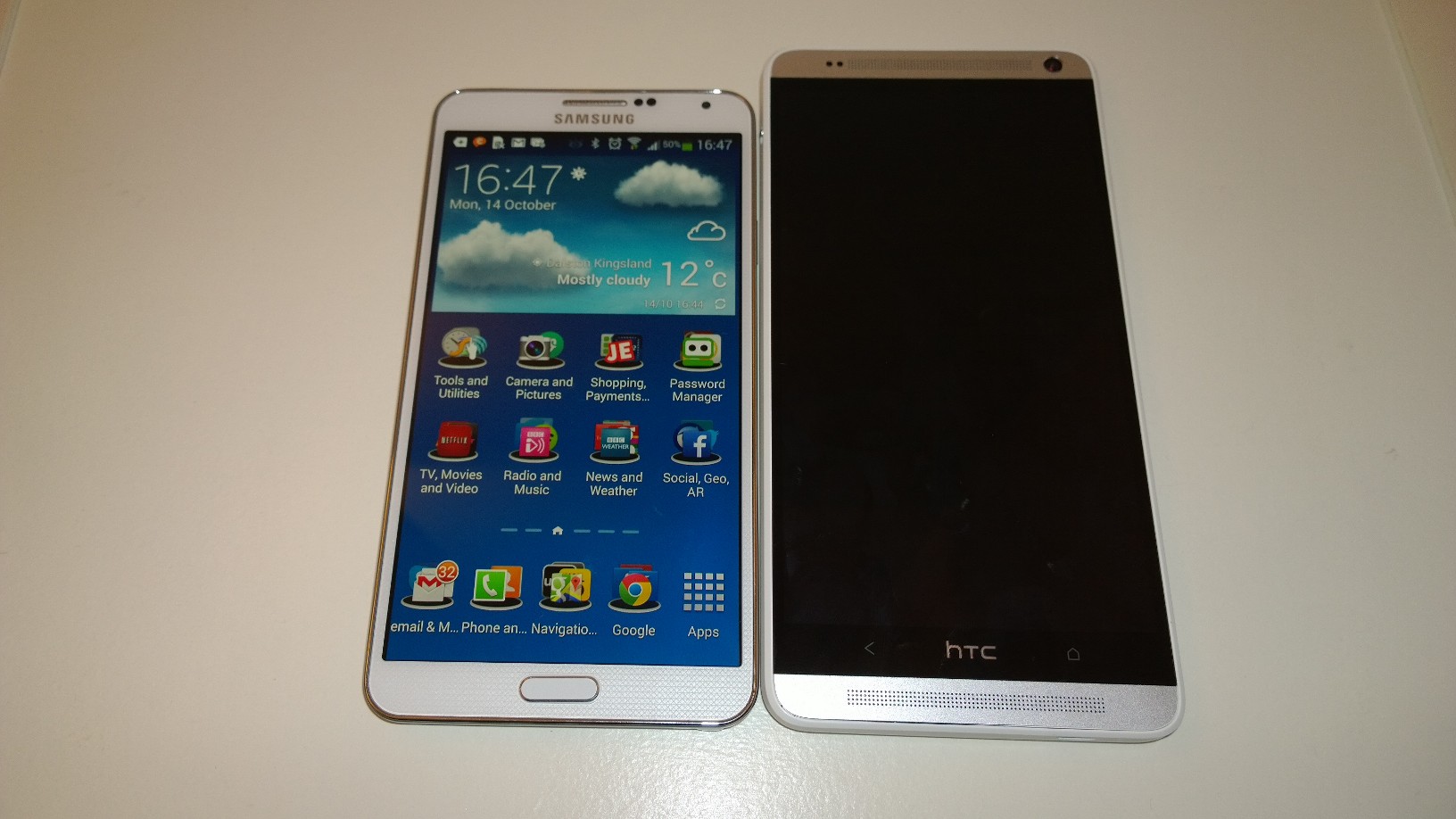
However, try as you might, it’s hard to ignore the size of the One max. With official dimensions pitting it as 164.5 x 82.5 x 10.29mm, you certainly can feel it in your pocket. I say ‘in’ but poking out the top of your pocket is more accurate, as it really is a struggle to fit in, and I’m no skinny jeans wearer.
More than the size, however, you’ll notice the weight, all 217 grams of it.
To put that in perspective, that’s nearly twice the weight of the iPhone 5s at 112 grams. Normally, a little excess weight on a device doesn’t bother me too much, but in this case, it goes too far. Way too far. For comparison, the similarly sized Note 3 weighs 168 grams.
For any sort of prolonged usage, you’ll want to use both hands – but that’s likely the case anyway if you’re writing a message or an email, due to the physical stretch required to type and hold the phone with one hand. Below is the HTC One max next to the Note 3 – which is hardly a small device itself and has a 5.7-inch display.
Naturally, a lot of that weight is the responsibility of the 5.9-inch 1080p display. Aside of the onward effect it has on weight, battery life and general portability of the device, I’ve got no complaints whatsoever about the One max’s 349 PPI offering. As with other range-leading devices, images are sharp and crisp – with no sign of bleeding or fuzziness. It’s plenty responsive too, and won’t have you pawing at the screen multiple times simply to carry out your chosen task.
Other core specs include the same Ultrapixel camera found in the One and One mini, a large 3,300 mAh battery, 1.7Ghz quad core processor, 4G LTE support, Bluetooth 4.0 and internal storage of 16GB or 32GB, expandable via that micro SD slot.
Fingerprint sensor
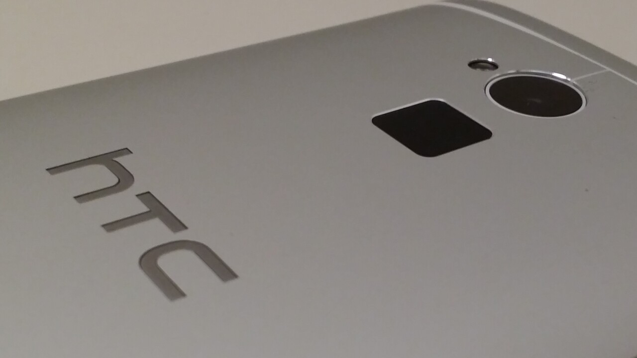
One of the most notable aspects of the HTC One max is the fingerprint sensor on the rear.
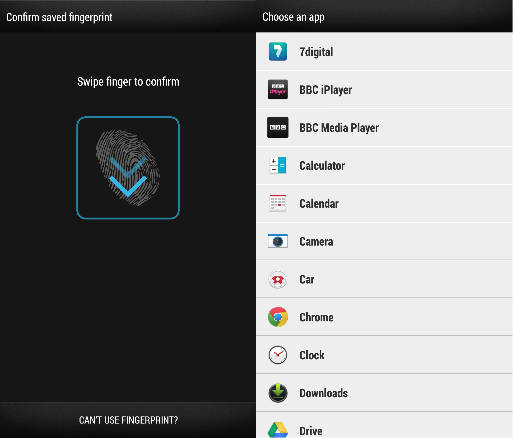
Used primarily for unlocking the device, you simply assign your chosen finger to the sensor and swiping your finger on it unlocks your phone. In theory.
As has often been the case with fingerprint sensors, it doesn’t work very well a lot of the time. Indeed, if like me, you made the mistake of swiping your finger straight down when setting the fingerprint initially, this is how you’ll have to do it each time to unlock it, which is made harder by the size of the phone.
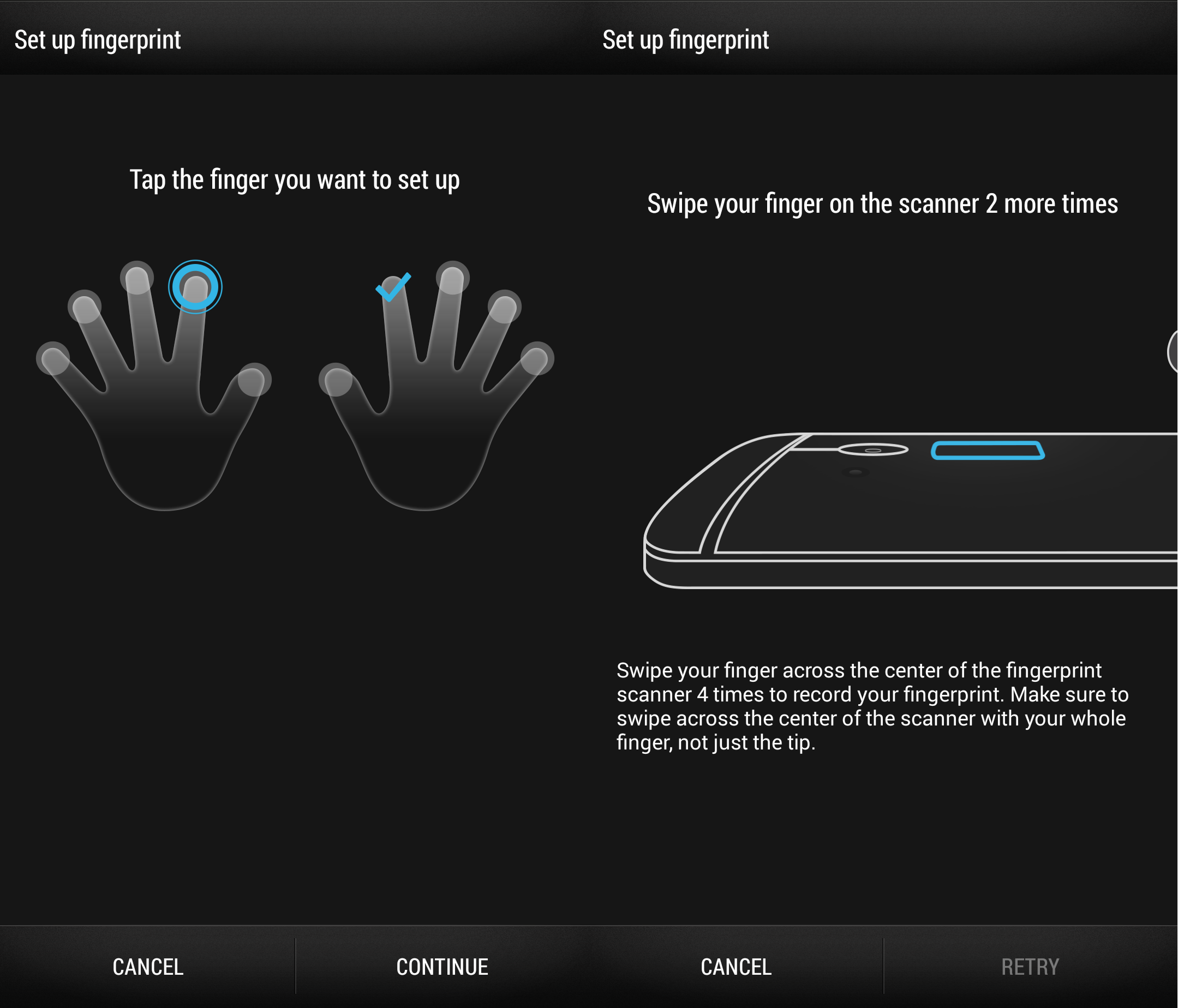
Perhaps it’s just an issue of getting used to it, but in my testing, it took somewhere between three and five attempts to unlock the screen every single time. Thankfully, when setting up the fingerprint reader, you’re also prompted to set up a password, so there’s no obligation to stick with it.
The sensor can also be assigned to automatically unlock and then launch an app, and can support up to three individual fingerprints. When you’re setting it up, it suggests some of the things you might like to use it for, but you can also click the ‘choose from all apps’ option to set it to launch whatever you’d like.
Software
The software on the One max is largely a known entity thanks to being so similar to the One and One mini, but one of the changes it does bring is the introduction of Sense 5.5, sitting atop Android.
Android 4.3 (Jelly Bean)
While the differences between Android 4.2 and 4.3 are mostly minor, it does add support for OpenGL ES 3.0 (for better gaming graphics), dial-pad autocomplete, restricted profiles and a slew of other features.
If you’ve used a One or One mini, you’ll be perfectly at home on the One max because it’s largely identical.
You still have the on-board TV guide and remote control options (in conjunction with the IR blaster) and most of HTC’s other software, like Car mode is also present on the device. In short, it offers little beyond the same experience as its forerunners.
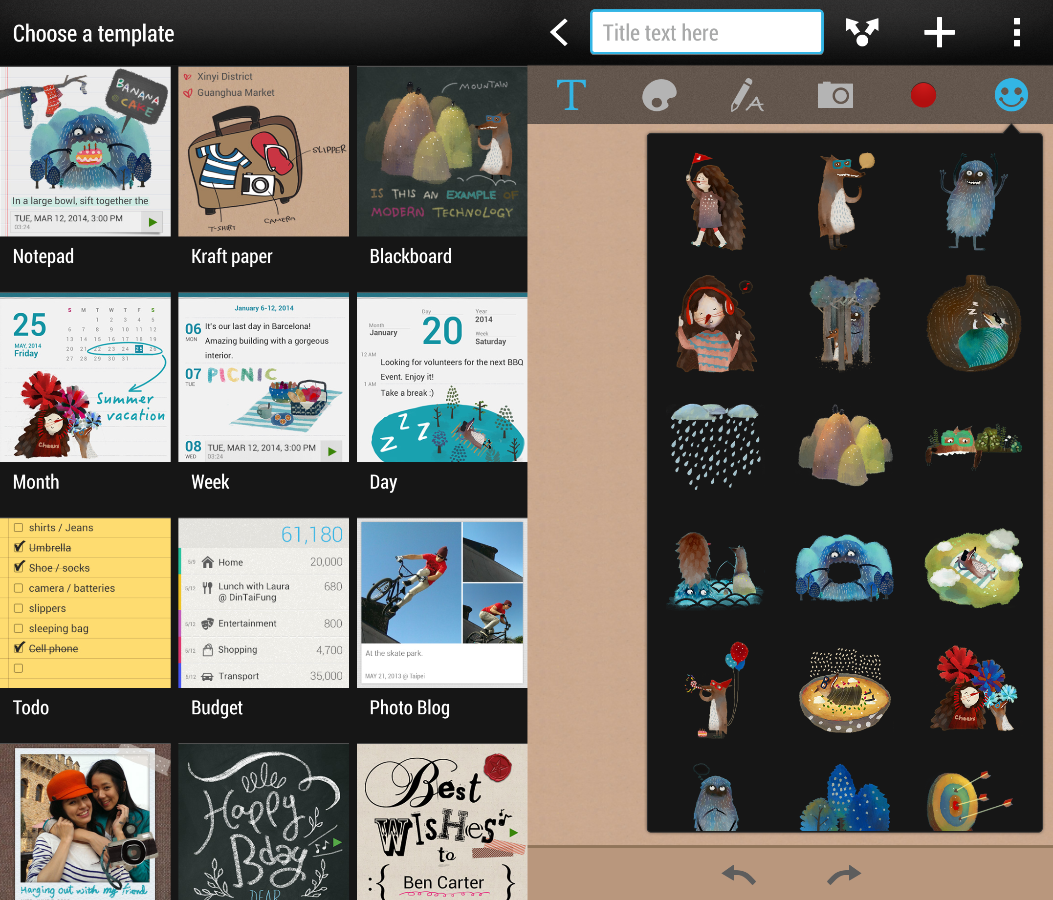
However, one addition designed to make the most of the supersized display is HTC Scribble, pictured above. This feature allows you to create a scrapbook of content in note form. For example, you can create a new Scribble note (from scratch, using a template, from Web content or from a calendar entry) and add text, photos, audio recordings (you can record directly from within Scribble), pictures that you’ve drawn or handwritten messages. You can also choose from perhaps the strangest set of preset note taking icons I’ve seen.
Naturally, as it’s still the Google OS powering it all along, you’ll also get access to the usual Google Play app, music and video content, as well as HTC specific recommendations, too.
BlinkFeed updates
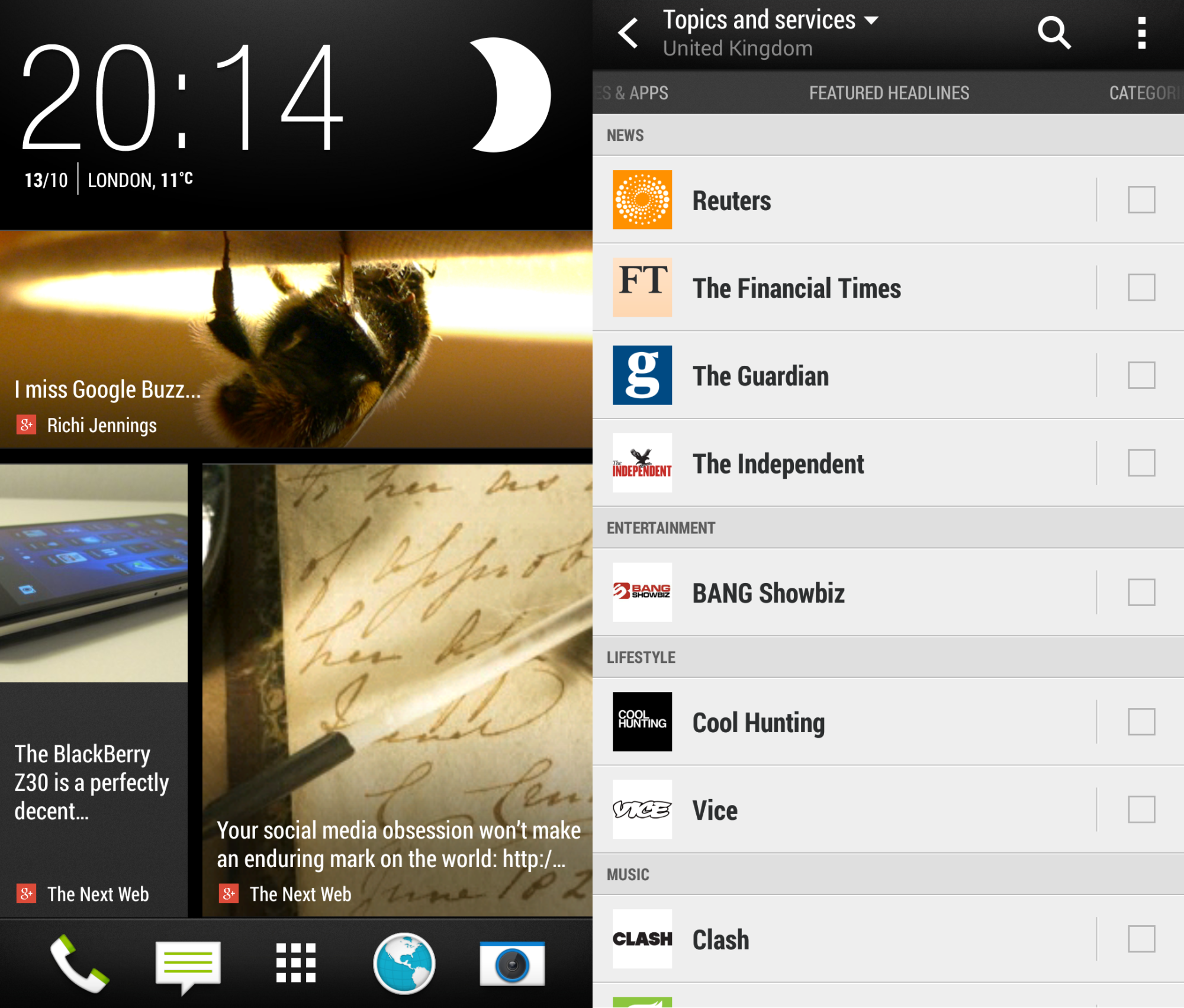
As part of the Sense 5.5 update, the BlinkFeed news and social aggregation system on the front page has undergone a few tweaks – nothing major, just a couple of things to make it a bit more useful and easily accessible out of the box.
For example, allowing it to personalize recommendations based on your Facebook profile likes, posts and other information is a quick way to pre-populate the feed with (theoretically) relevant info when you’re first getting started.
Its suggestions were actually pretty solid, but to get the best out of BlinkFeed, you’ll want to go through and add your favorite content sources from the list.
New for Sense 5.5, BlinkFeed now has an offline reader mode in which you can specify how much of the article you want synced for offline access, and it can also now support RSS feeds (an oft-requested feature). The update also introduces Google+ and Instagram integration, in addition to Facebook, LinkedIn, Twitter and all the other services it already supported.
You can also create custom ‘channels’ of content that will show up in BlinkFeed based on keyword searches, should you wish.
If BlinkFeed is more of an annoyance than a bonus for you, there’s the option to turn it off this time around – a lot of people will be thankful for that, though I don’t mind BlinkFeed, personally.
Zoe and Highlight Videos
The other biggest change to the software in comparison to other One devices are new sharing options for images captured using the camera in ‘Zoe’ (a Zoe photo captures a short video clip of just a few seconds along with audio, rather than just a still image) mode, and new creation and editing options for Video Highlights clips.
Where Zoe images used to be based on a proprietary format that meant you needed to upload them to HTC Share before posting them on your chosen social network, this restriction has now been removed so you can now post them straight from your camera. If you’re anything like our very own Nick Summers, you’ll be ecstatic to hear that there’s now a GIF editor on board too.
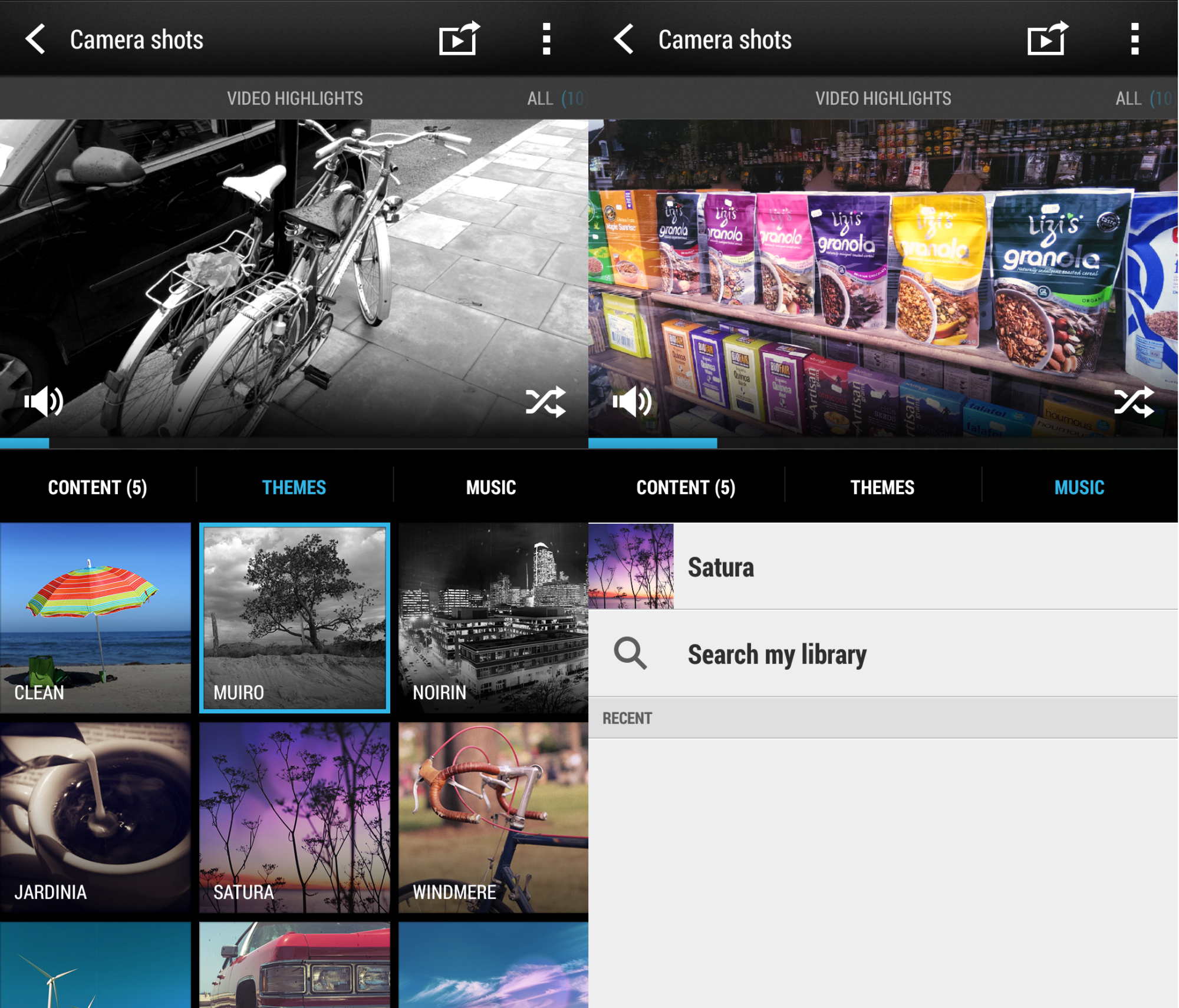
The Highlight Videos, which automatically create short videos using still images and Zoe photos, also has a couple of new options, including the ability to use your own music as a soundtrack (including the ability to specify exactly where it starts) for the video and more preset theme options for different visual effects. The thirty second Video Highlight restriction has also been removed now too, so you can make them as long as you want.
IRL
In use, the One max performed well for the 48 hours or so I had my hands on it. It didn’t seem to struggle with multi-tasking and no software gremlins seemed to raise their heads. However, while it’s a good indication, two days of use isn’t really long enough to ascertain whether there any potential problems on the horizon.
For calling, the One max performed well – and perhaps unsurprisingly, offered a good loudspeaker/speaker phone experience. While I did use it for calls without a headset, it never failed to feel just a little bit ridiculous to do so.
Texting and emailing was an even more awkward affair; I had to resort to two-handed landscape mode for longer responses, simply to save on thumb stretch.
Battery life from the high capacity power pack in the back was as expected – you’ll need to charge daily. As always, it depends on usage, but watching an exactly one hour programme on BBC iPlayer used exactly 10 percent of the battery (with default screen settings). Extrapolating, this means you should be able to stream (over WiFi in this case) around five hours of video on the One max and still have half a tank. That’s really not too shabby for a device with a screen this large. Still, remember to charge it.
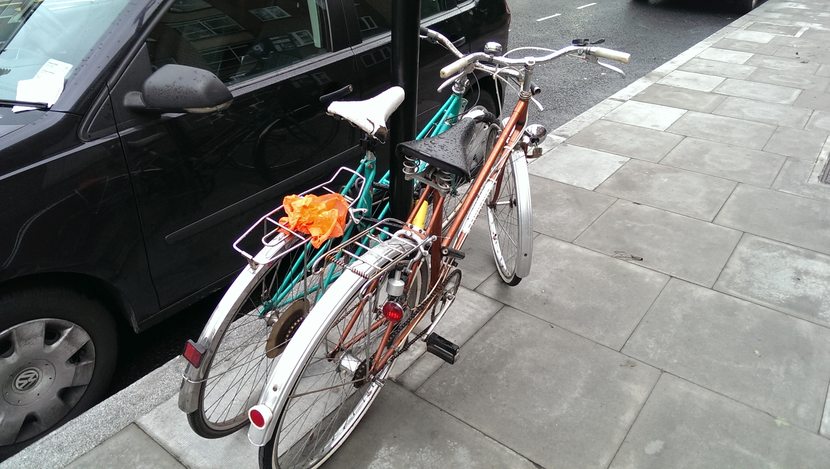
The Ultrapixel camera, the same one found in the previous devices, makes another outing here and performs (as you would expect) on a comparable level, quality-wise. Below, you can see a couple of examples shot on a slightly miserable, but still quite bright, day in London.
The only major addition to the camera software is a Dual Shot mode, which allows you to take a picture using the front and rear cameras simultaneously, as also seen on some Samsung devices recently.
A step too far
The point of phablets like the One max is that it offers a larger display and therefore opens the door to new uses for the device. For example, in Samsung’s range, each member of the Note series has included the S Pen stylus, allowing for handwriting recognition, drawing of pictures and a whole load of other things. Not to mention true, side-by-side multi-tasking. In contrast, the size of the One max’s display seems simply to provide a bigger screen for the HTC One/One mini and offers little in terms of added value software or features above these devices, particularly as the updates to Sense, BlinkFeed and Video Highlights will eventually filter down to the rest of the range.
For me, the HTC One max is a swing-and-a-miss, a handset that HTC didn’t need to build and that feels like it has been done in a hurry. It may well appeal to some people that just love larger screens, but for me, if that’s the route you want to go down, there are better options out there that provide a more refined experience, a sleeker chassis, less of a rock in the pocket and a host of software aimed at making the most of the extra screen real-estate – like the Galaxy Note 3. The only unique thing the One max tries to offer is the fingerprint sensor, but that doesn’t really work so well.
Ultimately, If I was choosing a handset in this size range, I’d be hard pushed to find a reason to choose the One max over some of the competition.
Get the TNW newsletter
Get the most important tech news in your inbox each week.
