Finnish-based startup Jolla unveiled the first smartphone running Sailfish OS, its new mobile platform created from the ashes of Nokia’s abandoned MeeGo project, at the tail-end of last month.
It’s an unprecedented device, opting for an industrial design that uses two distinct and utterly contrasting parts. A sleek top half houses the display and core components, while a colorful, rounded bottom half offers additional themes and content through a separate chip.
A reservation system has already opened on the Jolla website ahead of formal pre-orders, but a full examination of the platform’s capabilities is yet to emerge. TNW was given the chance to sit down with the Jolla smartphone and see how it performs in its current pre-release form.
Hardware
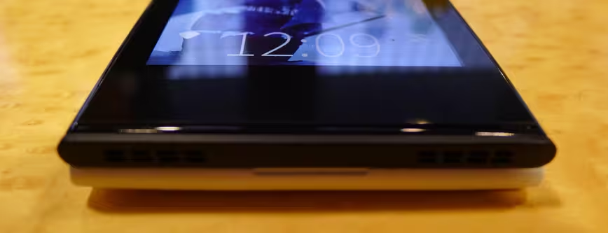
Holding the Jolla smartphone is pleasant enough. Most of the construction is plastic, although it has a noticeable weight and durable feel that takes after its older and larger Finnish sibling Nokia.

There are no physical buttons on the front of the device, allowing the 4.5-inch display to take center stage. Jolla is yet to reveal the screen resolution, but it’s a far cry from the 1080p offerings found on the HTC One and Samsung Galaxy S4.
The side has a volume rocker and power button sandwiched between the two sections – it’s actually fitted to the top-half, which is where almost all of the components reside – and there’s a top-mounted headphone jack and micro USB charging port.
It’s certainly different, but the jury is still out on whether the design is actually any better than its competition. The Jolla smartphone is comfortable enough in the hand, but just doesn’t give off the same premium, high-end feel enjoyed by the iPhone 5 or HTC One.
Lock screen
Double-tapping the screen wakes the device and displays the Sailfish OS lock screen. The clock is displayed in crisp text and there’s a series of icons along the left-hand edge notifying the user of new emails, messages or missed calls.
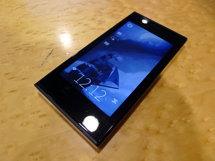
It’s not possible to jump to any of the related apps from the home screen, although it’s worth emphasizing here that the device was running pre-release software. Jolla could well be working on this for its official launch later this year.
Home screen
A swipe up from the bottom of the display reveals the home screen. Four icons are nestled in the dock and there’s space for up to nine app cards, or thumbnails above.
These show the apps currently running on the smartphone in real-time. The user can tap once to jump into the app, or close any of them with a long-press, which results in a number of small, circular icons with a cross symbol similar to that used in iOS.
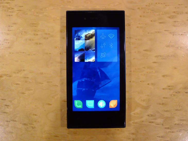
Gestures are prevalent here too. Long-pressing an icon and then swiping to either the left or right triggers additional actions that are executed as soon as the app is re-opened. A brush to the side while tapping the Contacts app, for instance, went straight to the standard dialler.
App tray
Another flick up from the bottom of the display shows the app tray, with up to 24 apps in a neat little grid. The icons here are simple and rather beautiful actually, often surpassing the latest offerings in iOS 7.
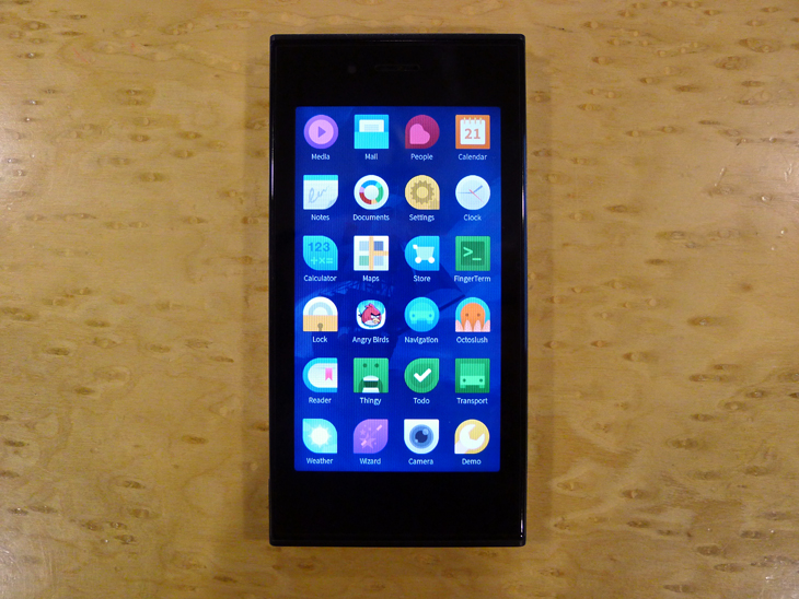
There’s no folders to speak of just yet, although Jolla confirmed that they’ll be available when the smartphone launches this year. The home screen also supports multiple app trays, creating a new screen automatically when the current one is filled.
Store
The final section of Jolla’s vertical interface is the store. Although there’s a dedicated app for more immediate access, it’s a sensible design choice that subtly encourages a quick glance to see what’s new.
Suggestions appear from prominent Jolla owners or those in the user’s network, giving a more curated and personalized feel to the store. Jolla says search and a more in-depth discovery process will also be in place soon enough. It’s a little rough around the edges, but the company later confirmed that this would be improved and changed before launch.
Pulley menu
A final swipe from the bottom of the store returns the user to the initial home screen. Swiping down from the top of the display, from anywhere in the Sailfish OS, reveals the Pulley Menu with a number of shortcuts such as general settings, the camera and smartphone profile.
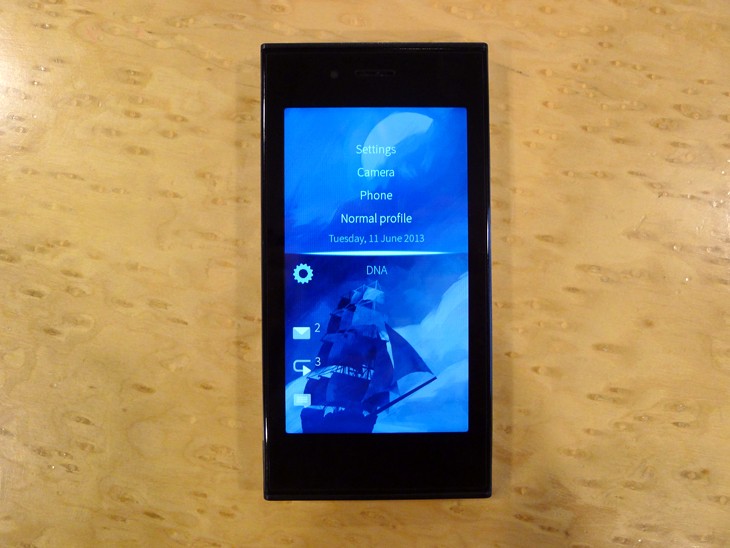
It’s simple at first glance, but Jolla has combined subtle sounds and rather advanced haptics so that the user can naturally jump to a shortcut without looking at the device.
Messaging
Jolla’s unified messaging app contains all of the users’ ongoing conversations. It’s all fairly straight-forward here, with the usual left and right-aligned messages to denote the sender and recipient. The type icon in the bottom right-hand corner of the screen, however, signals the service which the message is being sent from.
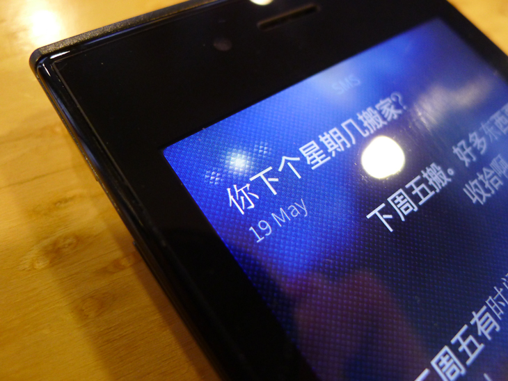
Tapping through to an individual conversation also shows three circular dots in the top left-hand corner. These are used to notify the user of secondary screens, accessible with a horizontal swipe. It’s a small, but simple tool which should ensure that users don’t feel lost when navigating Sailfish OS.
Camera
The camera wasn’t up and running yet in the device that we tested, but it was still possible to take a quick look at Jolla’s prototype camera app.
Again, simplicity has been the driving force here. There are two circular icons at the bottom of the screen, with the right-hand dial being used for flash, macro and video recording. A tap on the symbol at the opposite end of the display, meanwhile, shows a number of shooting modes common in compact cameras, such as Auto, Macro, Action and Scene.
It’s simple, but effective. Again, Jolla has emphasized that this interface could change before launch though.
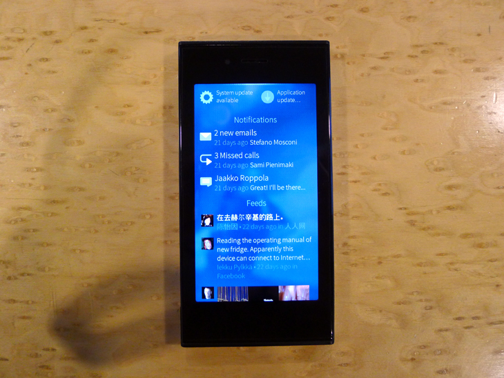
Notification center
Sailfish OS also comes with a fairly robust notification center, which includes alerts for emails, missed calls and messages – the same as those found on the lock screen – as well as a unified feed of social network updates and alerts for firmware and app updates.
Wrap up
The first Jolla smartphone is still in development, but it’s already shaping up to be a robust and refreshing proposition. The vertical screen layout is a nice change from Android or iOS, and the overall design is rather beautiful. The apps are sleek, it’s nippy to use and general navigation is a far-cry from the mess found on BlackBerry 10.
The question, however, remains the same. Is Jolla doing enough to carve out its own niche in the smartphone market? Is the “Other Half” just a gimmick, or a feature that consumers are crying out for?
Get the TNW newsletter
Get the most important tech news in your inbox each week.