Changes in Facebook’s site design tend to upset and infuriate users who are used to the way it looks. So it’s understandable that the company treads lightly when it updates its layout.
It seems like Facebook is now taking cues from Messenger; the chat windows in the site now look a lot more like the messaging app’s interface, with a matching color palette and a new set of icons.
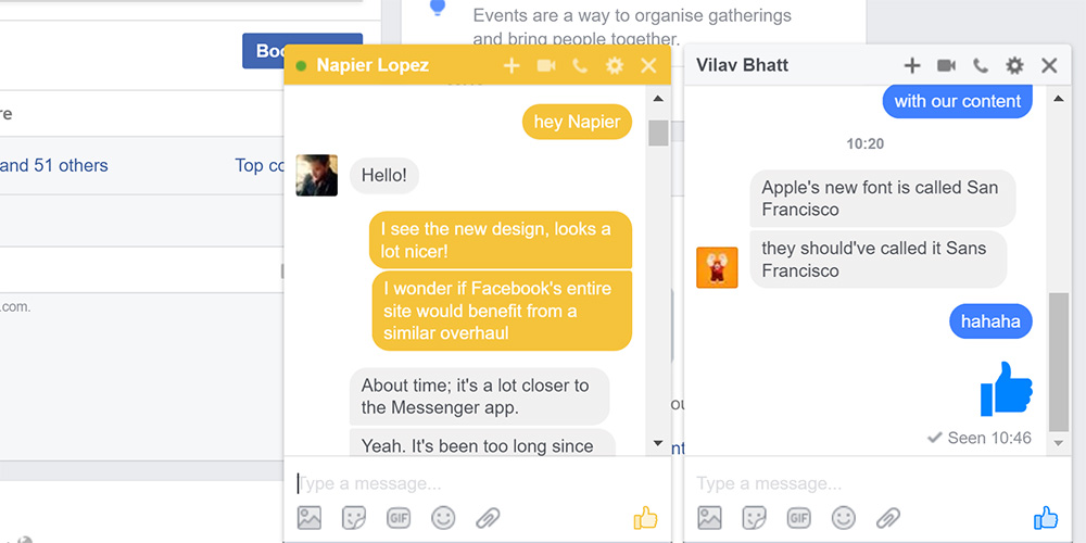
The new chat windows for conversations and for displaying your lists of online contacts are much more attractive than the old ones. In addition, they adopt the accent color you’ve chosen for each contact in Messenger, which makes it easier to differentiate between conversations at a glance (and hopefully avoid posting messages in the wrong window).
At this point, it seems like Messenger’s design language is cleaner and more modern than Facebook’s site, with the latter beginning to look a bit dated. Plus, the discrepancy between key elements, like the iconography, color palette and emoji are jarring.

The 💜 of EU tech
The latest rumblings from the EU tech scene, a story from our wise ol' founder Boris, and some questionable AI art. It's free, every week, in your inbox. Sign up now!
Hopefully the change to the chat window is just the first of many in a series of updates to Facebook’s tired site design.
There’s also another little difference that the company is either testing or rolling out gradually: it’s no longer including descriptions of trending topics. Instead, each topic now only indicates how many people are talking about it.
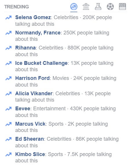
It’s possible that this is a measure to remove any chance for Facebook’s human editors to introduce any sort of bias, after it was accused of manipulating its Trending Topics section to suppress content from conservative media back in May.
We’ve contacted Facebook to learn more and will update this post if there’s a response.
Get the TNW newsletter
Get the most important tech news in your inbox each week.