Facebook Messenger is getting a major design refresh on Android.
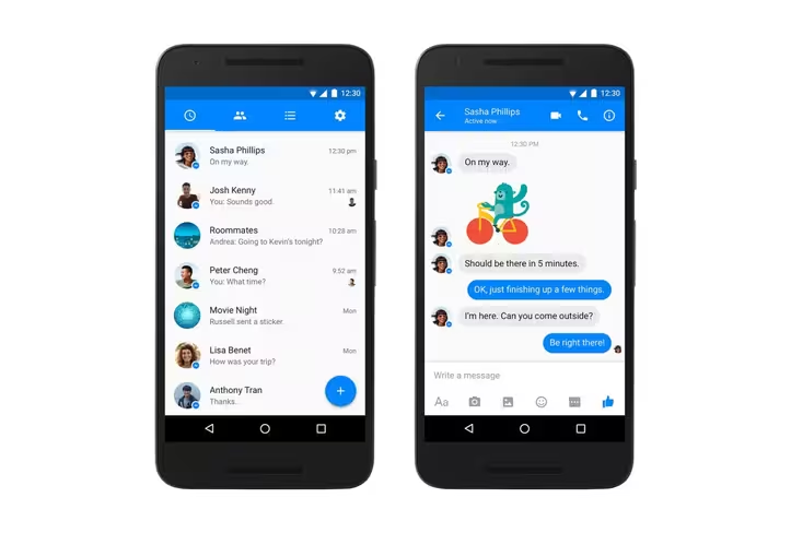
Head of Messenger David Marcus took to social media today to announce the new look, which uses a variety of Material Design elements, including a floating action button for starting new chats.
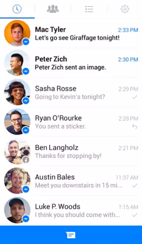
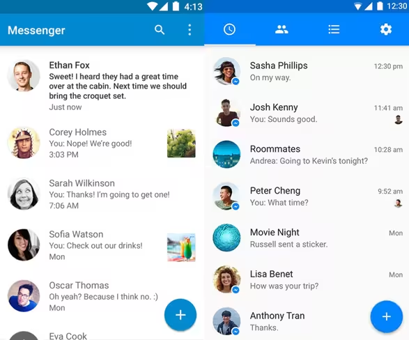
For comparison here’s the old version:
And here’s the new one:
That said, there don’t seem to be any new features in tow; as far as we can tell it’s all about the new look. As for why it took so long for the redesign, Marcus says:
“Any major redesign of an essential app used by hundreds of millions of people around the world is painstakenly hard, and that’s why we took every precaution to ensure you’d truly enjoy this evolution.”
So basically, Facebook just wanted to get it right.
It’s also worth noting that this is the first time Messenger has gotten a distinct look on any particular platform – it was basically identical on the Web, iOS and Android.
And while the old standard UI may have matched iOS’ aesthetic decently, the new look on Android looks much more in line with the design philosophy we expect on team Google.
The only caveat is that the chat list looks remarkably similar to Google’s own identically-named Messenger, down to the similar shade of blue.
Let’s just hope you don’t end up sending a raunchy message to the wrong person when the update begins rolling out later today.
➤ David Marcus [Facebook]
Get the TNW newsletter
Get the most important tech news in your inbox each week.