If you’ve been online today, you probably heard the news already: Facebook announced a completely redesigned News Feed, featuring larger images, a mobile-inspired design that’s consistent across devices, and specialized feeds focusing on music, photos, games, people you follow and all of your friends.
We know. It’s a mouthful. But now that the facts are out of the way, we can dive into what actually makes this update significant: its design.
Opening up the event, CEO Mark Zuckerberg likened Facebook’s new News Feed to a “personalized newspaper.” It’s an interesting comparison, considering the struggles of the newspaper industry and Facebook’s distinct lack of breaking news (that’s Twitter’s bag). Perhaps a magazine would have be more appropriate?
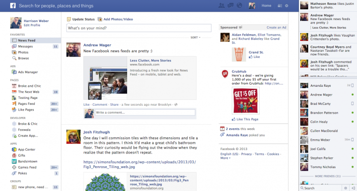
Confusing sentiment aside, Facebook design director Julie Zhuo shared something much more useful to the audience: a key flaw in Facebook’s previous News Feed design. It was, she admitted, “cluttered.”
Zhuo is right; it was horribly cluttered, but the new look appears to be taking turn for the better.
Holy Web App
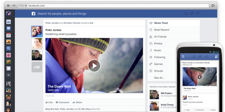
Heavily influenced by mobile, the new Facebook News Feed is distinctly app-like. Working hand-in-hand with the search bar (a sleek change on its own), the visual hierarchy of the design points the user’s eyes directly to the middle column for viewing and sharing content.
Here’s the new design:
And the original look (gah!):
According to Zuckerberg, images make up 50% of total news feed content, which is why imagery now plays a major role. As shown below, photos are now much larger, with overlaid text and slightly rounded corners.
The new left sidebar is prominent as well, merging both navigational elements and Facebook’s chat features atop a smooth, slightly pushed back dark-gray background.
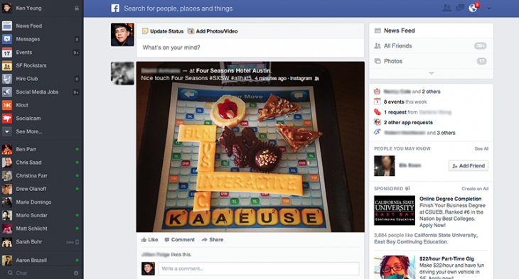
The right sidebar, on the other hand, seems to get lost in the background. Aside from the specialized feeds, which will likely received plenty of attention, the birthday announcements, app requests, “People You May Know” section and ads are easy to ignore — that’s a good thing, at least for users. Businesses may disagree.
How It Feels
Despite the fact that more functionality was added to Facebook’s already bursting feature-set, the new design feels surprisingly spacious. Content is easier to consume, meaning it will get more attention but possibly less clicks taking users off of Facebook.com. That’s both good and bad for third-parties.
There’s also some small, subtle details which make the News Feed a pleasant experience, including the way the right sidebar navigation collapses as you scroll down the feed to make room for ads. Also, “New Story” alerts which pop up at the top of the page are nice; they feel more like a nudge or suggestion than a command.
Another nice surprise: the sidebar can collapse, drawer-style.

The Google+ Comparison
Ever since Google+ launched, people have found comparing it to Facebook irresistible. The comparison is warranted in many cases, especially because both services seem to overlap in functionality and purpose.
With the redesigned News Feed, similarities to Google+ on the desktop include the icon-centric left sidebar navigation, the larger images, the way text is overlaid on images, how all content in the feed is now entirely boxed in and the dedicated games feed/stream.
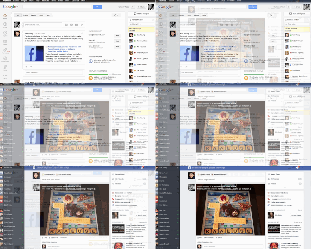
Beyond these similarities (which are certainly present), Facebook’s design language is very different than that of Google and Google+. In other words, to say Facebook ripped off Google+ would be incorrect. Facebook is clearly taking influences from a number of different sources, including the playfulness of Tumblr and countless mobile design trends. The image above overlays feeds from the two services, showing what’s similar and what isn’t.
Flaws
It’s difficult to call how Facebook users will react to change this time around, but to be honest, I don’t believe this redesign will feel as jarring as past ones, as Facebook’s mobile app will help ease the shift for many. Making sure that content (not ads) is more prominent than ever will help.
Facebook’s new focus on imagery, however, causes a problem. In the event that these giant images displayed in your feed are poor quality photos — which happens a lot — the whole page will look like garbage.
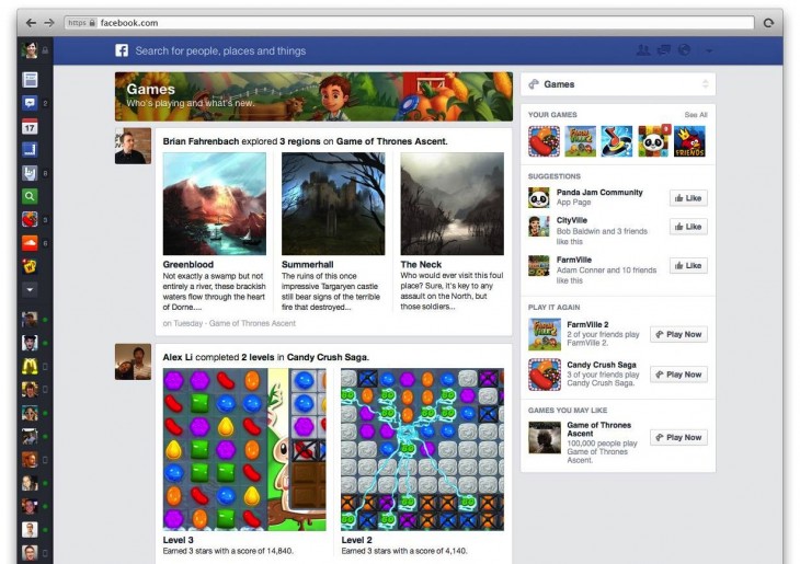
Moving on, the headings for specialized feeds like “Games” (pictured below) leaves more to desire. Somehow, the way the backgrounds and titles work together feels childish and temporary.
One last complaint: Facebook has yet to resolve its infinite scroll issue. If you happen to need to use the site’s footer navigation, you’ll end up chasing it down the page unless you shut off your internet connection. This is a usability error which happens across the Web, and I wish Facebook would set a new standard. Luckily, this issue likely won’t affect many users, despite my sulking.
Overall First Impression
Facebook’s rethought News Feed appears to be a major improvement. At least in the short run, it breathes some new life into the service, and encourages feature parity across devices. It’s also significantly easier on the eyes than previous designs, which makes me feel less eager to leave after checking notifications and messages.
If you’re itching to try the new design out, know that it is rolling out slowly starting today, and will arrive on iOS in a few weeks. An Android release will follow.
What do you think of the redesign?
Image credit: Thinkstock
Get the TNW newsletter
Get the most important tech news in your inbox each week.

