According to All Facebook, Facebook is making changes fast and furiously. Much like the Birthday tweak we noticed, Facebook is not announcing these changes necessarily, but it’s very interesting to see these easter egg type changes pop up.
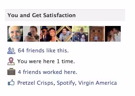
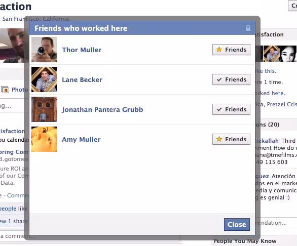
The most interesting change we think is when you visit a company page, you are told how many of your friends have worked there. In the present AND past tense, though, which Facebook makes confusing with their wording.
When you add a company you have or are working at, you’re added to the network for that company on Facebook. Facebook is now showing that data on the company page.

The 💜 of EU tech
The latest rumblings from the EU tech scene, a story from our wise ol' founder Boris, and some questionable AI art. It's free, every week, in your inbox. Sign up now!
All Facebook also points out:
- The site has renamed an old test module “past status updates,” which we’d last seen called “on this day in,” followed by the year.
- Poke notifications have received a makeover: They now include the old icon showing a hand with index finger extended.
- The ticker on the right-hand side of the home page automatically shrinks to take up less real estate on the screen wheneer friend activity on the site subsides. Some have observed the ticker move beneath sponsored stories.
This is a change in engineering practice for Facebook, as the overhaul is fast and furiously. The Google+ team is taking a similar approach, albeit with larger features like Google+ shared circles.
Have you noticed any changes on Facebook? Send us a tip.
Get the TNW newsletter
Get the most important tech news in your inbox each week.