
The end of the year isn’t merely the end of the financial year for many companies, it’s also the time when many people take a few extra days off. And the two entangle each other in a sort of ROI tango many people are afraid of.
Will you reach your quarterly goals? Will you end the year in the black? And especially for publishers like us, can you cut through the holiday noise and keep reader engagement up?
That’s always an overarching question for media companies. When readership flatlines and employees need a much deserved break, just how do you make the most of what you have?
And this is where data comes in handy.
Data analytics tools can help companies improve operational efficiency, drive new revenue, and gain the competitive advantage over business rivals.
So with the aid of analytics, we assessed exactly how to optimize workflow and articles to make the most of downtime and employee time off. And it worked.
Thanks to Spotfire by TIBCO, we were able to convert data into easy to interpret visuals that everyone could read, analyze, and then implement a plan of attack for publishing articles.
Here’s what we did, and how it can work for your company.
Collect initial data
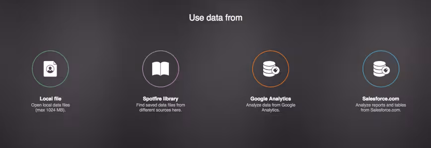
We’ve used Google Analytics for some time. Having tried a plethora of other sites, GA just works for us… most of the time. When it doesn’t, a quick shoutout to our handy-dandy marketing colleagues does the trick. Those guys are definitely data-mining masters. But that’s another story, for another time.
With its easy GA integration, we were able to upload our data directly into Spotfire. Don’t use Google Analytics? No problem. Spotfire also allows you to easily drag-and-drop files directly from your computer or Salesforce.
 Explore data
Once you have the data uploaded, you can easily sort through the metrics you need. For TNW, that meant finding all the data related to sessions, dates, and social sharing. Spotfire allows 10 selected metrics and seven dimensions.
And with the program’s smart wizard Recommendations, you’ll be guided through the entire analytics creating process. The tool suggests what type of graph is best for displaying time-series data, for instance, helping non-experts stay on the right investigative path. Users can create an entire dashboard with just a few clicks.
This is honestly what’s so great about Spotfire. Where most people who aren’t interested or understand data science, the bright visualizations of Spotfire allow even the data-challenged to interpret information. The power of this once highly specialized function is now in the hands of us non-data fanatics.
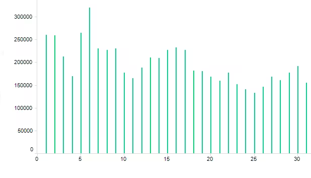
As you can see from our 2015 numbers, traffic always falls a bit during the holidays. While this can’t be stopped, it can be used to our advantage by not publishing during dead times.
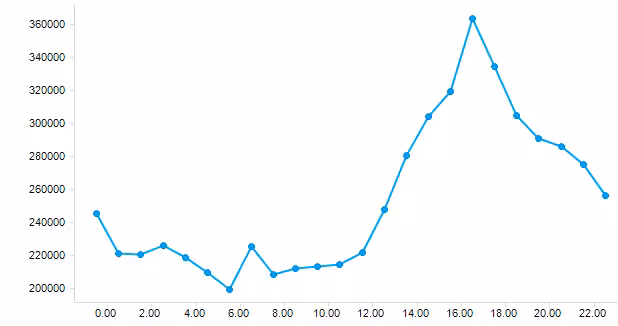
But first, we need to know when people are reading.
Convert data into knowledge
With the ability to see and interpret data, you can make effective business decisions. In our case, we needed to know the best times to publish content so our reader numbers wouldn’t fall.
A streamlined user interface, meanwhile, is designed to make data discovery faster, easier and more precise. New style options allow users to adjust the look and feel of a Spotfire workspace depending on their audience and the type of data at hand.
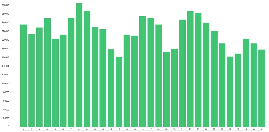
And – tada! Not only did we keep readers engaged, we were able to increase viewership:
Proper analytics means positive results
Regardless if you’re a global enterprise or an up-and-coming startup, meaningful statistics are necessary for decision making. And while data can help you make better and faster decisions, data analytics tools that are clumsy or hard to interpret are counterintuitive.
With Spotfire’s intuitive design and easy to read visualizations, you can ensure that your results yield positive effects.
Get the TNW newsletter
Get the most important tech news in your inbox each week.