
The importance of a logo can never be overstated. A logo is what gives your business its identity. Branding guru David Brier reminds us all that “one of the first items prospects will see, besides your name, is your logo.”
Every business, be it big or small, needs a logo for recognition and establishing an identity. However, not every business gets it right. There are some common mistakes we commit when designing a logo.
These mistakes cause us not just embarrassment but loss as well.
Let’s have a look at six logo design mistakes committed by designers and business persons that cause logos to fail:
1. Having too simple or too complex designs

The <3 of EU tech
The latest rumblings from the EU tech scene, a story from our wise ol' founder Boris, and some questionable AI art. It's free, every week, in your inbox. Sign up now!
It’s true that simple logos are more memorable, but times are changing and so are logo requirements.
Today’s logos are conceptual and unique. A burger joint does not necessarily need a burger in its logo to make a point. Logos can be abstract. However, being too abstract or complex can also backfire.
If your logo is too abstract and hard to understand it will not be able to leave its mark.
Have a look at Nike’s logo, which according to this study is the most recognized logo in the US. It’s very simple, and though not related to the nature of the business, does the job well.

Shy away from having logos that are too complex. Logos with a lot of details are not only hard to recognize and remember, but also difficult to print.
Common mistakes:
- Having too simple designs.
- Having too complex designs.
- Having designs that do not print well.
2. Going for cheap choices
There are many websites providing logo designs for free or at cheap rates. These cheap jobs can end up being more expensive in the long-run. Business owners often shy away from investing in a logo, which is a mistake that can cause a business to fail.
If you’re not an expert at logo designing, then it’s better to hire a professional. Some ‘tutorials’ may make the job look easy, but you’ll not be able to take care of the nitty gritty.
Remember, you only get what you pay for. You should be willing to spend a good amount of money to get a quality logo.
![]()
![]()
Logo tutorials and templates only give you limited options, and lack creativity.
A good logo costs around $250 on an average. But, how much you pay is never a guarantee of a good logo. The London 2012 Olympics logo cost over $500,000 but was a massive failure.
Common mistakes:
- Using online tools to design.
- Designing yourself.
- Getting it done by an amateur.
3. Using poor quality images
It’s important to use high quality images when designing logos to ensure quality reproduction and printing. Since logos are used everywhere (web and print) and in different sizes, image quality is of paramount importance.
The best solution is to use vector graphics. They’re created by using tools such CorelDraw and Adobe Illustrator, and are presented using mathematically precise points.
On the other hand, the alternative is .JPEG images, consisting of pixels. These images are usually of low quality and can cause the logo to look imperfect or cheap if printed on a large banner.
Since visual consistency is important, the quality of the image needs to be paid attention to.
![]()
![]()
Common mistakes:
- Using raster images.
- Using images with watermarks on them.
- Using images that lack consistency when printed.
4. Neglecting the brand
It’s important to keep the brand in mind when designing a logo. Remember, you’re designing for your client and not for yourself.
You must speak to the client before getting down to logo designing. Ask questions and be on the same page regarding everything from color selection to brand positioning. Requirements should be clear and ideally in writing.
You can also use one of many requirement management tools to manage things better.
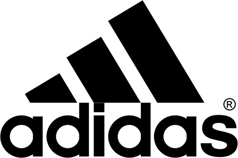
Adidas’ logo is designed like a shoe, with a unique font that helps position its brand.
A logo is more than just an image. It tells a story and must be able to effectively communicate your client’s USP.
Common mistakes:
- Not understanding the client’s target audience.
- Not understanding the brand position.
- Not speaking to the client.
5. Using too many effects
It’s important to have colorful logos, but overdoing it can backfire. Some of the most famous logos are actually in black and white (Nike, Apple etc). However, in certain cases colors are of importance.
For example, if you’re creating a logo for a restaurant you should select red, yellow, green or orange since these colors are believed to induce hunger. McDonald’s seems to be doing it right.
Also, at times the colors you can use may be limited due to client’s requirements or the theme.
In case your client requests specific colors, make sure to present them in a way that looks appealing to the eye. A good example is the Olympic rings that include five colors in a neat manner.
On the other hand, the uses six colors but in an untidy manner. In addition to this, you should also avoid using filters and multiple fonts. It’s wise to stick to one professional font.
![]()
![]()
It’s important to design a logo that looks good in monotone as well since logos, even if made in color, may be presented in black and white as well.
Common mistakes:
- Using too many fonts.
- Using too many colors.
- Using different filters.
6. Copying other’s ideas
While it’s okay to be inspired, blatantly copying someone else’s idea is not only a crime (Sony Ericson vs Clearwire Corporation being an example), but also one of the major reasons why logos fail. Also, if your logo resembles someone else’s logo it would not be able to connect with the audience.
Sit down and research well. See what’s working and what isn’t working, but never go for fads.
![]()
![]()
You should design an evergreen logo since replacing or changing logos is considered unorthodox, especially once a logo is established. A lack of research can cause you to produce poor quality logos.
Common mistakes:
- Going for trends or fads.
- Getting too inspired by others.
- Not researching enough.
Logo designing requires time, effort and money as well. Make sure to put in all three and you will get good results.
Get the TNW newsletter
Get the most important tech news in your inbox each week.