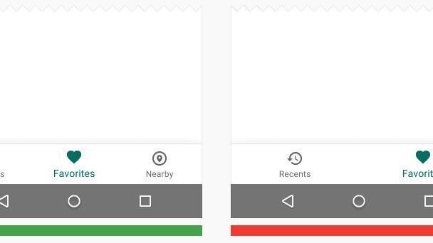
Google has finally embraced one of iOS’ most standard features: bottom-bar navigation.
With a change to its Material Design guidelines, Google is now encouraging developers and designers to use navigation buttons on the bottom of the screen. Ahead of this change, all in-app navigation occurred via Android’s ‘hamburger’ menu or the static navigation buttons in Android.
There are rules to bottom navigation, so don’t expect to see it everywhere. Google still wants hamburger menus for tablets and desktop applications, and asks that bottom-bar navigation only have three to five options for users.
Bars also aren’t static like Android’s home, back and recents tabs. Instead, developers can have them slip away when they’re not needed, unlike iOS where the options remain on-screen throughout the lifespan of a view.
These are new rules, so don’t go digging through Android apps hoping to see them. Google hasn’t even implemented it in its own apps yet, but look for those changes to happen ahead of Google I/O. If you’re designing in Sketch, don’t forget to download the updated sheets with all the new Material Design goodies!
➤ Bottom navigation [Google]
Get the TNW newsletter
Get the most important tech news in your inbox each week.


