Creating a home page is momentous for any business. You spend weeks carefully crafting every line of copy, every image, every color, every icon.
Agencies are hired, opinions are gathered, and budgets are obliterated. This is your brand we’re talking about, right? Everything is on the line.
Except it’s not.
If you look at how the home pages of successful, growing businesses have evolved, you’ll notice they seem to follow a process — one that’s able to successfully navigate the tension between trying to get customers as quickly as possible and trying to build a brand.
How you use your home page to convert visitors and establish your brand will evolve over the life of your business. At times, those two priorities may seem to be at odds with one another. You’ll have to make difficult decisions about which to focus on or invest in at the possible expense of the other.
The easiest way to make those types of decisions is to understand where your company falls in the three stages of home page growth. Let’s look at how you can use this info to build your best home page and, in turn, grow your business.
Building your best home page begins with your customers. They will not only help you learn how to convert more visitors, your customers can also help shape your brand in the process.
If you look at the journey of most home pages, particularly for software or service-related businesses, you’ll notice a consistent three-stage path many of them follow.
Stage 1: Validation (what you think customers want)
When you first launch, you’re really just testing a hypothesis: that you’ve created a product the market wants, and you’ve presented it in a manner compelling enough to convince visitors to try or purchase it.
Sure — personal experiences, research, and conversations with prospective customers can go a long way toward helping you launch with messaging, positioning, and branding that hits the mark, but here’s the truth: no one has any idea how effective their marketing will be until traffic starts hitting the page.
Everyone wants to put their best foot forward when making a first impression, but this might not even be the first impression that matters.
Back in 2008, a company called AirBed & Breakfast launched a site and presented visitors with the following headlines:
- March 2008: “AirBed & Breakfast is the fun, affordable alternative to hotels for your favorite events.”
- June 2008: “Stay with locals when traveling for cheap.”
- July 2008: “Stay with a local when traveling.”
- March 2009: “Find a place to stay.”
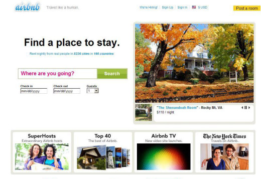
It wasn’t until July 2009 that they switched their name to the now ubiquitous Airbnb, and the look, feel, and positioning of the brand has continued to evolve ever since.
The customer who enjoyed using AirBed & Breakfast to find a super-cheap, blow-up bed in someone’s spare room for their trip to SXSW is likely very different from the customer who uses Airbnb today to rent an entire house for a weeklong getaway. Now their home page reads “Welcome Home” — which creates a vastly different feeling than “Stay with locals when traveling for cheap.”
Before you can truly know what your brand is and how to optimize your copy, you need customers to actually use it so you can understand what they want and what they don’t want.
To attract those early customers, rather than a fancy logo and clever tagline, you need a clear-cut value proposition, much like Slack’s in the early iteration of their home page in 2013, seen below.
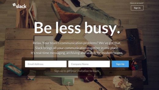
- What is it? A real-time messaging service with archiving and search.
- The pain it’s solving? Being overly busy.
- Who is it for? Teams that desire better communication.
When you’re new and largely attracting visitors who are unfamiliar with your product, you need to be clear with your messaging. Make it easy for visitors to understand what you’re offering and how it helps them.
Stage 2: Co-Creation (what customers say they want)
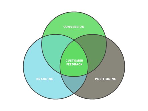
Customer feedback for a growing company is the sweet spot where conversion, branding, and positioning insights can all merge.
Once you have customers, actually talking to them will be one of the best ways for you to zero in on the words and phrases they use to describe how your product has helped them.
When you see and hear how your customers are using your product to solve their problems, how it makes them feel, and how they think you can improve it, you’ll gain invaluable insight that can push your positioning, branding, and marketing forward.
You may be the architect of your brand, but your customers are the tenants. They inhabit it, they pay the rent and they tell others what that experience is like.
When Slack started gaining steam, the most distinctive thing about it to non-users was how people wouldn’t shut up about it.
“Have you tried Slack yet?”
“Can we move this conversation to Slack? I’ll send you an invite.”
“I wish we were on Slack because I have the perfect GIF for this.”
Slack wisely capitalized on the word-of-mouth frenzy their user-friendly product had created and baked it right into their home page.
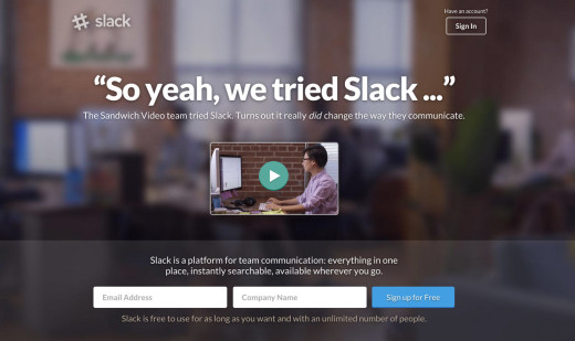
They used an existing customer’s language to create a headline that continued the conversations that were bringing tons of prospective users to their site. They then backed up the hype with a quick sub-headline that affirms the game-changing results the company behind the quote achieved. The video showcases those results to finish things off, all while featuring happy customers describing the experience of using the product in their own words.
When describing why utilizing customer feedback on your website and landing pages is so effective, Joanna Wiebe from Copy Hackers said, “The more you reflect what people are thinking, feeling and experiencing when they arrive on your landing page, the greater the likelihood they will trust you, believe you’ve created the solution to their problems and buy from you.”
For a long time, the home page for the analytics platform Kissmetrics featured the headline, “Google Analytics tells you what’s happening. Kissmetrics tells you who’s doing it.”
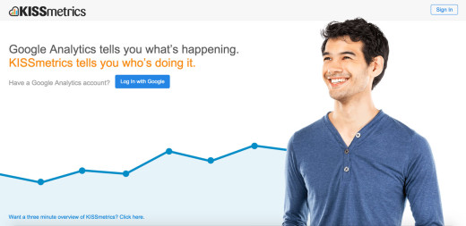
That headline wasn’t the result of a weeklong vision quest in the desert. Here’s how Kissmetrics came up with it, according to an interview with co-founder Hiten Shah:
We did a lot of customer interviews and research on our blog subscribers to determine how they think about Google Analytics and also how they think about KISSmetrics. The tagline initially came out of that research and we’ve had a hard time coming up with a better performing one.
Of course, you don’t have to slap word-for-word quotes from your customers on your home page to utilize their feedback in your copy.
As Kissmetrics continued to grow and test they eventually discovered a better-performing headline (and they changed their name from KISSmetrics to just Kissmetrics). And with that, like Slack, they moved into the third stage of the home page journey.
Stage 3: Authority (what you know customers want)
Steve Jobs famously said, “It’s really hard to design products by focus groups. A lot of times, people don’t know what they want until you show it to them.”
This quote initiated great conversations about customer feedback, and in many ways it also applies to the second stage of home pages.
After all, if people don’t really know what they want, why rely on their language to create your copy?
The first thing to realize is that not everyone takes Jobs’ opinion on this matter as gospel. There’s plenty of evidence that customers often do, in fact, know what they’re talking about.
Balance is important. Your customers may tell you exactly where they want to go, but that doesn’t mean you’ll never have to hold their hands and guide them along the way.
That’s why many companies utilizing direct customer quotes or language on their home pages eventually move on to something else. Not because they’re getting bad results, but because as companies grow and the brand evolves, they tend to seek new territory — different places to take their existing customers, and alternative places to find new customers.
The third iteration of Slack’s home page illustrates this change.
No longer relying on the viral conversations their customers started all over the world, Slack is now positioning itself as a brand that frees up teams to accomplish the extraordinary.
Knowing that NASA’s jet propulsion laboratory is using Slack will appeal to larger, more complex businesses but won’t alienate smaller ones. Both aspire to create great things. And everyone thinks it’s cool to use something NASA is using.
Just like Slack’s home page has continued to evolve, so has Kissmetrics’:
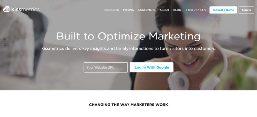
When you’ve reached stage three, you have a deeper understanding of who your customers are, what types of customers you want to attract, and where you want to go as a brand.
You’re still listening to your customers (that part should never stop), but you’re also ready to show them things they might not be able to articulate a need for. You’re not just a player in your space — you’re an authority that’s leading your industry forward.
Continuing home page growth
Regardless of where you are as a company — whether you have zero customers or thousands — some things never change. You’ll always want your home page to convert more visitors into customers. You’ll always want a brand that customers love.
The way your brand will help you achieve those conversions will evolve along the way. I look at it like this:
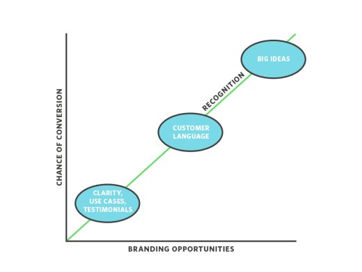
As your customer base and recognition within your industry grow, there are more opportunities for things traditionally lumped into the concept of branding to impact conversion.
When you’re new, everything is more difficult because no one knows who you are. Most companies aren’t spreading like wildfire from day one. They’re hustling just to get visitors to the site and working to earn their trust once they arrive.
That’s why clarity is so important early on. If there’s a good chance visitors haven’t heard of you, they need to easily understand what you’re offering and how it helps them within a few seconds of arriving on your home page. It’s less about how your site makes them feel, and more about answering the simple question, “Is this relevant to me?”
As companies grow, however, they become more familiar to prospective customers in their space. The likelihood of prospects being referred by someone they trust increases.
Look at the difference between Wistia’s home page in 2010 versus 2015:
In 2010, the website featured an extremely straightforward video and copy that explained exactly what their product is and does.
Now, it’s a bit more creative.
The headline is unorthodox. Their company culture is front and center. The design is sharper. The video is higher quality and conveys aspects of their brand that were invisible five years ago.
The awareness and growth they’ve generated over the life of the business makes a somewhat unorthodox page like this much less of a risk than it would have been in the company’s early days.
Like Slack’s current home page, it’s now presenting something bigger. They’re a brand their users have validated and helped create along the way.
Are there exceptions to all of this? Of course. In some industries, brand is everything and is much more important from day one of a company’s existence.
But what most businesses need is an iterative, collaborative process with their customers that scales as they grow. For those businesses, this is that process.
➤ This post originally appeared on HelpScout
Read next: 8 habits of epic UX designers
Get the TNW newsletter
Get the most important tech news in your inbox each week.


