During my first full-time UX design job, I remember a lot of the conversations within our UX team would go something like this:
- “The user wouldn’t really think this way…”
- “The user would probably do this…”
- “The user will get confused here…”
Throughout our discussions and design presentations, the “user” was often referenced as a way of justifying our design actions. But there was one catch.
We didn’t have any users.
Since we were developing a brand new app for our client, there was no current user base that we could draw from. And due to the nature of our quick sprints, user research was never considered. All we did was theorize and hypothesize the behaviors of our users without ever testing our assumptions – a process that was set up to fail.
It’s probably why we were called “Experience” Designers and not “UX” Designers, because in this design process the user was nowhere to be found.
Now, I’m currently leading UX Research at the collaborative design platform UXPin, and during this year I had the chance of interviewing a little under 100 designers, often discussing their design processes. Based on my interviews, I found that this quick assumption process was not unique to my old agency, but present in many other companies in various degrees.
I’ll explain the most common frustrations from UX designers I heard throughout my interviews and how we can bring users back to the forefront in our design process. Here are the four clues that your design is neglecting the user, along with suggested solutions:
You only usability test high-fidelity prototypes
Usability testing is most effective when conducted periodically throughout the entire process, starting from low-fidelity prototypes.
At times the process can be so tight that there’s simply no time for user research, especially if your team uses quick sprint cycles. Testing shouldn’t be dispensable, but rather it should be your strongest link to what your users actually need. Otherwise, you’re just guessing.
Solution
When it comes to your design process, start with the user research.
I found that early user testing with wireframes help users focus more on the function rather than its looks. When users are asked to conceptualize and not simply look, then you can pinpoint some of the common behaviors they might make with your application. This way, you can find the core usability problems and start addressing them as you move forward with the design process.
Ask yourself this: How often do your place your designs in front of the user?
For the past few months, I’ve dedicated most of my time to redesigning our core product. As soon as we had a somewhat mid-fi wireframe, we immediately placed it in front of our users. We took them through the basic functionalities and the biggest changes. Because they weren’t focused on the visual aspect of the wireframe, they gave us clearer information on the usability of the product.
If you’re building an app that does not have users (like my previous agencies), then test early with co-workers who are not involved with the design process. Anyone not involved in your design process can provide you a fresher perspective, catch big usability issues, and overall improve the experience for your app.
Visuals precede usability
During my time at the aforementioned agency, I remember the team created a mobile homepage that I thought would be easy to use (assumption), but the visual design team came up with some drastically different, a design that I thought would have poor usability (assumption).
To my surprise, the client picked the “fancier” design. I was shocked, but unfortunately I had 0 information on user behavior, so I had to put my personal feelings aside.
Stunning graphics are impressive — especially to stakeholders — but they won’t make a difference to your users if the usability is poor.
Of course, visual design plays a role in UX. However, it shouldn’t be the only consideration. Because visuals are far easier to present to stakeholders, they can often take precedence over something abstract like a user flow – part of the Dribbblisation trap that is often discussed.
When you prioritize visuals, you’re designing for awards, not users. There are times for stunning visuals, but none of them require sacrificing usability.
Solution
The reason I strongly believe in early wireframing prototyping is that it focuses on function.
Visual designs should build on top of your UX talent, not the other way around. Understand that early user input will provide a better foundation in which visual design can grow.
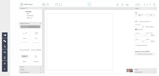
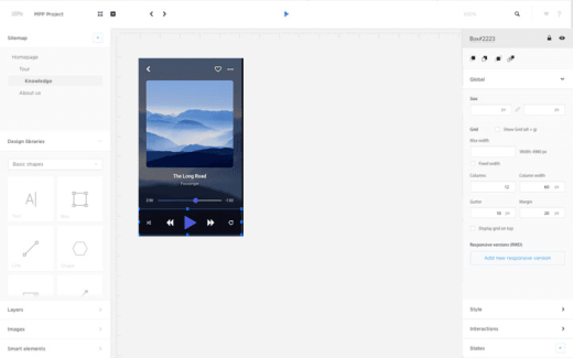
We’ve found that a mid-fidelity prototype actually strikes the perfect balance between useful feedback and design effort. The design looks real enough for accurate user interactions (e.g. the first example below) without requiring hours of visual design work. During our own redesign process, we iterated mostly on icon labels and visual hierarchy as we moved from mid to high fidelity.
Mid-Fi Prototype

Hi-Fi Prototype

When creating a mid-fi prototype, make sure the design:
- Delivers the right content at the right time
- Remains consistent to the user’s prior knowledge (e.g. uses straightforward UI patterns)
- Does not contradict itself with inconsistent interaction design on different pages
You substitute others’ opinions for the users.
… And the two biggest “others” are yourself and your stakeholders.
To design for users, avoid “The User Probably Thinks Like Me” syndrome.
Even if you fit well into the target demographic, you’re still just guessing unless you’re drawing from actual data. It’s easy to develop a personal bond with your projects, but one of the most important design skills is detaching your ego from the product.
Bring your expertise as a UX designer to the project, not your personal preferences.
The other common substitute is the stakeholders, which is a common mistake made in agencies. Stakeholders, of course, have their say, but at the end of the day what they need most is a satisfied user.
It’s certainly not easy to satisfy everyone: yourself, business stakeholders, and above all, the user.
Solution
But even before you start, conducting user interviews (and even surveys) can help inform your team of the product strategy.
- Before prescribing the specific changes for our product redesign, we spent five days interviewing 20+ users including customers and potential customers.
- Throughout the process, we still followed up usability tests with interviews. To date, we’ve conducted well over 50 user interviews for the redesign.
Interviews allow you to ask follow up questions regarding user behaviors, which feeds real information into your personas.
Involve other product team members in the usability research and testing.

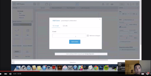
Testing our redesigned interface with designer Jessica Tiao of KissMetrics
I moderated the user interviews and usability tests during our redesign process, but I also invited our developers, designers, and product marketers to the sessions. Design insights are most powerful when they’re absorbed firsthand by as many people on the product team as possible.
- Conduct a few early stakeholder interviews. Since UXPin is a startup, our stakeholder interviews were fairly informal and only lasted about 30 minutes. However, the time was enough for me to understand the business goals, concerns, as well as personal preferences of different people involved in the product design. Just as you need to empathize with users, you also must turn that empathy inwards towards your team.
- Try setting a ground rule that people who want to offer feedback must first attend user interviews and/or usability test sessions. If they can’t attend the sessions, they need to at least view the raw material or the distilled insights. You’ll receive more focused feedback and reduce the likelihood of strong opinions based on personal preference.
- Share usability insights with anyone who touches the product. During our redesign process, the raw usability research (like recorded usability tests) as well as my written recommendations were available to everyone on Google Drive including developers, marketers, visual designers, and UX designers.
You’re designing without data
Even the best UX designers can’t create successful experiences from thin air.
Designing from guesswork is just a culmination of assumptions. Assumptions without context kill products.
You know when you say a word so much is loses its meaning? This phenomenon, called semantic satiation, happens everywhere, including design. It’s a process I like to call, design satiation.
When you’re too close to a design, its elements start losing meaning thanks to overexposure. At some point, you’re only passively designing, making decisions from habit rather than sound judgement — and in this state you can miss some of the worst usability flaws.
Data prevents this by providing an incorruptible foundation to make decisions on. No matter the preferences of the stakeholders or the mental state of the designer, the data won’t lie.
If you aren’t tracking specific product events (e.g. “added an interaction in past seven days”), you aren’t seeing the reality of your design decisions.
Solution
As we said above, test early and test often.
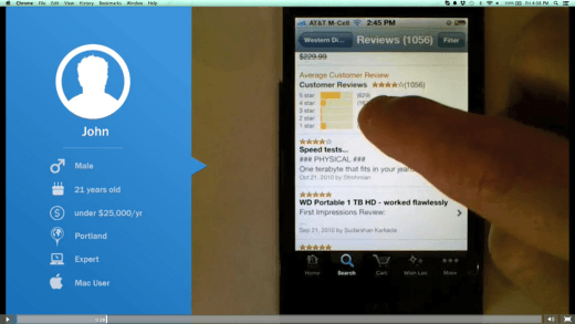
Interval testing periodically “checks in” with your users to make sure you’re on the right track, and delivers more relevant data to incorporate moving forward.

Photo credit: UserTesting
It’s hard to test for everything at once, especially at the beginning when a lot of the design isn’t formulated yet. Periodic testing brings data in at a manageable pace and when it’s relevant. It perpetually gives you a fresh perspective to ward off “design satiation.”
We also used Google Analytics, KISSMetrics, and MadKudu to inform us of user preferences and behaviors.
By reviewing site engagement across pages of uxpin.com, we gathered data points around people’s interests (e.g. comparing traffic and time-on-page for our Prototyping and Collaboration sections on our Tour page). KISSMetrics informed us of which product events were most common, while MadKudu helped us understand which on-boarding steps required improvement.
Remember that great product strategy is a result of triangulating qualitative data (usability testing and user interview insights) and quantitative data (site metrics and app usage data).
Conclusion
As practitioners of the UX field, the user should be our number one priority.
Amidst all of our Lean and Agile UX thinking, it’s easy to overlook the small details that speak volumes about our users. Timelines are short, burndown rates are constantly monitored, and unexpected bugs can always pop up during the worst times.
The only practical way to stay focused on the user is to adopt a user-focused mindset instead of just setting aside “one week for user research and one week for usability testing”. UX isn’t a game of design phases, it must be a shared philosophy between the entire team.
Think in terms of activities instead of “stages” and you already stand a much better chance of designing for users.
Get the TNW newsletter
Get the most important tech news in your inbox each week.


